Excel Charts
How to Sort a Bar Chart in Descending Order in Excel
Bar charts are a great way to compare different categories in Excel, and sorting the bars from largest to smallest makes it easier to see the top values right away.

Bar charts are a great way to compare different categories in Excel, and sorting the bars from largest to smallest makes it easier to see the top values right away.
When you’re working with data in Excel, bar charts are a great way to compare values across different categories. They’re especially useful for showing totals, counts, or any kind of

When working with sales, survey data, or any comparison-based dataset, it’s often helpful to display two related data series side by side. A double bar graph, also known as a
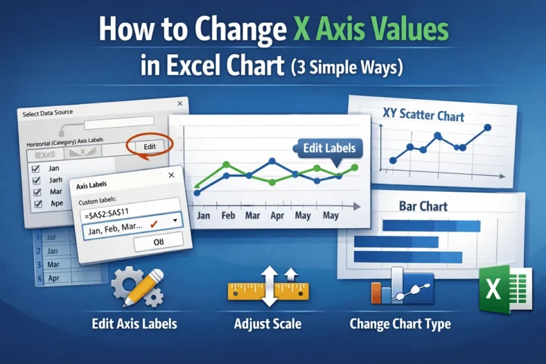
The X-axis in Excel charts plays a crucial role in organizing and displaying your data visually whether you’re working with categories, dates, or numerical values. Depending on your dataset, you
The AVERAGEIF function in Excel is an effective tool for calculating the average of cells that meet a specific condition. In many real-world datasets, you often need to exclude zero
When analyzing data in Excel, calculating percentages can give you a better understanding of proportions, trends, or distributions. With the COUNTIF function, you can quickly find out how much of
The COUNTIFS function in Excel is an excellent tool that lets you count the number of entries that meet multiple criteria. But beyond the basic syntax, there are many advanced
Ranking data is a crucial part of analyzing performance, whether you’re working with exam results, employee metrics, or product sales. It helps you identify top performers, compare values quickly, and
When you’re working with time-based data in Excel like sales, expenses, or activity logs, it’s often necessary to calculate totals for a specific month. Maybe you’re preparing monthly reports, reviewing