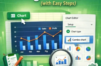
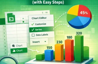
We use combo charts in Google Sheets to easily compare different types of data on one single chart. This makes spotting patterns and understanding complex information, such as sales and profit ...
We need to label legends in Google Sheets to ensure that the viewers of our charts understand the insights clearly. Although charts in Google Sheets usually include a label legend, it may sometimes ...
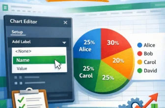
In Google Sheets, data labels are visual indicators on a chart that show the exact values of individual data points or data series. Whether you’re preparing reports or presenting results, data labels ...
Sparklines in Google Sheets are miniature charts that fit into a single cell, providing a quick visual representation of your data. They're perfect for dashboards, trend tracking, and giving context ...
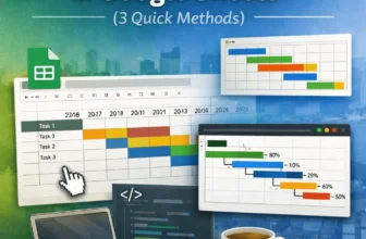
Gantt charts are essential tools for visualizing timelines, tracking project progress, and managing tasks over time. While Google Sheets doesn’t have a dedicated Gantt chart feature, you can still ...
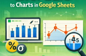
For data involving uncertainty, such as scientific experiments or survey results, error bars in charts visually represent the value range. Google Sheets allows you to add error bars to columns, bars, ...
Organizational charts visualize team structures, reporting lines, and workflows in a company or project. If you manage teams or need to clarify roles and hierarchies, an org chart can save time and ...
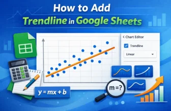
Trendlines are often used to understand the pattern of a dataset. If you want to track and analyze your data better, you might have to create a trendline after making a chart. In this article, you ...