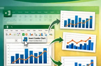
Combining two graphs in Excel lets you compare different data series within a single visual which is perfect for presentations, dashboards, or trend analysis. Whether you're working with two ...
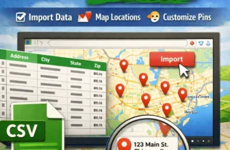
Whether you're tracking customer locations, delivery routes, or real estate listings, plotting addresses from Excel onto Google Maps can turn your spreadsheet data into an interactive, visual ...
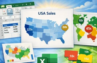
Mapping data in Excel lets you turn raw geographic information into excellent visuals that are easy to interpret. Whether you're tracking regional sales, population by state, or user distribution ...
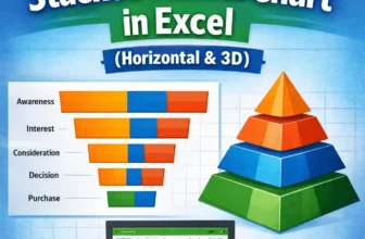
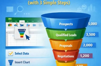
A stacked funnel chart is an excellent visual for tracking data through stages like marketing pipelines, sales funnels, or user journeys. Unlike the default funnel chart in Excel, which only allows a ...
Funnel charts are an effective way to visualize data that flows through stages, such as sales pipelines, lead conversions, or recruitment processes. Each stage is represented as a horizontal bar, and ...
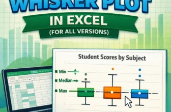
Box and Whisker plots, also called box plots, are excellent tools to visualize the distribution of data. They highlight key statistics like median, quartiles, and outliers, making them perfect for ...
Waterfall charts are an excellent tool for visualizing the step-by-step changes that lead to a final result. Whether you're tracking revenue growth, budgeting expenses, or analyzing inventory flow, a ...
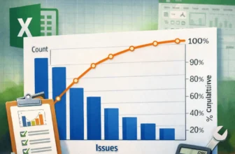
A Pareto chart is an efficient visual tool that highlights the most significant factors in a dataset. It combines a bar graph showing individual values in descending order with a line graph ...
Histogram charts in Excel offer a great way to visualize how data is distributed across defined ranges or “Bins”. But sometimes, your bin range might not work as expected. Excel could ignore your ...