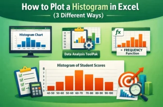
When we need to understand and visualize the distribution of a dataset, especially a large one, we use the histogram plot. Plotting a histogram allows us to group a large dataset into small intervals ...
Histogram charts in Excel offer a great way to visualize how data is distributed across defined ranges or “Bins”. But sometimes, your bin range might not work as expected. Excel could ignore your ...
Creating a bin range in Excel helps you group continuous numeric data into intervals, making it easier to interpret trends, build histograms, or summarize large datasets. Whether you’re analyzing ...