
When we need to understand and visualize the distribution of a dataset, especially a large one, we use the histogram plot. Plotting a histogram allows us to group a large dataset into small intervals and visualize how frequently each range of values occurs. By doing so, the histogram makes it easier for us to spot the trends, patterns, and outliers of the dataset.
Suppose you are analyzing the exam scores of students in a class. But checking each score one by one is time-consuming and can lead to mistakes. Instead, if you use a histogram, you can easily see how many students fall into different score ranges, such as 40–50, 50–60, 60–70, etc.. Not only that, by plotting the histogram, you can quickly identify whether the scores are normally distributed, if most students scored high or low, or if there are any unusual gaps.
In this article, we will explain three different methods to plot a histogram in Excel, including using the built-in Histogram chart, the Data Analysis ToolPak, and creating dynamic histograms with the FREQUENCY function.
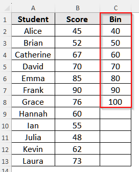
➤ First, make a bin for the dataset. Select cell C1 and write Bin. Then, write 40, 50, 60, 70, 80, 90, 100 in cell C2 to cell C8. You can write any suitable bins for your number. As our dataset started from 45 and the maximum score is 100, we took an interval of 10 and wrote the bins likewise.
➤ Now, select cell D1 and write Frequency.
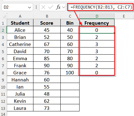
➤ Then, click on cell D2 and insert the following formula:
=FREQUENCY(B2:B13, C2:C7)
Here, B2:B13 is the Score column, and C2:C7 contains the bin values.
➤ Now, press Enter if you are using Excel 365 or 2021. However, for older versions, press Ctrl + Shift + Enter . And, the formula will return the bins. For example, how many students scored ≤40, how many scored between 51–60, and so on.
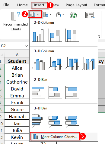
➤ Next, select the bin ranges and the frequency results together, i.e., C2 to D8
➤ Now, click on the Insert tab and select the column chart icon under Charts. Then, select More Column Charts.
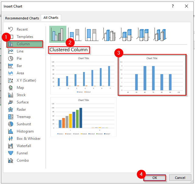
➤ You will see a pop-up come out. Click on the Column section and under Clustered Column chart, choose a suitable chart, preferably the second chart.
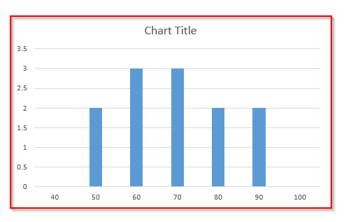
➤ Select OK, and finally, your histogram is ready.
Plot a Histogram in Excel with the Built-in Histogram Chart
The built-in Histogram chart in Excel allows us to quickly group numeric data into ranges (also called bins) and visualize how frequently values occur within those ranges. By doing this, it helps us to analyze the distributions and spot trends in a dataset more precisely.
We will use the dataset below to explain how you can make a histogram in Excel using the built-in Histogram chart.
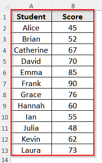
This dataset shows the exam scores of a few students.
Steps:
➤ First, select the Score column, i.e., cell B1 to B13.
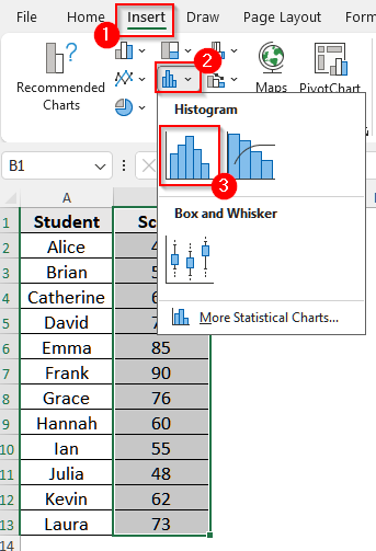
➤ Then, click on the Insert tab from the upper menu bar, and select the Insert Statistic Chart from the Charts group. It looks like a bar chart.
➤ Now, choose the first chart, i.e., Histogram, and Excel will automatically generate a histogram chart.
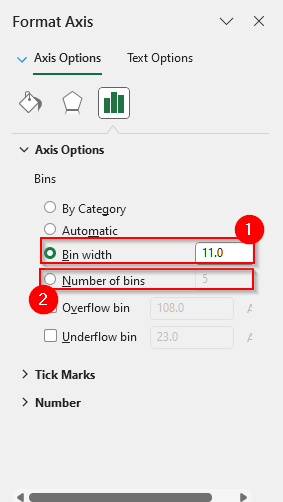
➤ Now, right-click on the horizontal axis (the bins) and it will show a list with a few options. Select Format Axis from the list.
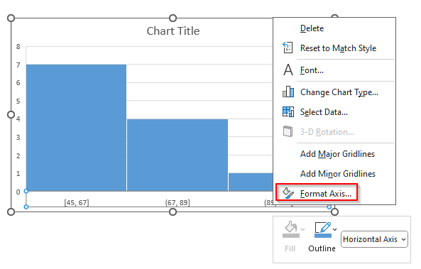
➤ Then, select the Axis Options panel to adjust the bins.
➤ For our data, we will click on Number of Bins and write 5. Then click on Bin Width and write 11. You can choose any suitable number for these two categories for your dataset.
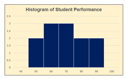
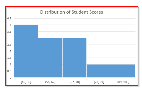
➤ Also, double-tap the Chart Title and add a title such as Distribution of Student Exam Scores to make the chart clearer.
➤ Finally, the histogram is completed.
Make a Histogram with the Data Analysis ToolPak in Excel
The Data Analysis ToolPak in Excel is an add-in that allows us to perform advanced statistical analysis, including creating histograms. While the built-in chart is easier to plot, it is only available in Excel 2016 and later versions. However, you can use the Data Analysis ToolPak in any version of Excel. Also, it gives us more control over our bin and generates a frequency table alongside.
Steps:
➤ First, make a bin for the dataset. Select cell C1 and write Bin. Then, write 40, 50, 60, 70, 80, 90, 100 in cell C2 to cell C8. You can write any suitable bins for your number. As our dataset started from 45 and the maximum score is 100, we took an interval of 10 and wrote the bins likewise.
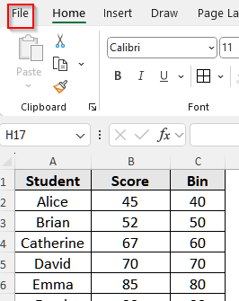
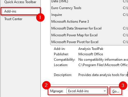
➤ Then, enable the Data Analysis ToolPak. To do it, go to the File tab, and it will take you to a new window.
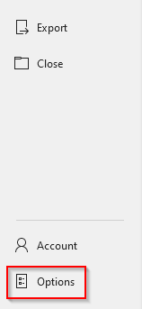
➤ Then select Options from the bottom, and it will open a new window.
➤ Now, click on Add-ins and in the Manage box, choose Excel Add-ins and then click on Go.
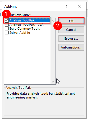
➤ Now, a pop-up will come out. Select, Analysis ToolPak in it, and click OK.
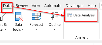
➤ Then, go to the Data tab on the ribbon and in the Analysis group, you will see the Data Analysis button. Click on it.
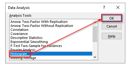
➤ Now, you will see a list of tools. Select Histogram from that list and then click OK.
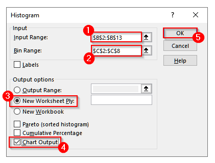
➤ Another pop-up window will appear. In it, for Input Range, select the scores range $B$2:$B$13. For Bin Range, select the bin range $C$2:$C$8.
➤ Now, select New Worksheet Ply and check the box Chart Output. Finally, click OK.
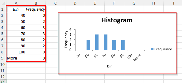
➤ You will see a new sheet generated in your worksheet. Go there and you will find Excel has generated a frequency distribution table along with a histogram chart.
Plot a Histogram in Excel with the FREQUENCY Function
The FREQUENCY function in Excel helps us count how many values fall into specific ranges or bins. Then, if we combine this function with a column chart, we can create a dynamic histogram that updates automatically when the dataset changes.
Steps:
➤ First, we need to prepare the bin ranges. For our dataset, select cell C1 and write Bin. Then, write 40, 50, 60, 70, 80, 90, 100 in cell C2 to cell C8.
➤ Now, select cell D1 and write Frequency.
➤ Then, click on cell D2 and insert the following formula:
=FREQUENCY(B2:B13, C2:C7)
Here, B2:B13 is the Score column, and C2:C7 contains the bin values.
➤ Now, press Enter if you are using Excel 365 or 2021. However, for older versions, press Ctrl + Shift + Enter . And, the formula will return the bins. For example, how many students scored ≤40, how many scored between 51–60, and so on.
➤ Next, select the bin ranges and the frequency results together, i.e., C2 to D8
➤ Now, click on the Insert tab and select the column chart icon under Charts. Then, select More Column Charts.
➤ You will see a pop-up come out. Click on the Column section and under Clustered Column chart, choose a suitable chart, preferably the second chart.
➤ Select OK, and finally, your histogram is ready.
Formatting the Histogram
After plotting the histogram, it is crucial to format it so that we can interpret the data clearly and concisely. Now, we will add the Chart Title, remove any unnecessary gaps, and change the color of our Histogram.
Add Chart Title
Without a proper title, any chart is incomplete. So, make sure to add a title to your chart. It will help you later to remember what the chart is about and will make the chart more presentable.
Steps:
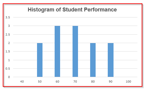
➤ First, double-click on the Chart Title.
➤ Now, write Histogram of Student Performance.
Remove Unnecessary Gaps
By default, Excel sometimes inserts gaps in a histogram, and so, it appears more like a bar chart. So, we need to remove these gaps manually.
Steps:
➤ First, right-click on any of the bars of the histogram and choose Format Data Series from the menu.
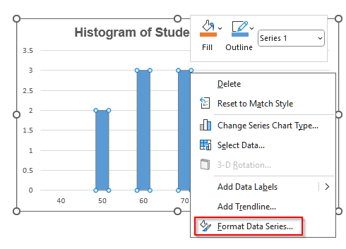
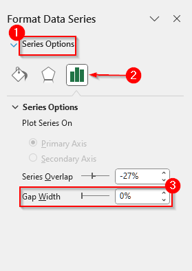
➤ Then, a panel will open on the right side of your Excel window. Under the Series Option, you will find Gap Width. Now, reduce the Gap Width all the way down to 0% and the bars will sit directly next to each other.
Change the Color
Changing the color of the bars and background of the histogram will give our chart a more refined look.
Steps:
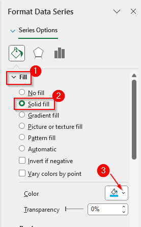
➤ To change the bar color, go to Fill under the Format Data Series.
➤ Now, select any fill type you like. We will use Solid fill for our chart.
➤ Then, under the color, you will see a tiny arrowhead. Click on it, and a color palette will open up. Choose any color you like. You can also change the border color under Border.
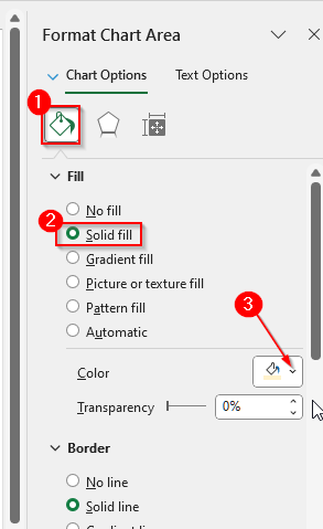
➤ Now, to change the background color of the chart, right-click on the chart area, not on the bar.
➤ A pop-up will come out. Choose Format Chart Area from it. Then, under the Fill option, choose any type, and also beside the color, click on the small arrowhead to choose any of the colors.
➤ Now, our histogram appears more presentable.
Frequently Asked Questions
Why Is the FFREQUENCY Function Not Working in Excel to Create a Histogram?
It can be for a few reasons. First, check the formula and make sure the bin range and the frequency range are selected properly. In this case, the bin and frequency range will have the same count. Now, if you are using an older version of Excel, i.e., Excel 2016 or older, make sure to press Ctrl + Shift + Enter . As the FREQUENCY function is an array formula, if you press only Enter , it will not work in older Excel.
Can I plot a histogram with text data in Excel?
No, you cannot. Histograms are only for numeric data. So, if your data is categorical, such as favorite fruit names, region names, etc., you need to use a column chart or bar chart instead.
Why Is My Histogram Showing Only One Bar in Excel?
If the bin settings of your data are too wide, then all your data will fall into a single interval, and you will see only one bar in your histogram. To fix this, right-click the horizontal axis, go to Format Axis, and adjust the Bin Width or increase the Number of bins to break the data into smaller groups.
Wrapping Up
In this article, we have learned to plot a histogram in Excel using three different methods. You can use the built-in Histogram chart for a quick plot in Excel 2016 and newer versions. Use the Data Analysis ToolPak for all versions, including the older versions of Excel. And, if you want a dynamic histogram, use the FREQUENCY function. Give them a try and let us know if you have any inquiries.