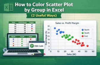
Scatter plots in Excel are useful for visualizing relationships between variables. Coloring the scatter plot based on groups, such as regions or categories, highlights patterns or trends. Let’s say ...
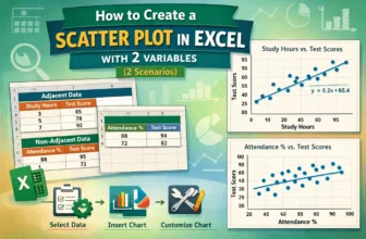
Scatter plots effectively visualize the relationship between two variables, vital for data analysis in business, science, and education. Microsoft Excel provides an easy way to create a scatter plot ...
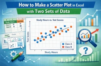
A scatter plot in Excel is a powerful tool for identifying relationships between variables, analyzing data patterns, detecting outliers, conducting trend analysis, and comparing data sets. Whether ...
Scatter plots are commonly used to visualize the relationship between two numeric variables. When a third variable needs to be included, Excel offers a practical solution through the Bubble Chart. ...