
To determine a product’s sales target, it is important to calculate the break-even point. A break-even chart is the visual representation of the break-even analysis. Using the fixed cost, variable cost, and the selling price, it is easy to prepare a break-even chart. It makes the break-even point more recognizable to the average user, as they don’t have to analyze the numbers. In this article, we will learn how to make a break-even chart in Excel.
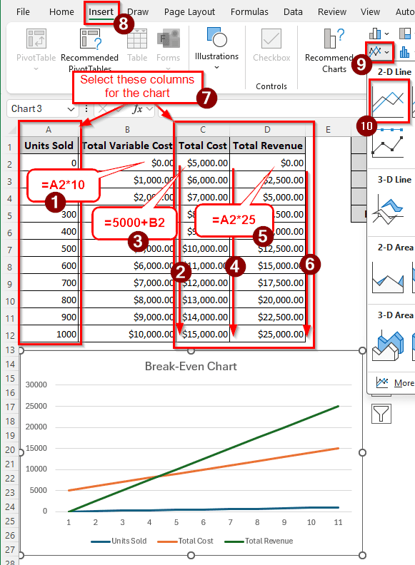
➤ Create a table with a speculation of units sold, total variable cost, total cost, and total revenue.
➤ Calculate the total variable cost using the following formula, and autofill the column:
=A2*10
➤ Replace A2 with the units sold, and 10 with the variable cost per unit.
➤ Calculate the total cost using the following formula, and autofill the column:
=5000+B2
➤ Replace B2 with the total variable cost, and 5000 with the fixed cost
➤ Calculate the total revenue using the following formula, and autofill the column:
=A2*25
➤ Replace A2 with the units sold, and 25 with the selling price per unit.
➤ Select the Total Cost, Total Revenue, and Units Sold columns. Then go to Insert > Charts > 2-D Line, and select the first chart to create the break-even chart.
This chart is good enough, but the break-even point is not that clear. In this article, we will calculate the break-even point separately, then create a chart that will clearly show the break-even point. Therefore, download the Excel file with this article, and read the tutorial attentively.
Steps to Make a Break-Even Chart in Excel
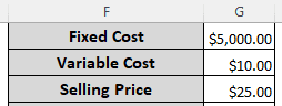
We have a table with three values: the fixed cost, the variable cost, and the selling price. We will use this table to prepare the break-even chart. Follow the step-by-step guide below:
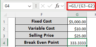
Step 1: Calculate the Break-Even Point
First, we need to calculate the break-even point, which will later be helpful to create the break-even chart.
➤ In the G4 cell, write the following formula to calculate the break-even point:
=G1/(G3-G2)
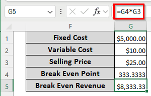
➤ Calculate the break-even revenue using the following formula:
=G4*G3
Step 2: Prepare the Break-Even Analysis Table
We have to create a table that will contain the data to be used in the break-even chart.
➤ Create a table with four columns and eleven rows (other than the heading). The column headers should be as follows:
Units Sold, Total Variable Cost, Total Cost, Total Revenue
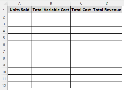
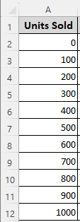
➤ Fill the Units Sold column with units from 0-1000, with a gap of 100 per row.
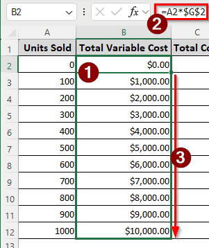
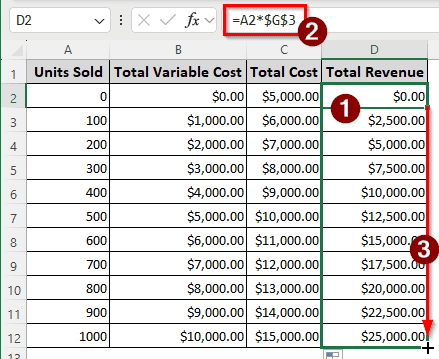
➤ In the B2 cell, insert the following formula, and autofill the whole column:
=A2*$G$2
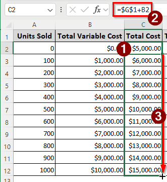
➤ In the C2 cell, use the following formula, and autofill till C12:
=$G$1+B2
➤ Finally, fill up column D by inserting the following formula in the D2 cell, and autofilling the rest of the rows:
=A2*$G$3
Step 3: Create the Break-Even Chart
We have all the data ready; now it’s time to create the actual break-even chart. Follow the process below:
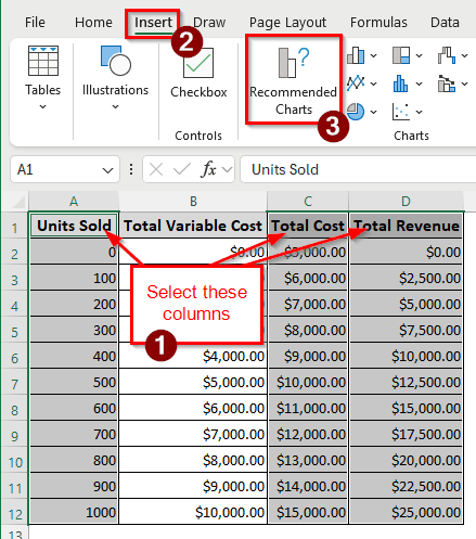
➤ Select the Units Sold, Total Cost, and Total Revenue columns by holding Ctrl and left-clicking the cells.
➤ Go to the Insert tab of the ribbon, and select Charts > Recommended Charts.
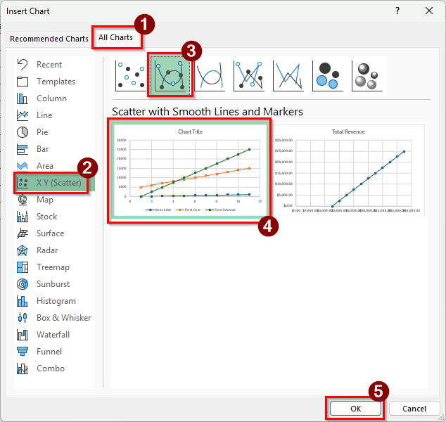
➤ From the All Charts tab, select X Y (Scatter) from the left pane. Then, select the left chart from the Scatter with Smooth Lines and Markers type. Press OK to create the chart.
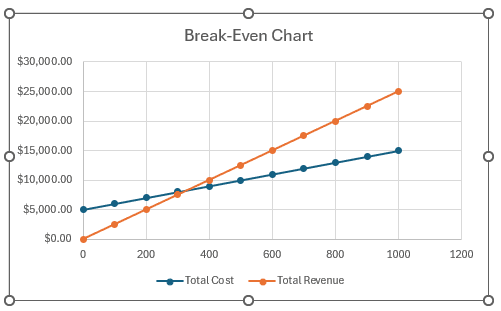
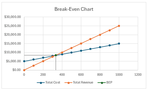
➤ Click on the Chart Title and change it to Break-Even Chart.
➤ Right-click on the graph and select “Select Data”.
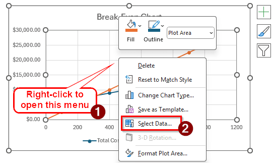
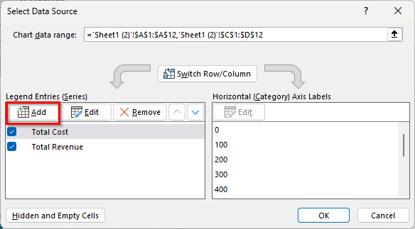
➤ Click Add on the Legend Entries (Series) section on the left panel.
➤ Change Series name to BEP (Short for Break-Even Point), Series X values to =Sheet1!$G$4 and Series Y values to =Sheet1!$G$5.
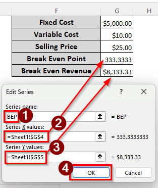
➤ Press OK to close this window.
➤ Press OK again to close the mother window.
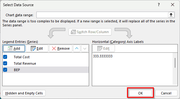
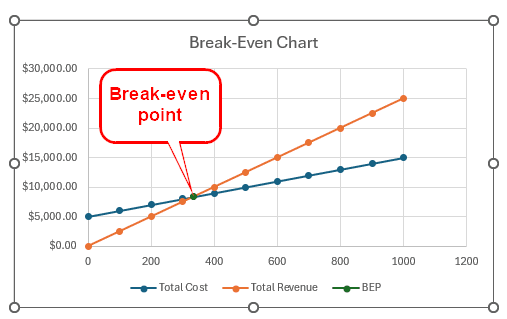
➤ Now, we can see the break-even point in the break-even chart properly.
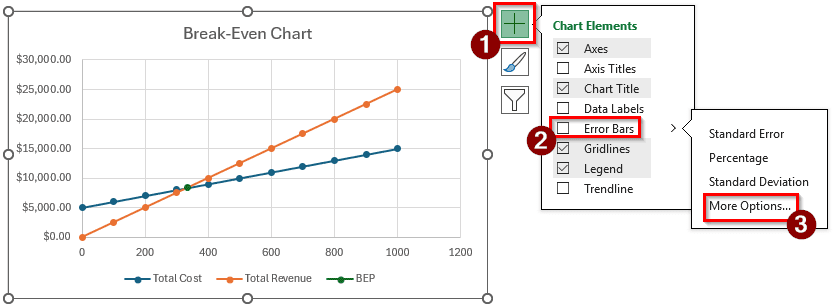
➤ Click on the plus icon (+) to open the Chart Elements menu. From there, select Error Bars > More Options.
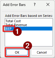
➤ Select BEP and press OK in the new window.
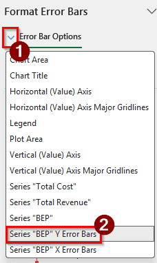
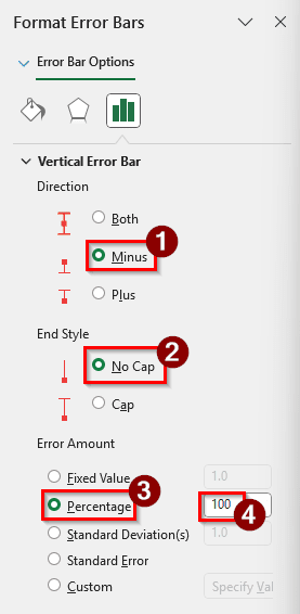
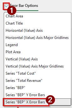
➤ Click on the small arrow left of the Error Bar Options, and select “Series “BEP” Y Error Bars”
➤ Select Minus in the Direction section, No Cap in the End Style section, and write 100 in the Percentage edit box of the Error Amount section.
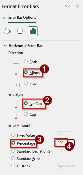
➤ From the arrow of the Error Bar Options, select “Series “BEP” X Error Bars”.
➤ Follow the same procedure as “Series “BEP” Y Error Bars”.
➤ Now we have a proper break-even chart with the break-even point clearly visible.
Frequently Asked Questions
What’s the formula for break-even?
The basic formula in Excel is as follows:
=A1/(B1-C1)
Here, A1 is the fixed costs as a whole, B1 is the sales price per unit, and C1 is the variable cost per unit.
How to make a breakdown chart in Excel?
In finance, you would want to make a waterfall chart for a breakdown chart. From the table with the data, select the columns with Category and Amount. Then, go to Insert > Charts > Recommended Charts. From the All Charts tab, find Waterfall on the left pane, and select the chart from the right pane.
How to make a broken line graph?
In the table of your data, insert some rows that have no data, other than the serial, for example. Then, create a graph using the whole table in Excel.
What is a stacked bar graph?
In a stacked bar graph, multiple data series are used. However, instead of showing them individually, the data series are stacked on top of each other in a single bar. As a result, we can see how each part contributes to the bar or a category. Different categories use different bars in the chart.
How do I set BreakEven?
In accounting, you can calculate the breakeven using the following formula in Excel:
=A1/B1
Here, A1 refers to the cell containing the fixed costs, and B1 contains the contribution margin.
Wrapping Up
In this article, we learned how to make a break-even chart in Excel. We went through the process of calculating the break-even point, preparing the table for the chart, creating the chart, and pinpointing the break-even point on the chart. If you have any confusion or questions, leave a comment below. Stay tuned for more tutorials.