A frequency distribution shows the frequency or number of observations within different intervals. You can use Excel functions, features, and add-ins to make a frequency distribution table.
➤ A frequency distribution shows the number of observations within different intervals or categories.
➤ Enable Data Analysis: File >> Options >> Excel Add-ins >> Data Analysis.
➤ Frequency table: Data tab >> Data Analysis >> Histogram >> Input range >> Output range >> OK.
➤ FREQUENCY function: =FREQUENCY(data_array, bins_array). For Excel 2019 or earlier versions use Ctrl+Shift+Enter to apply the formula. On Excel 365 or later versions just press Enter .
➤ PivotTable: Insert >> PivotTable >> Field Settings >> Group.
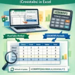
In this article, we’ll learn 3 ways to make a frequency distribution table in Excel using the Data Analysis ToolPak, the FREQUENCY function, and the PivotTable feature.
Quick Video Tutorial: Frequency Distribution Table in Excel
What is Frequency Distribution in Statistics?
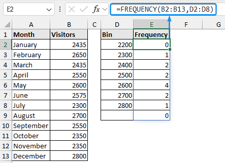
A frequency distribution shows the number of observations (frequency) within different intervals (bins). It provides a quick way to visualize how the data points are distributed across each bin.
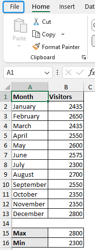
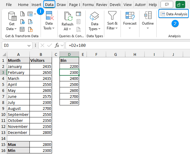
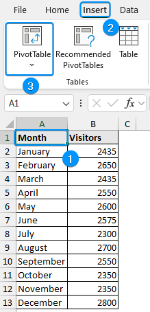
In this dataset, we have monthly visitors to a website in the year 2023. All the months in a year are shown in column A and the number of visitors is shown in column B.

Using Data Analysis ToolPak
The Data Analysis ToolPak can generate a frequency distribution table. Follow the steps.
Steps:
➤ First, we need to determine the maximum and minimum values in our data. The MAX function returns the maximum value (2800).
=MAX(B2:B13)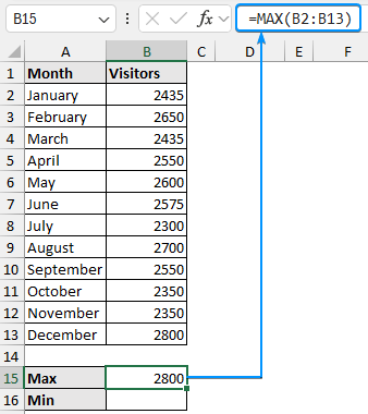
➤ Use the MIN function to determine the minimum value (2300).
=MIN(B2:B13)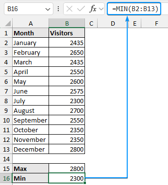
➤ We can see the number of visitors range from 2300 to 2800.
➤ Construct suitable bin ranges as needed. For example, we’ve started from 2200 adding 100 to each consecutive bin.
=D2+100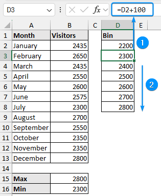
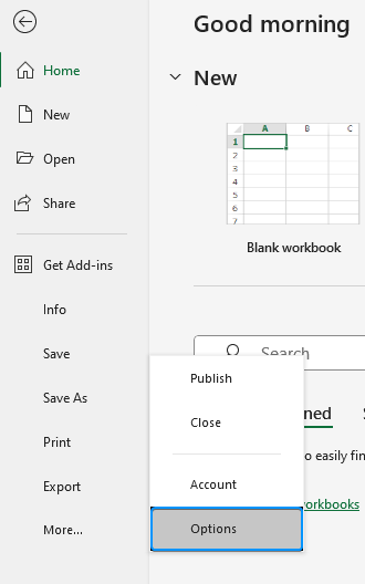
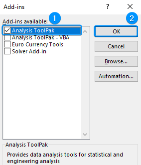
➤ We need to enable the Data Analysis add-in. Click on the File tab.
➤ Select Options. You can also use the shortcut Alt+F+T to open Excel Options.
➤ Select Add-ins >> Choose Excel Add-ins from the dropdown >> Go.
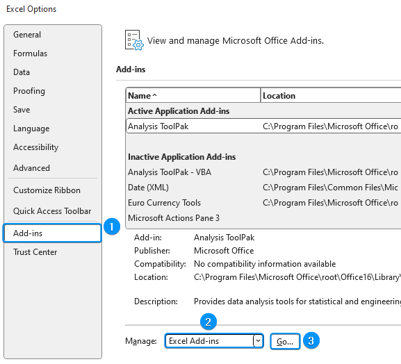
➤ Check the Analysis ToolPak option >> OK.
➤ Go to the Data tab >> Click Data Analysis.
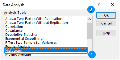
➤ Select Histogram >> OK.
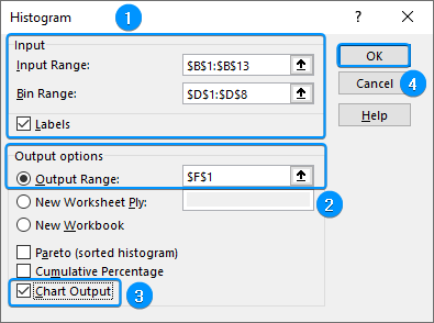
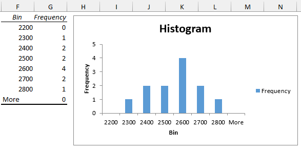
➤ Select the Input Range (B1:B13) >> Bin Range (D1:D8) >> Check the Labels option.
➤ Choose the Output cell (F1) >> Tick Chart Output option >> OK.
➤ You’ll get the results as shown below.
Making Frequency Distribution Table with FREQUENCY Function
You can use the FREQUENCY function to make a frequency distribution table. You need to prepare the bin ranges before using this function. We’ll use the same bin ranges as before.
Steps:
➤ Select the output cell (E2) >> Enter the formula. For Excel 2019 or earlier versions, press the Ctrl+Shift+Enter keys. On Excel 365 or later versions, just press Enter .
=FREQUENCY(B2:B13,D2:D8)
Optional Steps:
➤ Select the D1:E9 range >> Move to the Insert tab >> Recommended Charts.
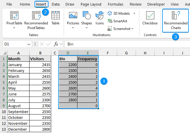
➤ Choose Clustered Column >> OK.
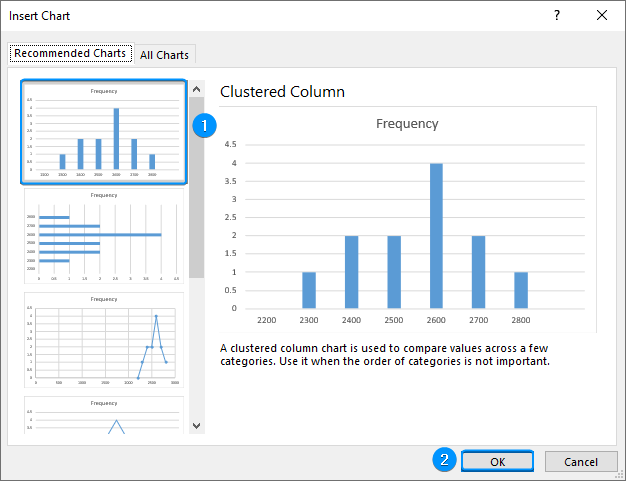
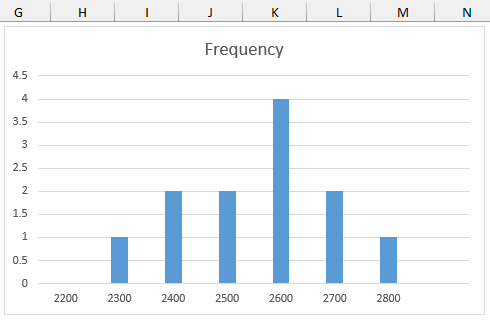
➤ You’ll get the histogram of the frequency distribution table.
Using PivotTable to Construct a Frequency Distribution Table
We can also use Excel’s PivotTable feature to make a frequency distribution table.
Steps:
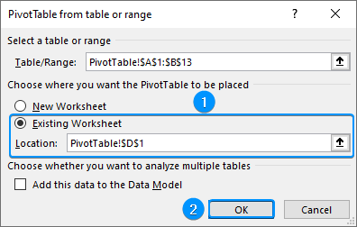
➤ Select any cell within the dataset >> Insert >> PivotTable.
➤ Check Existing Worksheet >> Location (D1) >> OK.
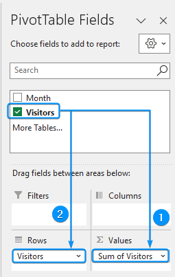
➤ Drag the visitors field in the Values and Rows areas.
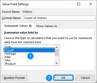
➤ Click any cell inside Sum of Visitors >> Right click >> Field Settings.
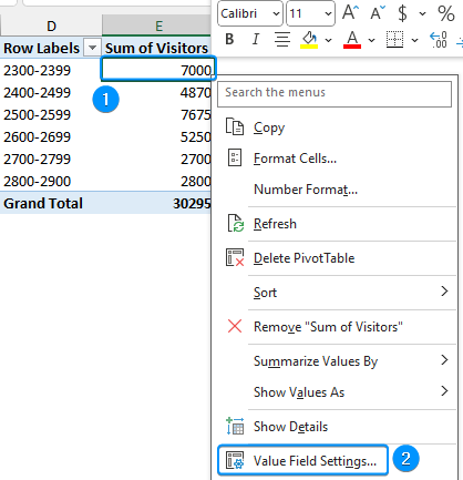
➤ Choose Count >> OK.
➤ Select any cell inside the Row Labels >> Right click >> Group.
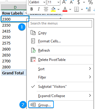
➤ Excel automatically does the grouping. You can set it manually too. For example, we’ve set 2200 for the Starting at, 2900 for Ending at, and 100 for By.

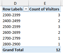
➤ You’ll see the results shown below.
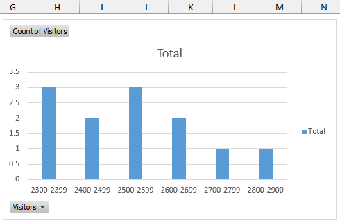
Optional Step:
➤ Select the PivotTable range (D1:E7) >> Insert tab >> Recommended Charts >> Clustered Column.
FAQ
How to convert raw data into a frequency table in Excel?
➤ Enter the data into the worksheet.
➤ Specify the upper limit of the bins (groups).
➤ Use the FREQUENCY function. Select the data points for the data_array argument and the upper limits of the bins as the bins_array argument.
➤ Press Ctrl+Shift+Enter to spill the results.
What is the frequency formula in Excel?
The frequency formula: =FREQUENCY(data_array, bins_array). Press Ctrl+Shift+Enter to get the results.
How do I determine the number of bins for my frequency distribution?
The number of bins depends on the dataset size and range (difference between largest and smallest observation). A common rule of thumb is to use between 5 to 20 bins.
How to choose the bin size for frequency distribution?
➤ Determine the range of your data (difference between the largest and smallest observation).
➤ Divide the range into equal intervals.
➤ List only the upper limits of each bin.
Can I create a frequency distribution table with categorical data?
Yes, you can. Instead of bins, use the distinct categories. The frequency will be the count of occurrences of each category.
Wrapping Up
In this tutorial, we’ve learned about frequency distribution and how to make a frequency distribution table in Excel. Feel free to download the practice file and let us know which method you like the most.