Gathering survey data is the first step. The true value lies in tabulating the results, which transforms the raw data into meaningful and useful insights. In this article, you’ll learn about tabulating data and how to tabulate data in Excel using functions, tools, and features. We’ll continue with our customer feedback questionnaire for easier understanding.
➤ Tabulating organizes and compiles raw data into tables for analysis and for drawing insights. In this article, we’ll learn the meaning of tabulating data and different ways to tabulate data in Excel using functions and Pivot Table.
➤ Frequency: =COUNTIF(range,criteria)
➤ Percentage: =cell reference/SUM(cell reference)
➤ Cross table: =COUNTIFS(criteria range1,criteria1,criteria range2,criteria2)
➤ Pivot Table: Insert >> Pivot Table >> Drag Fields >> Change Value Field settings or Right click on any data >> Show value as >> % of row/column/grand total.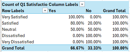
What is Tabulation?
The process of compiling raw, unprocessed data into tables for analysis is called tabulation. This involves calculating percentages, counting frequencies, and organizing the information in Excel to show trends and draw conclusions.
Tabulating Data in Excel with Functions
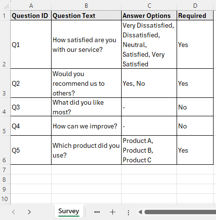
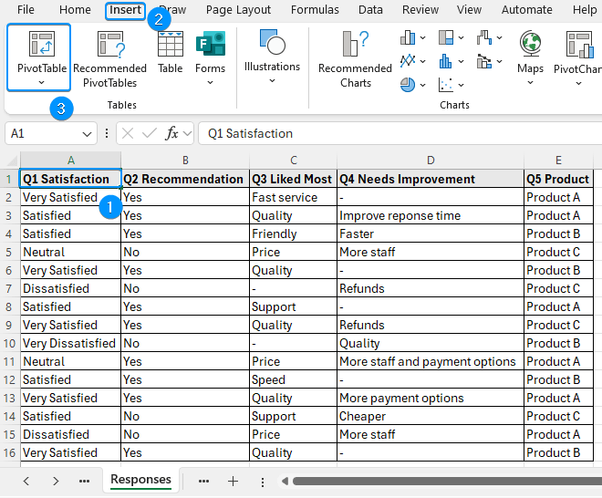
Consider the customer satisfaction survey questionnaire containing the question ID, question text, answer options, and required columns from A through D.
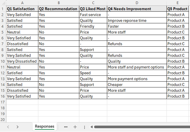
The response worksheet contains a total of 15 customer responses for the 5 questions.
For example, you may want to calculate the frequency of each satisfaction level, the Yes to No ratio, the variation of satisfaction across the three products, the distribution of satisfaction vs product recommendation, product performance index, etc.
Functions add a dynamic touch to any calculation. You can use the COUNTIFS function to tabulate data in Excel. For instance, you can calculate the frequency of each satisfaction level and express it as a percentage. Also, you can make a simple cross table to show the distribution of customer satisfaction for each of the three products.
Frequency and Percentage of Each Satisfaction Level
We start by calculating the frequency or count of the satisfaction levels using the COUNTIFS function.
Steps:
➤ Go to the B2 cell >> Enter the formula,
=COUNTIF(Responses!A2:A16,Functions!A2)
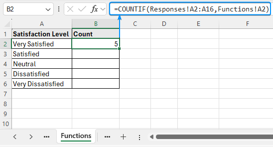
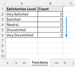
➤ Apply the Fill Handle tool to copy the formula to the cells below.
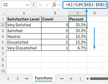
➤ Next, convert these frequencies into percentages.
=B2/SUM($B$2:$B$6)
➥ 20% are dissatisfied or worse, signaling a need for improvement
Product wise Customer Satisfaction Cross Table
Cross tables (also known as contingency tables) compare and summarize the relationship between two or more variables, such as product and customer satisfaction.
Steps:
➤ Move to cell B9 and enter the formula
=COUNTIFS(Responses!$E$2:$E$16,Functions!$A9,Responses!$A$2:$A$16,Functions!B$8)
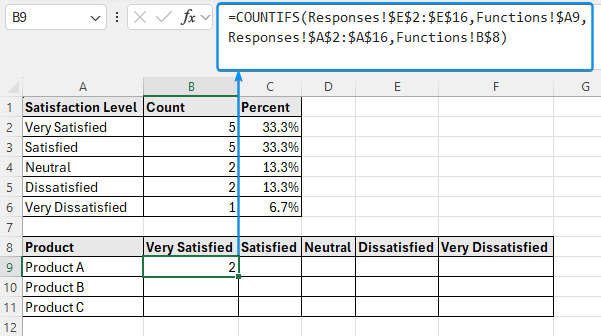
➤ Use the Fill Handle to fill in the table.
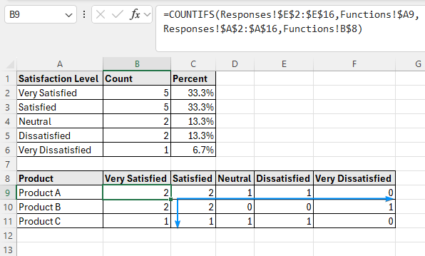
➥ Product C has mixed responses, indicative of lower performance.
Using Pivot Table to Tabulate Data in Excel
Excel’s PivotTable feature offers an interactive way to summarize raw data and draw useful conclusions.
Customer Satisfaction and Recommendation Table
You can easily compare two variables, like customer satisfaction and recommendation, using the PivotTable.
Steps:
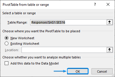
➤ Select a cell within the data in the “Responses” worksheet >> Insert >> Pivot Table.
➤ Choose New Worksheet >> OK.
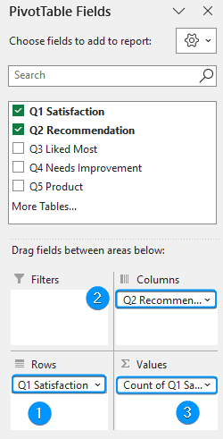
➤ Drag the Satisfaction and Recommendation fields into the Rows and Columns area, respectively >> Again drag and drop the Satisfaction field in the Values area.
➤ Select any value inside the Pivot Table >> Right click >> Show Values As >> % of Row Total.
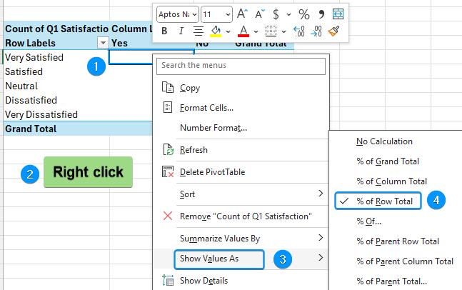
➤ The distribution for satisfaction vs recommendation is shown below.
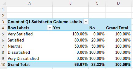
➥ Neutral respondents have a 50-50 chance of recommending or not recommending the product.
➥ All the dissatisfied and above respondents would not recommend the product.
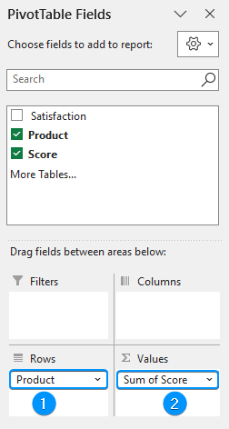
Product Performance Index with Pivot Table
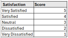
To calculate the product performance index we can assign weights to each satisfaction level.
Using the Pivot Table, we can calculate the average satisfaction score of each product.
Steps:
➤ Copy the columns in a new worksheet >> Select any cell within the data >> Insert >> Pivot Table >> Existing Worksheet >> Location (E1) >> OK.
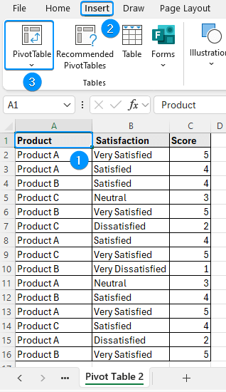
➤ Add products in the Rows area and score in the Values area.
➤ Click the drop down >> Value Field Settings.
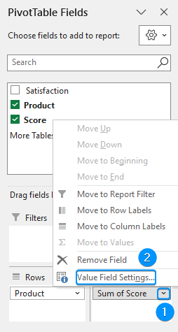
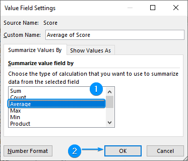
➤ Summarize value field by >> Average >> OK.
➤ The product performance index is ready.
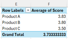
➥ Product C has a slightly lower average satisfaction compared to A and B.
➥ Based on this simple survey, there is room for improvement of Product C.
Frequently Asked Questions (FAQs)
How do I present data in tabular form in Excel?
Select any cell within the data range >> Insert >> Table or use the Ctrl+T shortcut.
How to summarize data by categories?
Use a Pivot Table. Select data >> Insert >> Pivot Table >> Drag the fields into row, column, values, etc. areas >> Change Value Field Settings to sum, count, average, etc.
How to show percentages in a Pivot Table?
To show percentages: Right click on any value in the Pivot Table >> Show Values As >> % of Row Total, % of Column Total, etc.
How to compile data in Excel?
Data >> Consolidate >> Choose a Function >> Select source data ranges.
How to make a tabulated layout using formulas instead of PivotTables?
Use COUNTIF, COUNTIFS, or SUMIFS to tabulate data manually.
Wrapping Up
In this tutorial, we’ve learned about tabulating data and different ways to tabulate data in Excel using functions and Pivot Table with key findings. Feel free to download the practice file and share your thoughts and suggestions.