
We use pivot tables to analyze and summarize large datasets while using pivot charts to visualize that summary.
Suppose you want to check monthly sales by region of a store. You can make a pivot table to check the total sales, seasonal changes, best-worst performing regions, etc., and then create a pivot chart to present these findings clearly.
In this article, we’ll show how to make a Pivot Table with the Insert option and then create a Pivot Chart, highlighting key differences.
➤ A pivot table summarizes and organizes large datasets into a structured tabular format, while a pivot chart is a graphical representation of the pivot table.
➤ Pivot tables are a customizable table that shows us data calculation and aggregation, while pivot charts focus on visual interpretation of that calculation.
➤ When we make a change in a pivot table, our linked pivot chart will automatically update. However, vice versa is not possible.
➤ Pivot tables break down our large dataset and make our analysis easier, while pivot charts make our presentation better. However, you can create a pivot table without creating a pivot chart. But, without a pivot table, making a pivot chart is not possible.
What is a Pivot Table & What Does It Do?
A Pivot Table is a feature in Excel that helps us summarize and analyze large amounts of data. Instead of writing complex formulas, we can simply drag and drop fields to group, filter, and the table will show us the results automatically.
Pivot tables allow us to see totals, averages, counts, and even some statistical computations quickly.
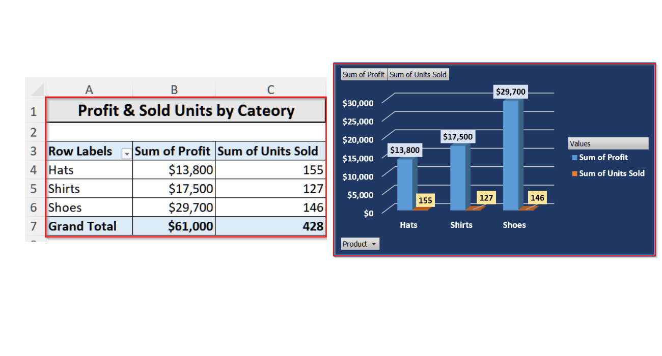
Such as in the pivot table below, you can see the summarized sales data for different product categories, including Hats, Shirts, and Shoes. The table also shows both the profit and the number of units sold for each category. At the bottom, it calculates the overall totals too.
What is a Pivot Chart & What Are Its Uses?
A pivot chart is a graphical representation of a pivot table that allows us to visually analyze, compare, and interpret large datasets.
Unlike normal charts, pivot charts are dynamic. You can filter, group, or rearrange these charts based on different dimensions. It gives the users flexibility in exploring data without altering the original dataset.
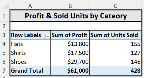
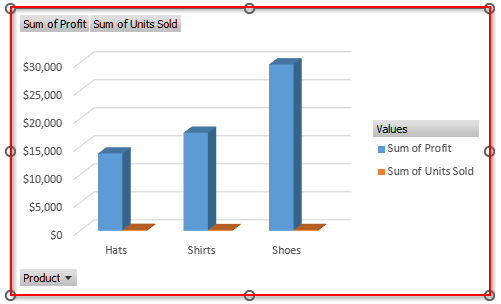
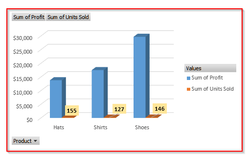
Such as in the pivot chart below, you can see the comparisons of the Sum of Profit and Sum of Units Sold across three product categories.
From this chart, it is clear that Shoes bring in the highest profit of $29,700 with 146 units sold, showing strong profitability. Hats sold the most units (155) but generated lower profit ($13,800), indicating lower profit margins. And, Shirts stand in the middle with 127 units sold and $17,500 profit.
Making a Pivot Table in Excel
Using the Insert option, we can easily make a pivot table to organize our data and get the results we want in just a few seconds.
We will use the dataset below to explain how you can make a pivot table in Excel with the Insert option.
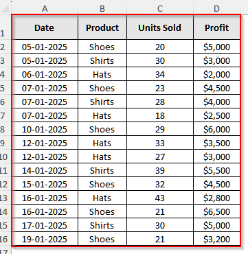
It is a store dataset where the store owner recorded the sales of various products on different dates and the total profits he made from each item. Now, we will make a pivot table to show the total profit he made by selling each type of item.
Steps:
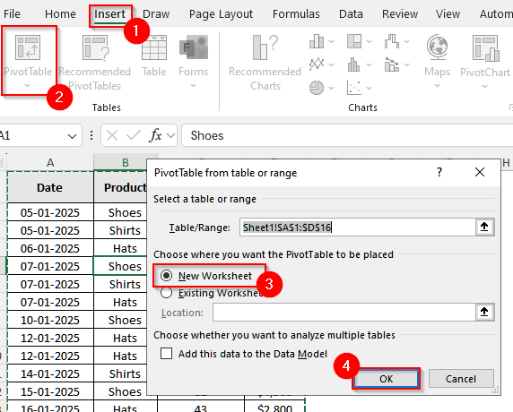
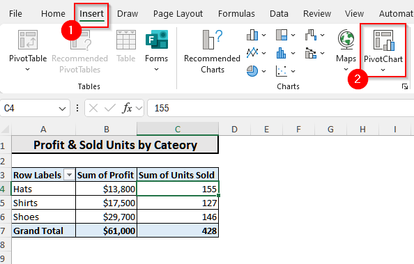
➤ First, click anywhere inside the dataset.
➤ Then, select Insert from the upper menu bar.
➤ Now, select PivotTable from the group Tables.
➤ A new pop-up will appear, and in it, choose New Worksheet. Finally, click OK.
➤ Now, in the PivotTable Fields section, drag Product in Rows. Then, drag both Units Sold and Profit in Values. By default, Excel will show the sum for the values.
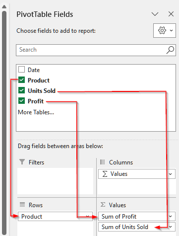
➤ Now you will see a pivot table showing the sum of the profit and sold units by each product.
Finding the Summary Measures with a Pivot Table
Now we will explore different summary measures other than sum, such as averages, counts, and maximum or minimum values, in our pivot table. These measures have a significant impact on a business report or annual presentation of your business.
Steps:
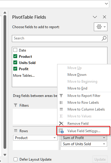
➤ First, click on any value inside the Values area of the pivot table. For our table, we will click on the profit value.
➤ Now, you will see a list of options appear. From that menu, select Value Field Settings.
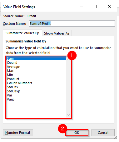
➤ Now, another pop-up will appear with a list of functions to choose from. Each of these summary measures has its own significance depending on the scenario. And, you can simply modify the pivot table to show whatever measure you need.
Making a Pivot Chart from a Pivot Table
While a pivot table lets us organize the data and make a summary report, it does not highlight the key changes. So, with a pivot chart, we can show these changes easily. And, this chart is an inevitable part to support our reports in both academic and professional settings.
Steps:
➤ First, click anywhere inside the pivot table we made earlier.
➤ Now, go to the Insert tab on the upper menu ribbon.
➤ Then, from the Charts group, select the PivotChart.
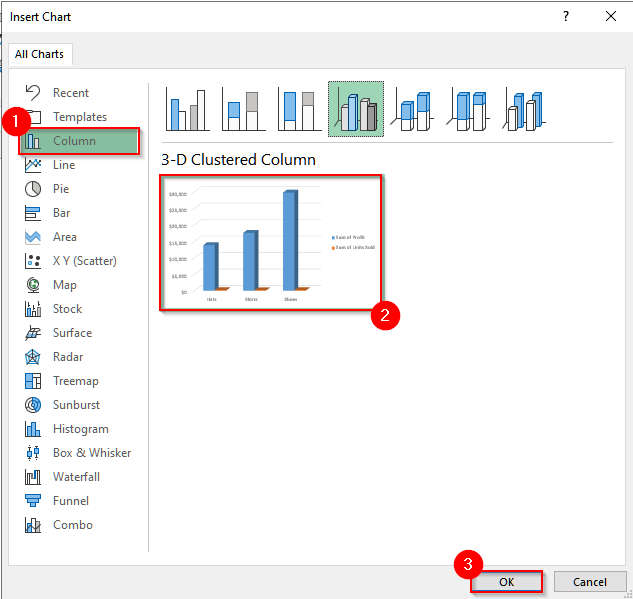
➤ A new window will open, and a list of charts will appear. Choose any suitable one from that chart. For our data, we will select the 3-D Clustered Column chart. And then click on Ok.
➤ Now, you can see the column chart.
Customizing the Pivot Chart
Now, to make your chart visibility appeal more clear, we can add data labels, change the color, etc., to customize it.
Add Data Labels
Let’s say we want to add the data labels for the units sold. To do it, follow the steps below.
Steps:
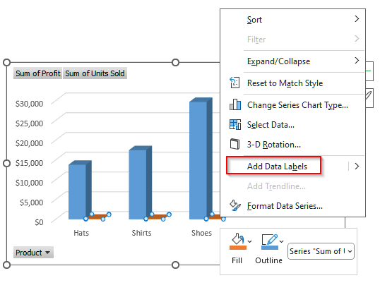
➤ First, click on a bar of the unit sold in the chart and then right-click on it.
➤ Now, you will see a list of options. Select Add Data Labels from it.
 ➤ After that, you will see the data labels appear for the units sold. Similarly, you can also add data labels for the profit.
Change the Background Color
Changing the background color of the pivot chart will make the chart more visible.
Steps:
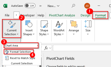
➤ First, click anywhere on the pivot chart. This will activate the chart.
➤ Then, select the Format tab on the ribbon.
➤ Now, in the Current Selection group, select Chart Area and then click on Format Selection.
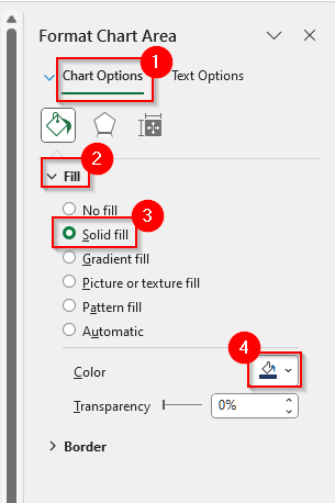
➤ Now, you will see the Format Chart Area pane appear.
➤ In that window, go to the Chart Options, and then select any type of Fill you want.
➤ You will also see a small paint bucket icon. Click on it and choose your preferred background color from the color palette.
➤ Finally, our pivot chart is ready after the customization.
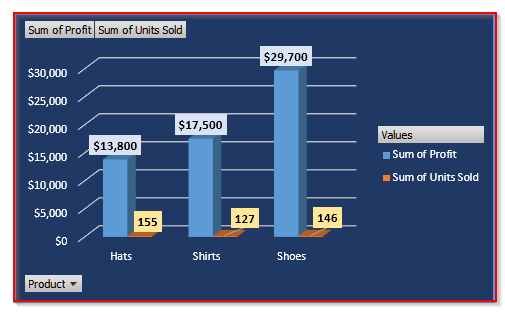
From the chart above, we can see that Shoes generated the most profit while Hats had the lowest profit.
Summary of the Key Differences Between a Pivot Table and a Pivot Chart
| Criteria | Pivot Chart | Pivot Table |
|---|---|---|
| Definition | A table that summarizes and organizes a dataset. | A visual representation of a pivot table, shows the findings graphically. |
| Purpose | To analyze and summarize large datasets in a tabular form. | To visualize patterns, trends, and comparisons from a Pivot Table. |
| Interactivity | Can sort, filter, and drill down into data. | Can filter and interact with the linked pivot table, updates automatically if the table update. |
| Data Display | Shows numbers, totals, averages, or percentages in rows and columns. | Shows the same data as graphs, like bar, column, line, or pie charts. |
| Ease of Interpretation | Requires reading numbers to understand trends. | Easier to interpret trends and comparisons at a glance. |
| Creation | Created from dataset to summarize data. | Created from an existing Pivot Table. |
Frequently Asked Questions
If I Delete My Pivot Table, Will the Pivot Chart Still Exist?
No, it will not. A pivot Chart depends entirely on its underlying Pivot Table for data. If you delete the Pivot Table, the Pivot Chart will also be deleted because it loses its data source. However, you can keep the chart by copying it as a regular chart and then pasting it to another place. You can also use the Move Chart option to a separate sheet, making it independent of the pivot table.
Can I Filter Data in a Pivot Chart?
Yes, you can filter data in pivot charts. However, these charts rely on the filters applied in the underlying pivot table. Regardless, you can use field filters, report filters, or slicers to control which data appears. When you adjust these filters, the pivot chart updates automatically to reflect only the selected data. This makes it easy to focus on specific trends or comparisons visually without changing the original dataset.
If I Filter My Data in a Pivot Table, Will the Pivot Chart Also Update Automatically?
Yes, the chart will update automatically. Pivot charts are directly connected to their underlying pivot table. So if you make any changes, such as applying filters, slicers, or adjusting report fields, those will also automatically reflect in the chart. This ensures that the visual representation always matches the data in the pivot table, making it easy to analyze trends and focus on specific subsets of data.
Wrapping Up
In this article, we learned the differences between a pivot table and a pivot chart by exploring how to create each of them. While a pivot table makes our analysis easier and presents the results in a table, a pivot chart presents the findings of that table graphically. Both are important for making a report, regardless of business or academic purposes. Try to make them and let us know if you have any inquiries or want to share any feedback.