
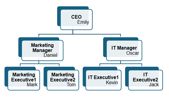
The hierarchy chart is a visual representation of a system where elements are organized according to importance, authority, or relationship levels. It helps users to clearly visualize team structures, decision chains and organizational roles.
Using Excel’s built-in tools and features, we can easily construct a clean and professional-looking hierarchy chart to effectively represent organizational roles or structures.
Follow the steps below to create your very own hierarchy chart using Excel:
➤ Start by highlighting and copying the range of cells that contain the names or roles you want to include in your hierarchy chart.
➤ Then, head to Insert >> SmartArt >> Hierarchy and choose your preferred hierarchy style.
➤ Next, paste the copied data into the text pane next to the hierarchy chart.
➤ Finally, press the Tab key to indent a role and place it beneath the appropriate higher-level position in the hierarchy.
In this article, we will learn two effective methods on how to create a hierarchy in Excel.
Create Hierarchy Automatically Using SmartArt
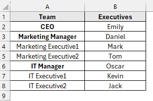
The sample dataset contains information about team roles and executive names in columns A and B, respectively. By using Excel’s SmartArt feature, we will construct a hierarchy and display it in a separate worksheet called “SmartArt”.
SmartArt in Excel is a powerful tool that enables users to quickly create professional diagrams and charts to clearly and effectively represent data relationships.
Steps:
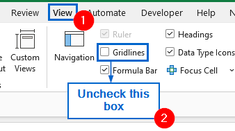
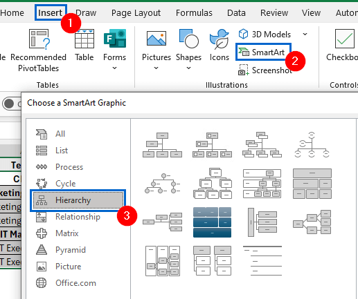
➤ Open the SmartArt worksheet, head to View and uncheck the Gridlines box.
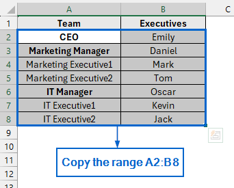
➤ Then select and copy the range of cells A2:B8 by pressing Ctrl + C .
➤ Next, head to Insert from the main menu, navigate to SmartArt >> Hierarchy and select your preferred hierarchy layout.
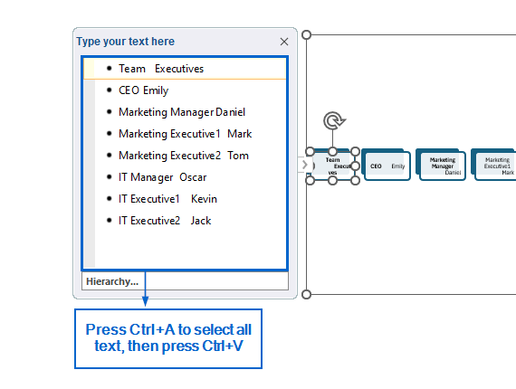
➤ In the hierarchy text pane, press Ctrl + A to highlight all existing text, then hit Ctrl + V to paste the copied data from the table.
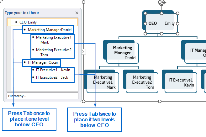
➤ From the text pane, select the position you want to indent beneath the top-level role, then press Tab to move it one level down. Press Tab again to indent it further under the previous position.
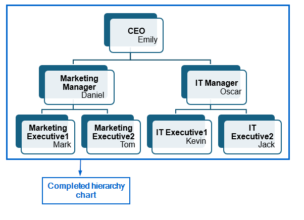
➤ You should now have a clear hierarchy displayed in the worksheet.
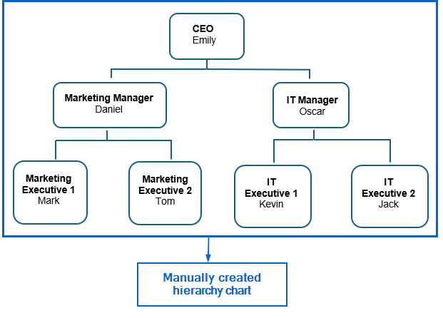
Manually Add Shapes and Arrows to Create Hierarchy
This method involves the use of shapes and arrows to manually construct a hierarchy. While it takes longer to construct a hierarchy using this method, it offers greater flexibility and customization compared to the previous approach.
Working again with the same dataset, this time we will manually insert shapes into the dataset to construct a professional hierarchy. The updated dataset will be stored in a separate “Manual Insert” worksheet.
Steps:
➤ Open the SmartArt worksheet, go to View and disable gridlines by unchecking the Gridlines box.

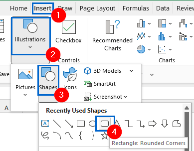
➤ Then navigate to Insert >> Illustrations >> Shape to choose the shape you would like to use for the hierarchy.
Note:
You can customize the appearance of the selected shape by heading to Shape Format and choosing options like fill colour, outline and effects to match your design preferences.
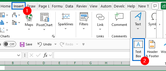
➤ Next, place all the shapes according to your desired layout and head to Insert >> Text Box to add necessary text inside the shapes.
Note:
Instead of manually selecting and inserting a new shape every time, select the existing shape and press Ctrl + D to duplicate it.
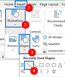
➤ Now, head to Insert >> Illustrations >> Shape >> Line to draw connectors between the shapes and show the flow direction.
Note:
You can also alter the thickness of the line by going to Shape Format >> Shape Outline >> Weight.
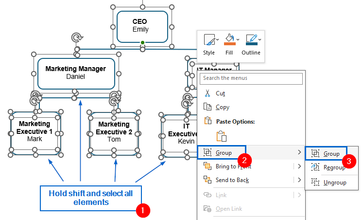
➤ Finally, hold Ctrl and click to select all elements of the hierarchy chart. Then, while pressing Ctrl , right-click any selected item and choose Group >> Group from the context menu to combine the entire chart into a single grouped object.
Note:
By grouping all elements into a single unit, you can manage the entire hierarchy chart more efficiently, as it allows you to move, resize, or format all parts at once.
➤ The required hierarchy should now be visible.
Frequently Asked Questions
Why are the Connector Lines in my Hierarchy Chart Not Straight?
If the connector lines in your hierarchy chart are not straight, it is likely due to misaligned shapes or manual positioning. Hold down the Shift key while dragging the line to avoid this issue.
Which Method is Best for Working With Large Datasets?
If you are dealing with large datasets, the manual shape method would generally be more practical than SmartArt. Manual shapes offer greater flexibility and allow for more precise control over individual elements, making them better suited for detailed or complex data structures.
Concluding Words
Knowing how to create a Hierarchy in Excel is crucial for clearly visualizing roles, responsibilities, or process flow. In this article, we have learned two effective methods of creating a hierarchy in Excel, including using SmartArt and manually inserting shapes. Feel free to try both methods and choose one that best aligns with your needs.