In Google Sheets, data labels are visual indicators on a chart that show the exact values of individual data points or data series. Whether you’re preparing reports or presenting results, data labels help show exact values of each element of the chart on the screen. This is particularly helpful for team, student and professional spreadsheets who wish to improve the clarity and versatility of possible communication.
Here’s how to add data labels to your chart in seconds:
➤ Choose your data range and add a chart using Insert > Chart.
➤ Find the Chart Editor on the right
➤ Navigate to the Customize tab.
➤ Expand the Series section.
➤ Tick the box next to Data labels if you want numbers to appear on the chart.
Once you know where to look, using these data labels in Google Sheets is an efficient and effective method for adding extra context to your charts. In this guide, we’ll explore how to add data labels to a chart and then show you how to customize your data labels to help the overall appearance of your charts. Additionally, we’ll also fix common issues you may face throughout the process.
What Are Data Labels in Google Sheets?
Data labels are the numbers or text on your chart that indicate which data point they belong to. They are labels indicating exactly what each mark represents. In a sales chart, for example, data labels could display the exact amount of sales volume, or for a pie chart, the percentage of each slice. These labels help make the charts more human readable at glance.
Steps to Add Data Labels in Google Sheets
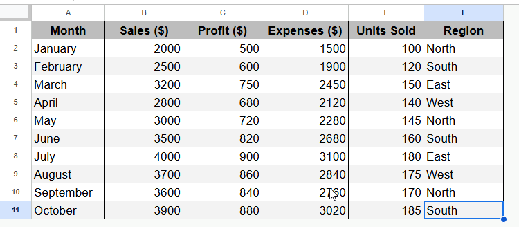
Let’s begin with a simple dataset that follows the monthly sales performance. And remember good data begins with good organization. So, here put your headers in the first row, such as Month, Sales, Profit, Expenses, Unit Sold and Region.
Also, maintain your data in a consistent table, without any blank rows or columns. This will help Google Sheets generate better-looking charts. For instance, in a standard dataset, we have these kinds of records:
Now, we will be using this dataset to create a column chart and show you how to add and customize the data labels. So, first of all, we have to create a chart according to the dataset we have in the spreadsheet. To do so, you need to navigate to the Chart Editor and below are steps to follow.
Step 1: Open the Chart Editor
Using the default Chart Editor feature on Google Sheets is the quickest way to add labels with ease.
Steps:
➤ To begin with, highlight the dataset you want to visualize.
➤ Then navigate to Insert > Chart. A chart will be created on Google Sheets by default.
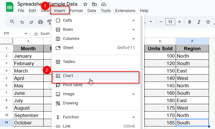
Once you do so, a default chart will appear as the image shows below.
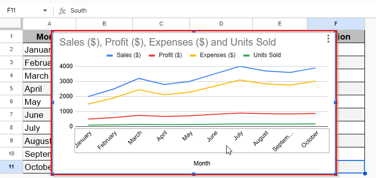
Now, you can simply customize this chart to better fit your data. And by default, Google Sheets usually choose a chart type, but you can also change it later from the Chart Editor. However, let’s dive into the next step.
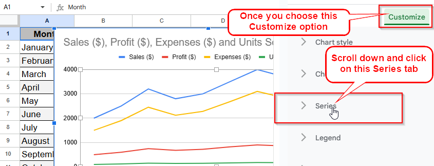
Step 2: Select Series Option from the Customize Tab
➤ Now go to the Chart Editor. If it doesn’t open, double click the chart. Then, in the Chart Editor panel, go to the Customize option.
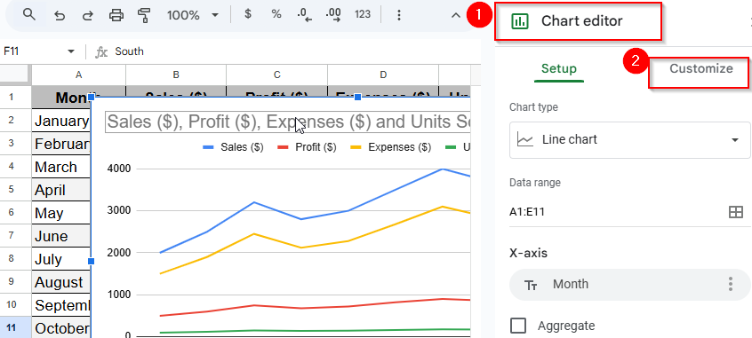
➤ Scroll down and click on the Series section.
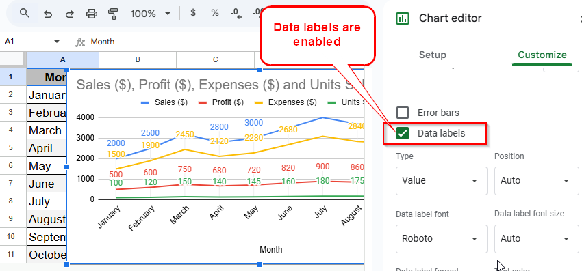
Step 3: Put a Checkmark on the Data Labels Checkbox Option
Now it’s time to turn on the Data Labels to display the actual values on each point of the chart. And here are the steps showing how it goes:
➤ Tap on the Data labels box and enable Data labels.
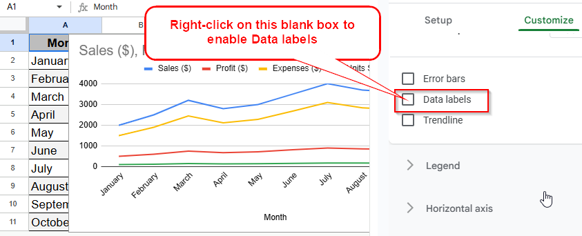
Once you enable this, the labels will appear on your chart next to the data point. And you can customize them according to your requirements.
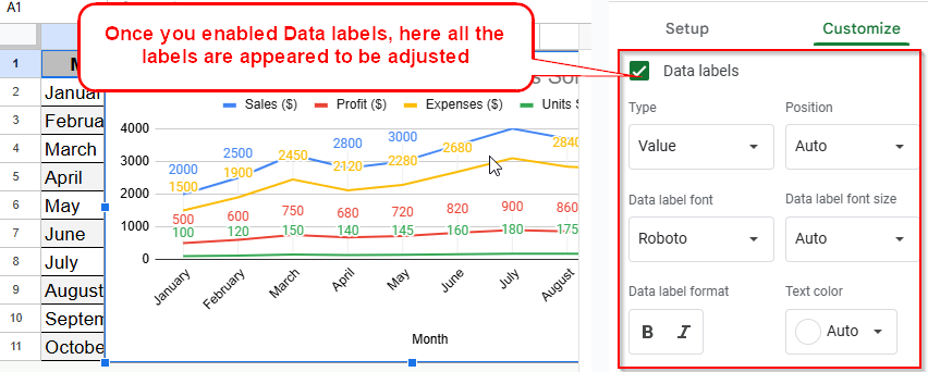
Customizing Data Labels
After enabling Data labels, you can simply customize the labels clearer and more appealing.
➤ Position: Decide where the labels will go: inside, outside, or center.
➤ Font: Make the font size and style as appropriate as possible to ensure a good read.
➤ Color: Choose a different color from what you use for your chart style.
➤ Format: Display targeted information, such as percentages, totals, or custom text.
For instance, in a chart you could make labels show up as bold to highlight different parts.
Charts That Support Data Labels
Data labels are available for most common chart types, such as bar charts, column charts, line charts, pie charts and scatter plots. Please note, not all types of chart can lend themselves to labels. For instance, some specialized and 3D charts might restrict your label choices. And do make sure to always verify your chart type before you insert labels.
Troubleshooting Common Issues
Data Labels Not Showing
There are multiple reasons why data labels may not show. If it happens to you:
➤ Be sure to also have Data labels switched on under the Series section.
➤ Make sure your chart type supports labels.
➤ See if labels are turned off or underneath some other items.
The Labels Misaligned or Overlapping
Adjust the label position for more clarity. Sometimes it helps to switch from inside to outside placement. Also, decrease the font size or trim information if clutters consistently.
Refreshing Data Labels after Data Changes
Labels change automatically as your data changes in Google Sheets. Just update the dataset, and the chart will adjust itself. If not, then go and refresh the chart or reapply label settings.
Frequently Asked Questions
Is It Possible to Apply Data Labels to Various Series?
Yes. You can choose to apply them to all series, or click the drop down in the Series section to customize each one in turn.
Can I use Data Labels on Pie charts?
Definitely you can. Within pie charts, you can choose whether the labels display values or percentages. There you can select your preferred option in Customize > Pie chart > Slice label.
How can I delete data labels afterwards?
Look for Data labels in the Chart Editor and uncheck it under Customize > Series.
Concluding Words
Data labels are a great way to make your charts in Google Sheets more readable and professional. It allows you to transform ordinary pictures into dashboards rich in analytics with just a few clicks. So, without any delay, let’s ensure your data shines, and resolve typical problems quickly with the help of this guide. Always welcome to the comments for further queries.