When you’re working with data in Excel, bar charts are a great way to compare values across different categories. They’re especially useful for showing totals, counts, or any kind of grouped information at a glance. But sometimes, you need to show more than just the individual values. For example, you might want to highlight an overall average, display a target benchmark, or emphasize a trend over time. In these cases, adding a line to your bar chart can provide extra context that makes your data easier to interpret.
In this article, you’ll learn several practical ways to add a line to your Excel bar chart. We’ll cover how to create combo charts, insert trendlines, overlay scatter plots, and draw vertical average lines with step-by-step instructions to help you build more insightful visuals.
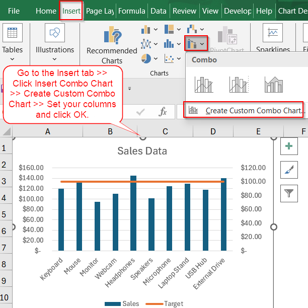
Steps to add a line to a bar chart in Excel:
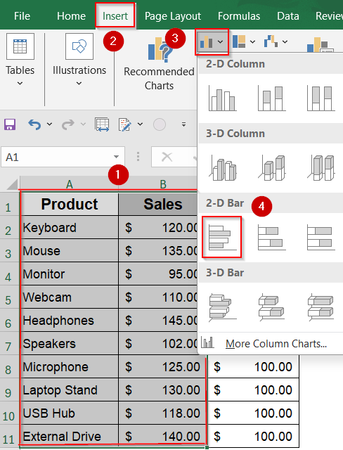
➤ Select your entire dataset, including both the Sales and Target columns.
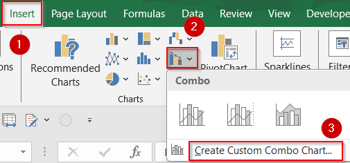
➤ Go to Insert tab >> Select Insert Combo Chart >> Create Custom Combo Chart.
➤ Set the Sales series chart type to Clustered Column.
➤ Set the Target series chart type to Line and check the Secondary Axis box.
➤ Click OK to insert the combo chart.
Add a Line to a Bar Chart Using a Combo Chart
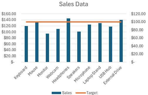
Creating a Combo Chart is one of the easiest and most effective ways to add a line alongside your bar chart in Excel. This method allows you to display the Sales data as bars while plotting the Target values as a line on the same chart. Using our product sales dataset, this approach helps you quickly see how each product’s sales compare to the fixed target, making it easy to identify which products meet or exceed expectations.
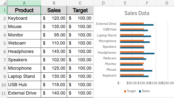
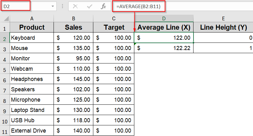
Our sample dataset shows sales figures for 10 different products alongside a fixed sales target. We’ll use these values to create bar charts and add lines that represent benchmarks, trends, and averages to enhance the visualization.
Steps:
➤ Select your entire dataset, including both the Sales and Target columns.
➤ Go to Insert tab >> Select Combo Chart >> Create Custom Combo Chart.
➤ Set the Sales series chart type to Clustered Column.
➤ Set the Target series chart type to Line and check the Secondary Axis box.
➤ Click OK to insert the combo chart.
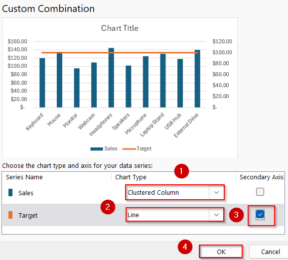
Now, your chart will display bars representing product sales with a line overlay showing the target benchmark, giving you a clear visual comparison.
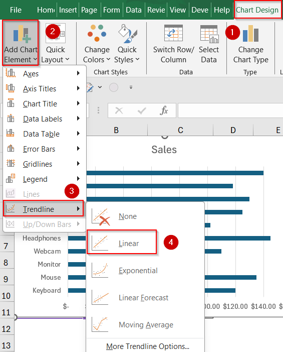
Apply a Trendline to a Bar Chart to Show Data Patterns
A Trendline is useful when you want to highlight a pattern or trend in your data instead of showing a fixed benchmark. By adding a Trendline to your bar chart, you can visually emphasize how sales figures change across different products or over time using our Sales data.
Steps:
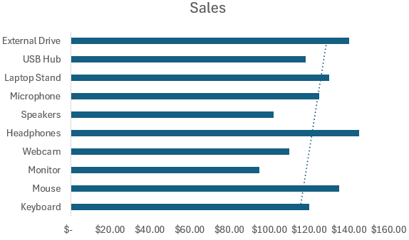
➤ Insert a bar chart using only the Sales column from your dataset by selecting range A1:B11 and going to Insert tab >> Bar Chart.
➤ Click on any bar in the chart to select the entire data series.
➤ Go to Chart Design tab >> Add Chart Element >> Trendline.
➤ Choose the type of trendline you want, such as Linear, Exponential, or Moving Average.
This method effectively shows trends or patterns in your data, making it easier to understand changes across categories.
Insert a Separate Data Series to Add a Line
This method gives you more flexibility by letting you overlay any line such as a benchmark, custom target, or average on top of your bar chart. Using our dataset, you can add the Target values as a separate series and convert it into a line for a clear comparison.
Steps:
➤ Create a bar chart using only the Sales column from your dataset by selecting range A1:B11 and going to Insert tab >> Bar Chart.

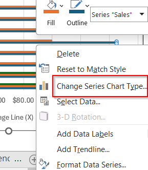
➤ Right-click on the chart and select Select Data.
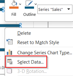
➤ Click Add to insert a new series for the line (e.g., Target).
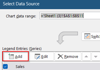
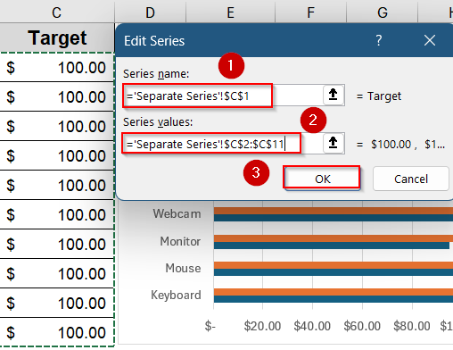
➤ Set the Series Name to “Target” and select the corresponding Target values for the Series Values.
➤ Click OK. You will see additional bars appear representing the new series.
➤ Right-click the new series on the chart and choose Change Series Chart Type.
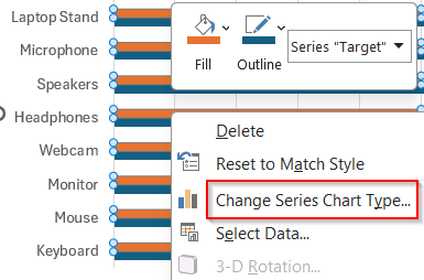
➤ Change the chart type for the Target series to Line or Scatter with Straight Lines.
➤ If necessary, format the line to plot on the secondary axis for better clarity.

Now your chart will display a line neatly layered over the bars, providing an effective visual comparison.
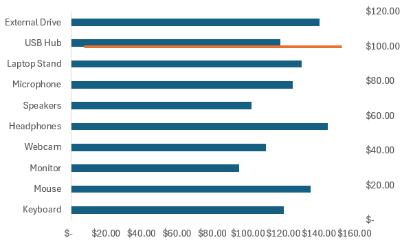
Draw a Vertical Average Line on a Bar Chart
Adding a vertical average line helps emphasize a key reference point across all categories in your bar chart. This makes it easier to compare individual product sales against the overall average. Using our product sales dataset, this method shows how to insert a vertical line at the average sales value, creating a clear visual benchmark that enhances your chart’s ability to highlight performance differences.
Steps:
➤ Calculate the average sales in two adjacent cells using the formula:
=AVERAGE(B2:B11)
➤ Copy that average value into two rows (for example, cells D2 and D3) so the line can be drawn from top to bottom.
➤ In the adjacent cells (E2 and E3), enter 0 and 1 to define the vertical range of the line.
➤ Right-click the bar chart and choose Select Data.
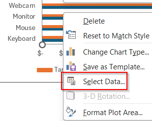
➤ Click Add under Legend Entries.

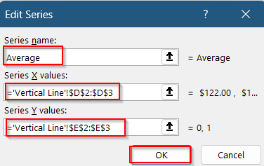
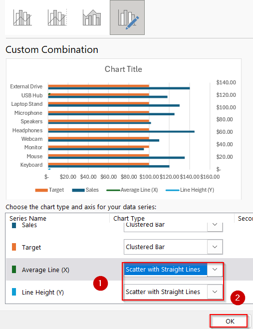
➤ Name the new series “Average” and set the X values to D2:D3 and Y values to E2:E3.
➤ Right-click the new series on the chart and select Change Series Chart Type.
➤ Choose Scatter with Straight Lines for this series.
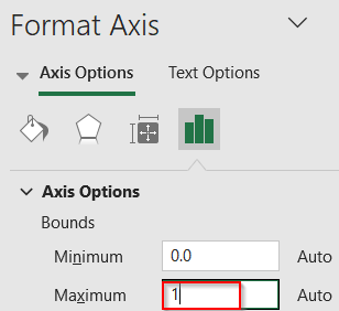
➤ Format the vertical (secondary) axis by setting its Maximum bound to 1.
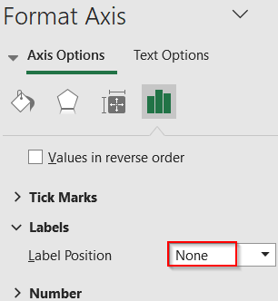
➤ Hide the secondary axis by setting its Label Position to None.
You will now see a vertical line crossing your bar chart at the average sales value, making it easy to compare individual bars against this reference point.

Frequently Asked Questions
Can I add a vertical line instead of a horizontal one?
Yes, you can add a vertical line using the scatter plot method. This technique allows you to place a vertical marker at any specific value, such as an average or target, across your chart.
How do I label each bar or line with values?
To add labels, click on your chart to select it, then click the green “+” icon (Chart Elements). From there, check the “Data Labels” box to show the exact values on each bar or line in your chart.
Can I add more than one line?
Yes, you can add multiple lines by creating additional columns in your dataset. Excel allows you to assign each new column as a separate line series, so you can compare several benchmarks or trends on the same chart.
Can I make the bars vertical instead of horizontal?
Yes. Instead of using a bar chart, choose a Clustered Column Chart to display vertical bars. This changes the orientation while keeping your data visualization clear and easy to interpret with lines added in the same way.
Wrapping Up
In this tutorial, we learned how to add a line to a bar chart in Excel using several flexible methods such as combo charts, trendlines, scatter overlays, and vertical reference lines. Whether you’re showing targets, averages, or trends, these techniques help you build more insightful and professional-looking visualizations. Feel free to download the practice file and share your feedback.