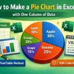
Pie charts are an excellent way to visualize how individual items contribute to a total. They’re commonly used in business reports, academic projects, or budgeting dashboards to display parts of a whole. However, a common issue with basic pie charts in Excel is that they often show only numbers, leaving out the category names (words), which can make the chart harder to understand at a glance. That’s why many users prefer to display words or labels directly on each slice to clarify what each section represents.
In this article, you’ll learn how to make a pie chart in Excel with words, using easy step-by-step instructions. We’ll show you how to create the chart, add category names, and format it to include values, percentages, or both to make your data clear, polished, and presentation-ready.
Steps to make a pie chart in Excel with words:
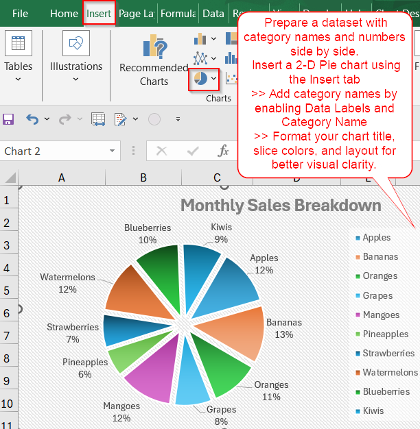
➤ Prepare a dataset with category names and numbers side by side.
➤ Insert a 2-D Pie chart using the Insert tab.
➤ Add category names by enabling Data Labels >> Category Name.
➤ Format your chart title, slice colors, and layout for better visual clarity.
Steps to Create a Pie Chart in Excel with Words
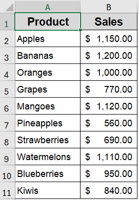
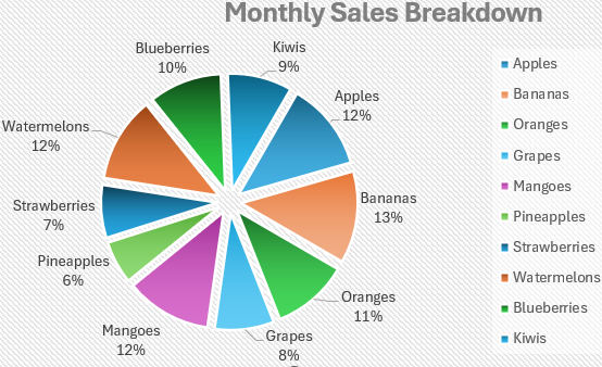
Let’s walk through how to build a clear, labeled pie chart that includes category names. The following dataset includes 10 fruit categories and their corresponding sales values. We’ll use the Product column for the labels (words) and the Sales column for the values in the pie chart.
Step 1: Select Your Dataset in Excel
Before you can create a pie chart with words, you need to set up your data in a way that Excel can interpret easily. Typically, this means having a list of categories alongside corresponding numeric values like types of fruits and their quantities or expense items and their amounts.
Steps:
➤ Enter your data in two columns, for example, Column A for category names (e.g., Product) and Column B for values like Sales.
➤ Select the full data range, such as A1:B11.
This step prepares your base data for the pie chart.
Step 2: Insert a Basic Pie Chart
With your dataset selected, it’s time to insert a pie chart. Excel offers several chart types, but for this tutorial, we’ll stick with a basic 2-D Pie chart that visually breaks down the total into proportional segments.
Steps:
➤ Go to the Insert tab in the ribbon.
➤ In the Charts group, click the Pie Chart icon.
➤ Choose the 2-D Pie chart option.
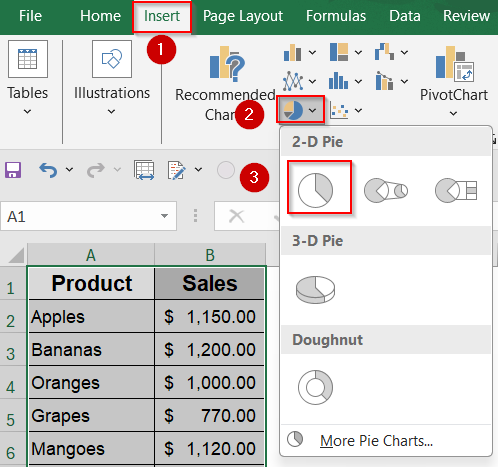
Excel will generate a simple pie chart based on your data.
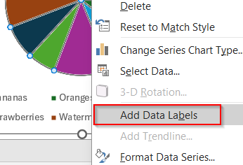
Step 3: Add Words (Category Names) to the Pie Chart
By default, Excel may show only values or percentages on your pie chart. To make your chart more descriptive, you can add the actual words such as category names directly to the slices.
Steps:
➤ Click once on the pie chart to select it.
➤ Then click once more on any slice to select all >> Right-click and choose Add Data Labels.
➤ Right-click again on the labels >> Choose Format Data Labels.
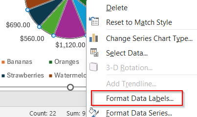
➤ In the Format pane, check the Category Name box. Uncheck the box for Values to keep it more clean.
➤ You can also check Percentage for more context.
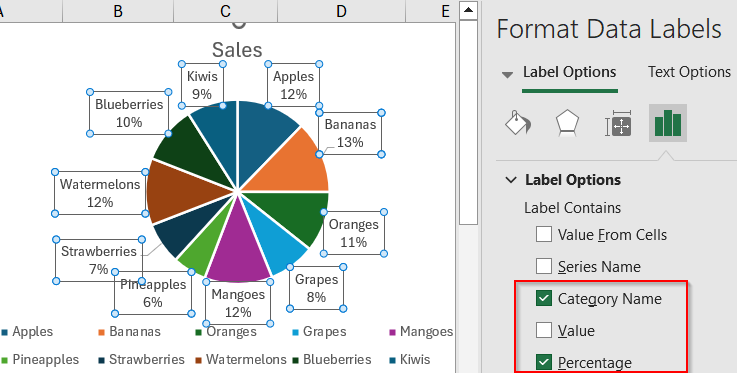
This adds meaningful words to your chart so it’s easier to read and explain.
Step 4: Customize the Chart Appearance
Once your chart is labeled, it’s time to improve its appearance to ensure it communicates your data effectively. Formatting can involve adjusting the title, styling the chart elements, or even adding visual effects to help it stand out.
Steps:
➤ Click on the Legend to a better position from Legend Options or delete it if it’s redundant.
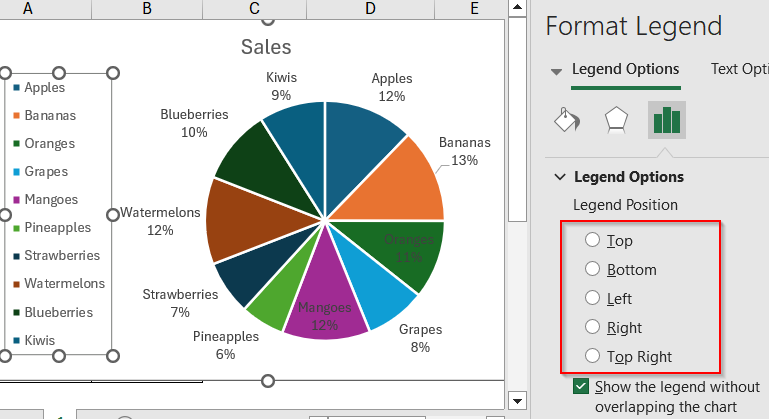
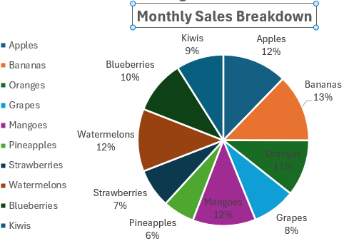
➤ Click on the Chart Title to edit it (e.g., “Monthly Sales Breakdown”).
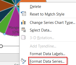
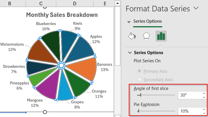
➤ Right-click on any slice >> Format Data Series to adjust colors, borders, or explosion.
➤ Drag the sliders to customise according to your preferences.
➤ Use the Chart Design tab to apply a built-in style or change the color palette using Change Colors located by the side.
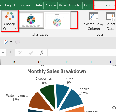
Custom formatting helps your chart stand out and better match your document’s design.
Frequently Asked Questions
What kind of data works best for a pie chart with words?
Pie charts are ideal for data that represents portions of a whole. Use them for limited categories like expense breakdowns, survey results, or product sales where each part contributes to a single total.
Can I display both words and percentages in the chart?
Yes, Excel allows you to display both category names (words) and percentages together on each slice. Simply enable both options in the Format Data Labels pane to make your chart more informative and visually clear.
Why aren’t the category names showing in my chart?
If the words (labels) are missing, you may not have enabled data labels correctly. Double-check that you’ve selected Add Data Labels, and then ensure Category Name is checked in the Format Data Labels pane.
Can I add custom labels or text manually?
Yes. You can insert text boxes directly on the chart for custom annotations or edit the chart title and individual data labels. This is useful for adding context, notes, or highlighting important segments.
Is there a limit to how many words I can show on a pie chart?
Excel doesn’t enforce a strict word or category limit, but overcrowding the chart with too many labels can reduce readability. Try to keep your chart under 6–8 categories to maintain visual clarity and balance.
Wrapping Up
In this tutorial, you learned how to make a pie chart in Excel that includes words, percentages, and other labels to enhance clarity and presentation. From inserting the chart to customizing the data labels using the Format Data Labels pane, each step helps you convert raw figures into a clear and informative visual. Whether you’re preparing a school project or a professional report, adding category names improves both readability and impact. Feel free to download the practice file and share your feedback.