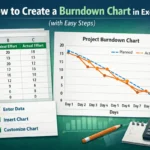
Waterfall charts are an excellent tool for visualizing the step-by-step changes that lead to a final result. Whether you’re tracking revenue growth, budgeting expenses, or analyzing inventory flow, a waterfall chart breaks the total into increments and clearly shows which values pushed the numbers up or dragged them down. It’s especially useful in business and financial presentations to tell a data story at a glance.
In this article, we’ll learn multiple methods to create a waterfall chart using Excel’s built-in feature (available in Excel 2016 or later), and another manual method using stacked columns for earlier versions. Let’s get started.
Steps to create a waterfall chart in Excel:
➤ Select your full dataset including the headers (“Category” and “Value“).
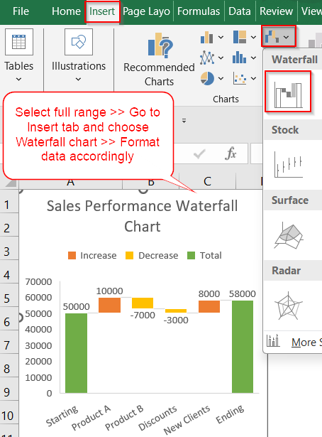
➤ Go to the Insert tab on the ribbon. In the Charts group, click the Insert Waterfall or Stock Chart dropdown.
➤ Choose Waterfall from the list and the chart will appear instantly.
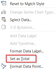
➤ Right-click the “Starting” and “Ending” bars one by one and click Set as Total to anchor these bars.
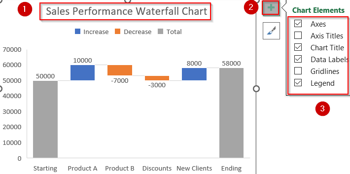
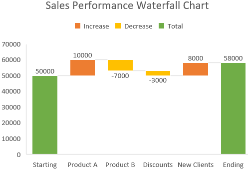
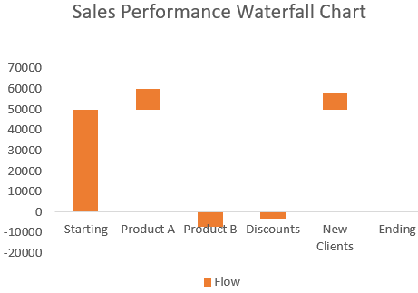
➤ Edit Chart Title to Sales Performance Waterfall Chart and use the Chart Elements (+) icon to add Data Labels, Axis Titles, or Legend. Additionally, uncheck Gridlines for better presentation.
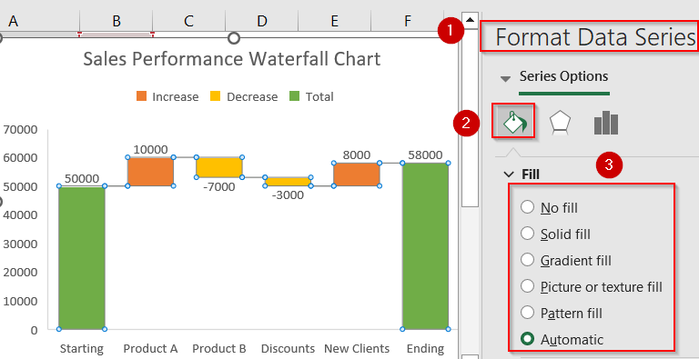
➤ Right-click any bar >> Click Format Data Series >> Customize colors, fills, or borders as needed.
Insert Using Built-in Waterfall Chart Feature (Excel 2016 or Later)
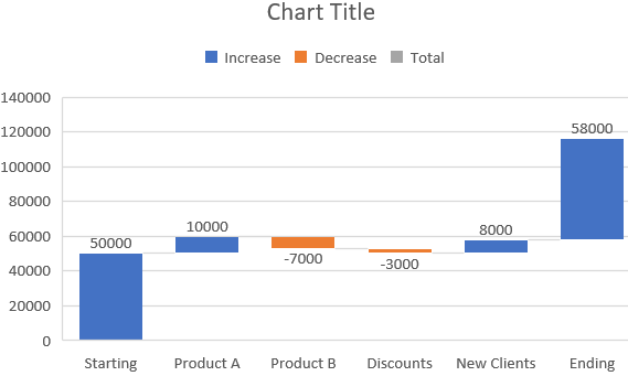
For users operating Excel 2016 or later, the built-in Waterfall Chart feature offers the most efficient and professional method for visualizing sequential changes in values. This functionality is particularly suited for scenarios such as financial performance tracking, cost analysis, or revenue fluctuation across time. Our goal is to have a fully functional waterfall chart where positive values (like Product Revenue) increase the total, negative values (like Fixed Costs) decrease it, and Start and End Balance bars are clearly marked as totals for context.
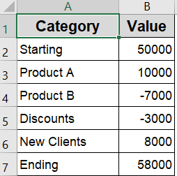
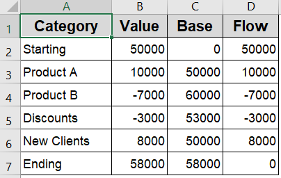
To demonstrate the chart-building process, we’ll use a simple table showing how different items affect the total sales value. It includes starting sales, increases and decreases from various sources, and the final total.
Steps:
➤ Select your full dataset including the headers (“Category” and “Value“).
➤ Go to the Insert tab on the ribbon.
➤ In the Charts group, click the Insert Waterfall or Stock Chart dropdown.
➤ Choose Waterfall from the list.
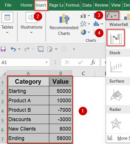
➤ The chart will appear instantly.
➤ Right-click the “Starting” and “Ending” bars one by one.
➤ Click Set as Total to anchor these bars.
➤ Edit Chart Title to Sales Performance Waterfall Chart and use the Chart Elements (+) icon to add Data Labels, Axis Titles, or Legend. Additionally, uncheck Gridlines for better presentation.
➤ Right-click any bar >> Click Format Data Series >> Customize colors, fills, or borders as needed.
This method results in a polished waterfall chart that offers clear insight into how each component in the dataset contributes to the overall outcome.
Manually Create a Waterfall Chart (For Older Excel Versions)
If you are working in Excel 2013 or earlier, the Waterfall chart feature is not available by default. However, you can still replicate the effect by manually building a Stacked Column Chart with the help of extra data columns. Though this method takes more effort, it provides full control over each chart element and works reliably across all versions of Excel.
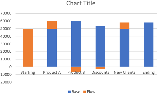
In this approach, you will restructure your dataset by introducing two additional columns Base and Flow to guide the height and positioning of each column. The Base column serves as the starting point for each bar, while the Flow column reflects the actual change in values, whether positive or negative. The chart output will visually demonstrate how each category, from Starting to Ending, contributes to the final balance.
Steps:
➤ Press Ctrl on your keyboard and select the range including Category, Base, and Flow columns (exclude the “Value” column).
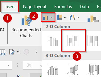
➤ Go to the Insert tab >> Click Insert Column or Bar Chart >> Select Stacked Column.
➤ Your chart will appear, showing stacked bars for Base and Flow.
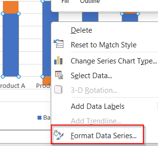
➤ Click on any Base bar to select the entire series.
➤ Right-click the Base series >> Format Data Series.
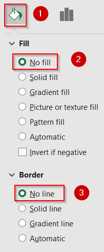
➤ In the Fill & Line tab, set Fill to No Fill and Border to No Line.
➤ This hides the Base bars, leaving the Flow bars floating.
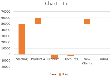
➤ Delete the Base label from the chart legend for a cleaner look.
➤ Customize chart colors, gridlines, or labels as needed.
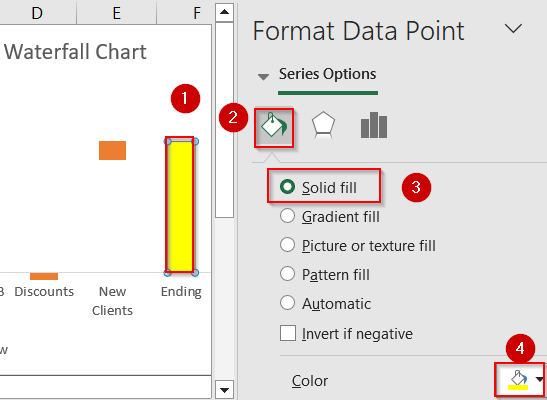
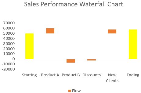
➤ Give the Ending bar a color by selecting it if needed.
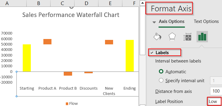
➤ To avoid overlapping with the bars, right-click the horizontal axis and choose Format axis. Then, scroll down to the Labels section and set Label Position to Low.
This method works in all Excel versions and gives full control over chart elements.
Frequently Asked Questions
Can I make a waterfall chart in Excel 2010?
Yes, but Excel 2010 doesn’t have a built-in Waterfall chart. You’ll need to manually create it using stacked column charts and helper columns for base values and spacing to simulate the waterfall effect.
Why does Excel not show the Waterfall option?
If you’re using Excel 2013 or earlier, the Waterfall chart option won’t appear because it was only introduced in Excel 2016. You can still build it manually using a stacked column workaround.
How do I mark totals in a waterfall chart?
To mark totals in a waterfall chart, click the column you want to treat as a total (like “Start” or “End”), right-click, and select “Set as Total.” Excel will then anchor it at the baseline.
What’s the difference between a bar chart and a waterfall chart?
A bar chart shows independent values, while a waterfall chart displays how sequential increases and decreases contribute to a final total, making it better suited for cumulative performance or financial breakdowns.
Wrapping Up
In this tutorial, we learned two effective ways to create a waterfall chart in Excel, one using the built-in feature available from Excel 2016 onward, and another manual method for older versions like Excel 2010 or 2013. Whether you’re visualizing profit flows, budget adjustments, or sales progress, waterfall charts offer a clean and intuitive breakdown of changes. Feel free to download the practice file and share your feedback.