Visualizing data through a normal distribution curve is one of the most common ways to understand how your values are spread around the mean. This bell-shaped curve is widely used in statistics, probability, finance, quality control, and even everyday business analysis to detect patterns, outliers, and probabilities. Whether you’re analyzing customer behavior or evaluating test scores, the normal distribution offers a clear visual cue to determine if your data follows a typical pattern or needs deeper investigation.
In this article, you’ll learn how to plot a normal distribution in Excel using your own dataset. We’ll walk through the exact steps for calculating the mean and standard deviation, then use the NORM.DIST function to generate smooth curve points and turn it into a professional looking chart. Let’s get started.
Steps to plot normal distribution in Excel:
➤ Start by calculating the mean and standard deviation using AVERAGE and STDEV.P functions to define the center and spread of your data.
➤ Then, create a range of evenly spaced X-values (like 60 to 90) to act as points along your horizontal axis.
➤ Next, apply the NORM.DIST formula to calculate the probability density for each X-value using your mean and standard deviation.
➤ After that, plot your X and Y values using a Scatter chart with Smooth Lines from the Insert tab.
➤ Finally, customize the chart by adding a title, labeling the axes, formatting the curve, and adjusting axis ranges for better clarity.
Steps to Plot Normal Distribution in Excel
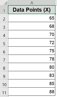
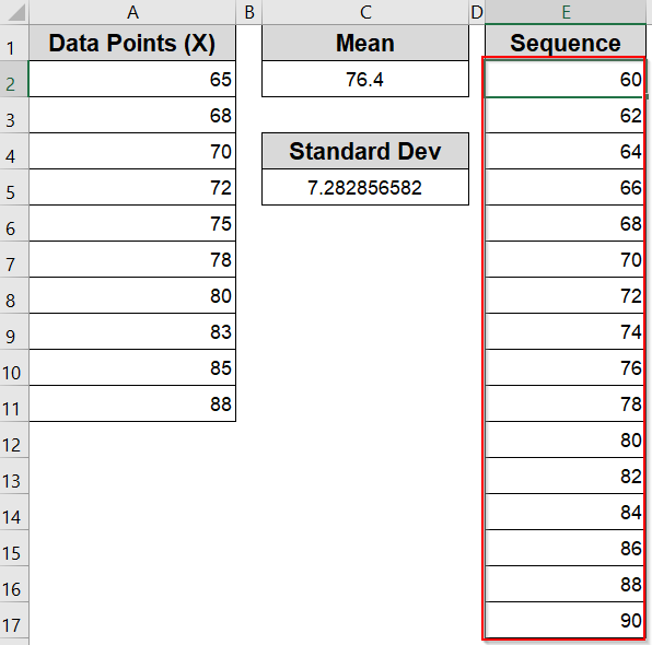
Let’s start with a sample dataset of 10 values representing test scores. We’ll then calculate the mean, standard deviation, and generate the probability density function (PDF) values to plot the curve.
Step 1: Calculate Mean and Standard Deviation
Before plotting a normal distribution, you need to understand the two core statistical properties of your dataset which are the mean (average) and the standard deviation (spread of values). These two metrics form the foundation of the bell curve.
Steps:
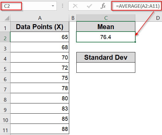
➤ In an empty cell like B2, enter the following formula to calculate the mean:
=AVERAGE(A2:A11)
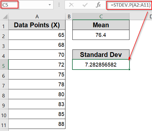
➤ In another cell like C5, calculate the standard deviation with:
=STDEV.P(A2:A11)
Note:
Use STDEV.P function if you’re working with the entire population. If you’re using a sample, switch to the STDEV.S function.
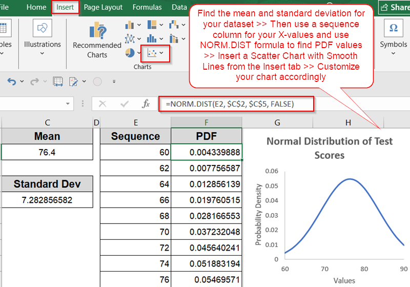
Step 2: Create a Range of X-values for the Curve
To draw a smooth bell curve, you need a set of X-values that span across the likely range of your data. These values represent points along the horizontal axis of the distribution and should cover the area where most data points fall.
Steps:
➤ In a new column (for example, Column E), type in a sequence of values starting slightly below your dataset’s minimum and ending slightly above the maximum such as 60 to 90.
➤ Space the values evenly (e.g., 60, 62, 64, 66…) to ensure the curve appears smooth rather than jagged.
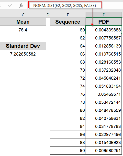
Step 3: Apply the NORM.DIST Formula
Now that you have the X-values and your statistical parameters (mean and standard deviation), it’s time to calculate the normal distribution’s probability density function (PDF). This tells Excel how likely each X-value is, based on a standard normal distribution.
Steps:
➤ In the adjacent column (Column F), enter the formula:
=NORM.DIST(E2, $C$2, $C$5, FALSE)
Be sure to replace $C$2 and $C$5 with the exact cells containing your calculated mean and standard deviation.
➤ Drag this formula down to fill all the rows alongside your X-values in Column E. This generates the Y-values needed to plot the curve.
Step 4: Insert the Normal Distribution Chart
With your X-values and calculated PDF results ready, you can now plot the normal distribution using Excel’s built-in charting tools.
Steps:
➤ Select both the X-values (Column E) and the corresponding Y-values (Column F).
➤ Go to the Insert tab on the ribbon >> Click on Scatter Chart >> Choose Scatter with Smooth Lines.
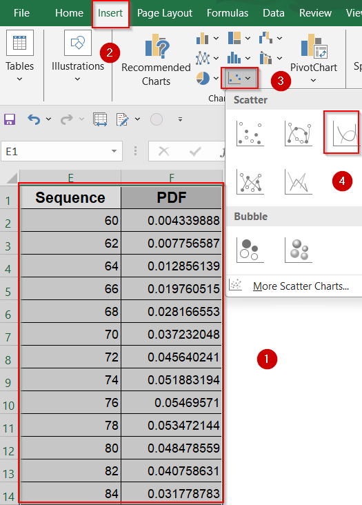
This inserts a professional-looking bell curve based on your dataset.
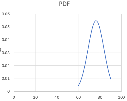
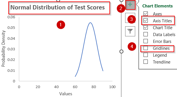
Step 5: Customize the Chart
The final step is to polish your chart to improve its readability and presentation. Excel allows you to tweak labels, titles, and line styles to make the curve easier to interpret or visually appealing for reports.
Steps:
➤ Add a chart title that explains what the chart shows (e.g., “Normal Distribution of Test Scores”).
➤ Go to Chart Elements and uncheck Gridlines for clarity. Add axis labels (X-axis as Values, Y-axis as Probability Density).
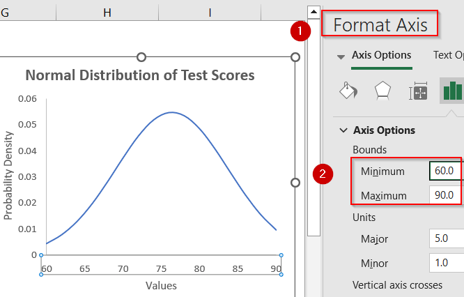
➤ Optionally, set the Minimum and Maximum values from Format Axis pane to avoid extra whitespace.
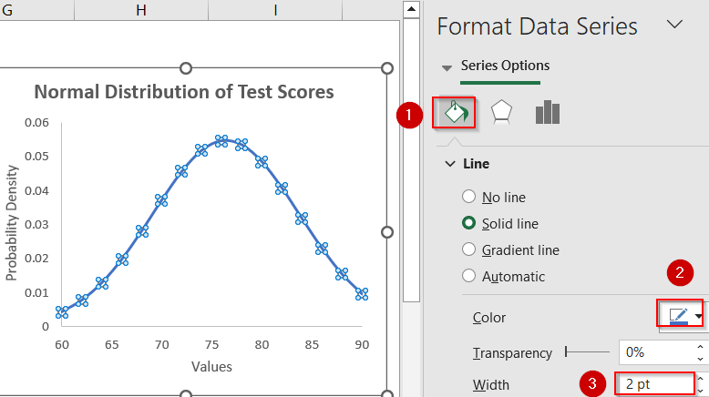
➤ Click the curve to open the Format Data Series sidebar and customise the line’s color or width so the curve stands out clearly against the background.
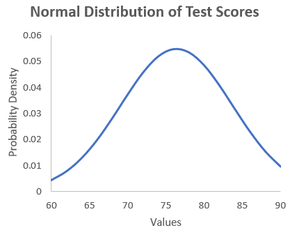
Now we have our desired normal distribution chart inserted into Excel.
Frequently Asked Questions
Can Excel plot a normal distribution curve automatically?
Excel doesn’t have a built-in chart labeled “Normal Distribution.” However, you can easily create one by calculating distribution values with NORM.DIST and plotting them using a smooth line chart manually.
What Excel function is used to create a normal distribution?
The NORM.DIST function is commonly used in Excel to calculate the probability density for a normal distribution. You’ll use it alongside your X-values, mean, and standard deviation to generate the points needed for the curve.
Is it necessary to sort data before creating the normal curve?
Yes, it’s highly recommended to sort your X-values in ascending order. This ensures the plotted curve doesn’t look jagged and instead flows smoothly, creating the expected bell-shaped normal distribution.
How do I calculate mean and standard deviation in Excel?
To get the mean, use the =AVERAGE(range) formula. For standard deviation, use either =STDEV.P(range) for full population data or =STDEV.S(range) if you’re working with a sample set.
Wrapping Up
In this tutorial, we showed how to plot a normal distribution curve in Excel using the NORM.DIST function. By calculating mean, standard deviation, and feeding those into a set of x-values, you can generate a clean, bell-shaped chart perfect for statistical analysis. This method works well across various domains where data distribution insights are needed. Feel free to download the practice file and share your feedback.