Data bars are a feature of Excel’s Conditional Formatting that visually represent values in a range using horizontal bars. The length of each bar resembles the cell’s value relative to others. It makes the comparisons simple without needing to read the numbers closely. When working with percentage values, like in dashboards, progress tracking, or performance reports, data bars improve the readability. We also apply this feature to quickly compare values within a range.
To show data bars with percentage in Excel follow these simple steps-
➤ Select the range of cells that contain percentage values.
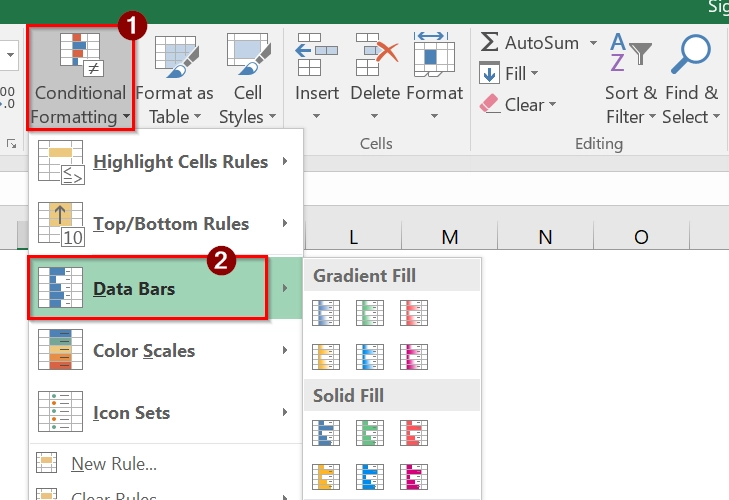
➤ Go to the Home tab and click on Conditional Formatting.
➤ Choose Data Bars from the dropdown, then pick a Gradient Fill or Solid Fill style.
In this article, you will learn how to apply data bars to percentage values, improving visual analysis. We will also explain the REPT function.
Use Conditional Formatting with Data Bars to Show Data Bars with Percentage
Conditional Formatting with Data Bars is a built-in Excel feature that visually represents values using horizontal bars within cells. This is good when we want to show relative percentages across a dataset.
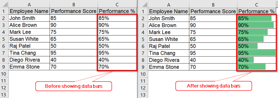
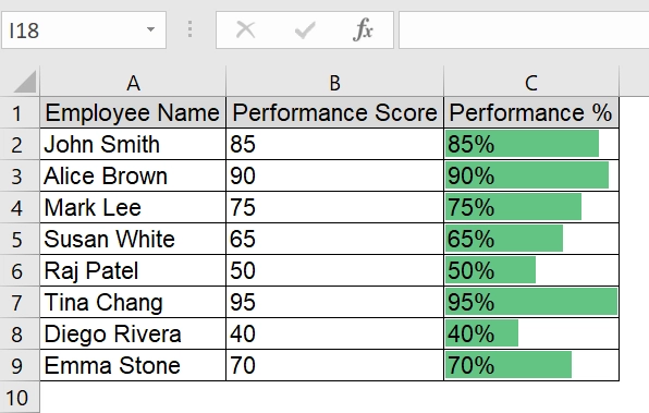
We have a table that represents employee performance scores and represents their percentage visually using Excel’s Data Bars feature. We will apply Conditional Formatting to the “Performance %” column to make it visually intuitive.
Steps:
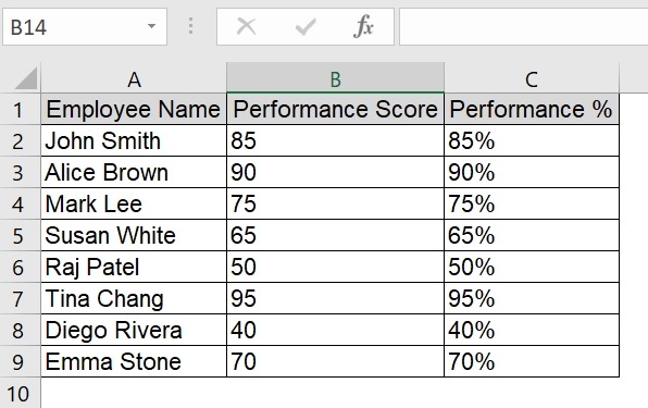
➤ Open the Excel file containing the dataset. We have taken a table containing Employee Name in Column A, Performance Score in Column B, and Performance % in column C. If you don’t have the column with percentage, calculate it using a formula such as =B2/100 to take percentage in Column C.
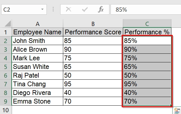
➤ Select the range of cells containing percentages (e.g., C2:C11). Make sure the values are in percentage format.
➤ Go to the Home tab in the Excel Ribbon.

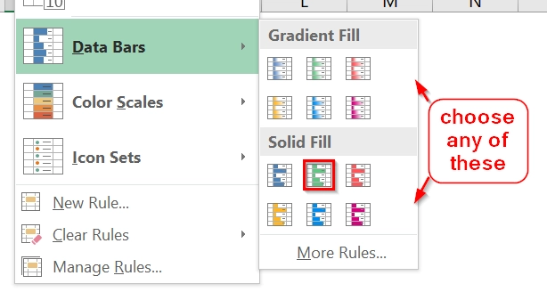
➤ Click Conditional Formatting, then hover over Data Bars.
➤ Select either a Gradient Fill or Solid Fill. Choose a color that suits your presentation. Solid Fill is clearer for presentations.
➤ You will now see visual data bars representing each employee’s performance percentage.
Note:
Make sure that the percentage values are correctly formatted. If values show as decimals (e.g., 0.85), convert them to percentages using Format Cells.
Applying REPT Function to Show Data Bars with Percentage
We use the REPT (repeat) function in Excel to simulate data bars using text characters such as block symbols (█). This method is good when we want to visualize data bars in plain text or when Excel’s built-in conditional formatting is not an option. It is the best for percentage-based datasets, such as performance metrics, survey results, or progress tracking.
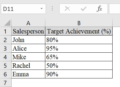
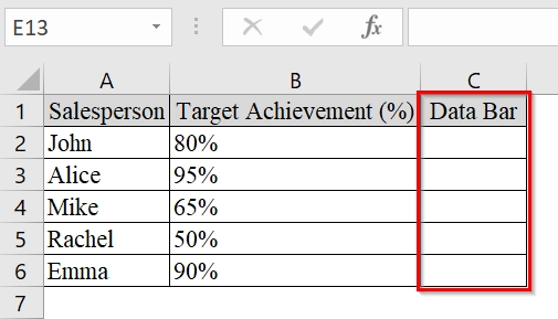
We have a dataset that contains a sales team’s performance against their sales targets. In the table, we have the “Target Achievement (%)” column that shows the percentage each salesperson achieved. We will visually represent this Data Bar using the REPT function in Excel to mimic a data bar effect with text.
Steps:
➤ Create a table in Excel with at least two columns: one for names and one for percentage values.
➤ In Column C, add a header called “Data Bar”. This column will be used to generate the text-based bars using a formula.
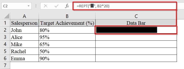
➤ Click on cell C2 and enter the formula: =REPT(“█”, B2*20)
➥ B2*20 converts the percentage into a whole number (e.g., 0.80 × 20 = 16 blocks).
➥ You can adjust the multiplier (20 in this case) to control bar length.
If you are new about this black block “█” character you can follow these steps to insert in the formula-
- Click into the Formula bar or cell.
- Hold the Alt key.
- On the numeric keypad, type: 219
- Release Alt.
However you can also use other characters or symbols like “|” or “■”.
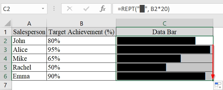
➤ Drag the formula down Column C to apply it to all rows. Each row will now have a bar that reflects the corresponding percentage.
Note:
➥ This method works best when used in dashboards, printable sheets, or limited-feature environments like CSV or plain text exports.
➥ The REPT function only creates a text representation, no color or real bar visualization like Excel’s conditional formatting.
Showing Data Bar with Negative Percentage Value
In this method, we will show how to visualize both positive and negative percentages in Excel using data bars. This is good when we work with datasets like profit/loss reports, growth rates, or performance metrics that fluctuate above and below zero. Excel can visually highlight trends, where bars extend right for positive values and left for negative.
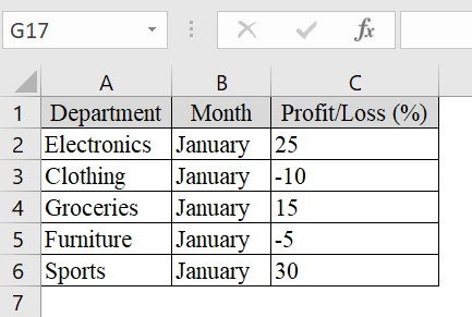
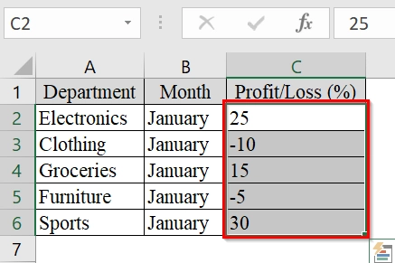
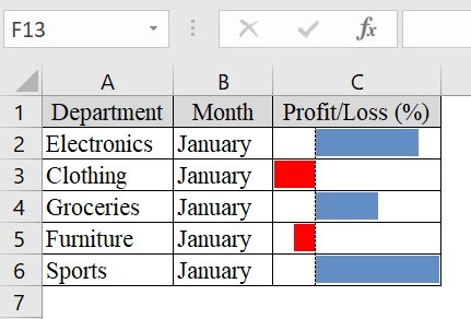
We have an Excel dataset that contains the monthly profit or loss (in percentage) of various departments in a small retail store. We will visualize which departments are doing well and which are underperforming using data bars.
Steps:
➤ We have taken a dataset containing list categories (e.g., Departments) in Column A,list months in Column B,, and input percentage values (positive and negative) in Column C.
➤ Select the range of percentage values (e.g., C2:C6).
➤ Go to the Home tab.
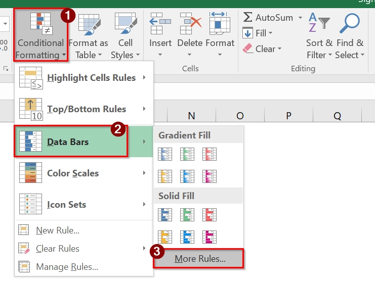
➤ Click on Conditional Formatting → Choose Data Bars → Click on More Rules at the bottom of the dropdown.
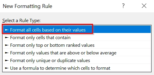
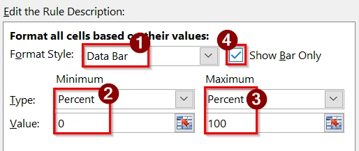
➤ In the New Formatting Rule dialog box, choose “Format all cells based on their values”.
➤ Now select Data Bar as format style. For Minimum and Maximum, choose Number and set manually if needed (e.g., Min = 0, Max = 100 for percentages). Lastly, check the option Show Bar Only (if you don’t want to display the actual number).
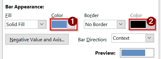
➤ In Bar Appearance, pick colors : One for positive values and other for negative values (Excel allows this in newer versions)
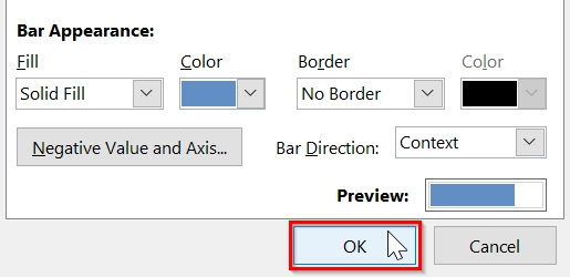
➤ Click OK to apply the formatting.
➤ Your selected cells now show data bars extending right (positive) and left (negative) depending on the value.
Note:
➥ Negative values will show bars to the left of the cell center; positive ones go to the right.
➥ You can still show percentage numbers by unchecking “Show Bar Only” if needed.
Frequently Asked Questions
Can I customize the colors of the data bars?
Yes, you can choose different colors or even create a custom fill style in the Conditional Formatting options.
Will Excel treat the percentages as numbers when using data bars?
Yes, Excel recognizes percentage values as numbers between 0 and 1 and adjusts the bar lengths accordingly.
Can I hide the actual number and only show the data bar?
Yes. Under “More Rules” in the Data Bars menu, uncheck “Show Bar Only” to hide the numerical value.
Do data bars update automatically if values change?
Yes. They are dynamic and will adjust based on changes to the underlying data.
Concluding Words
Using Conditional Formatting with Data Bars is a common yet efficient way to represent percentage values visually in Excel. REPT Function for text-based Bars is good to visualize data bars in plain text or when Excel’s built-in conditional formatting is not an option.