A stacked column chart allows for the comparison of components of a whole across different categories. Instead of showing separate bars, it stacks the values on top of each other, making it easy to see both the total and the contribution of each subcategory.
This makes it perfect for breaking down sales by product and region, survey results by demographic, or budget allocations by department. In Excel, you can create 2-D or 3-D standard/100% stacked column charts.
➤ Click and drag to highlight the cells containing your data including the headers.
➤ From your top ribbon, go to the Insert tab and click on the Insert Column or Bar Chart icon in the Charts group.
➤ Select the Stacked Column chart icon (it’s the second icon in the 2-D Column section) from the dropdown menu. Excel will instantly generate a stacked column chart on your worksheet. You can customize it using the Chart Design tab.
This article covers how to create different types of stacked column charts including 2-D and 3-D standard stacked column charts and 2-D and 3-D 100% stacked column charts.
Creating a 2-D Standard Stacked Column Chart
Before you start, it’s essential to arrange your dataset following these basic rules for a stacked column chart data layout:
- Categories (X-axis) → Put in the first column (e.g., Quarters, Years, Products).
- Series (the stacked parts) → Put in the next columns (e.g., Salespeople, Regions, Departments).
- Each row → one category.
- Each column (after the first) → one part of the stack.
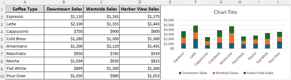
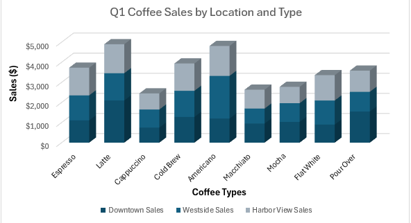
In our sample dataset, we have sales data for a coffee shop with 3 locations in 3 columns. We want to visualize the sales of different coffee types per location for the first quarter. So, we put the coffee types in the first column.
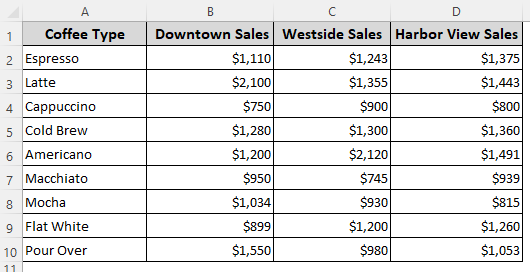
Within the chart, each column’s total height will represent the total sales for a location. The colored segments within each column will show how much each coffee type contributed to that location’s total. For this, follow these steps:
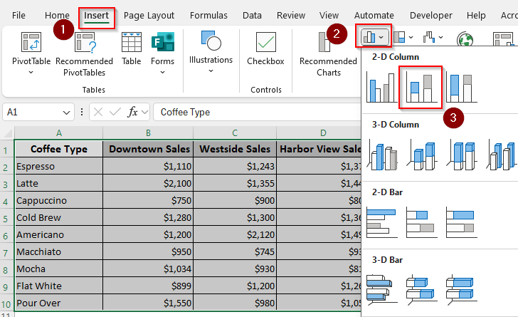
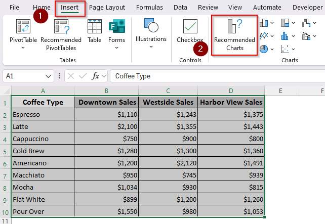
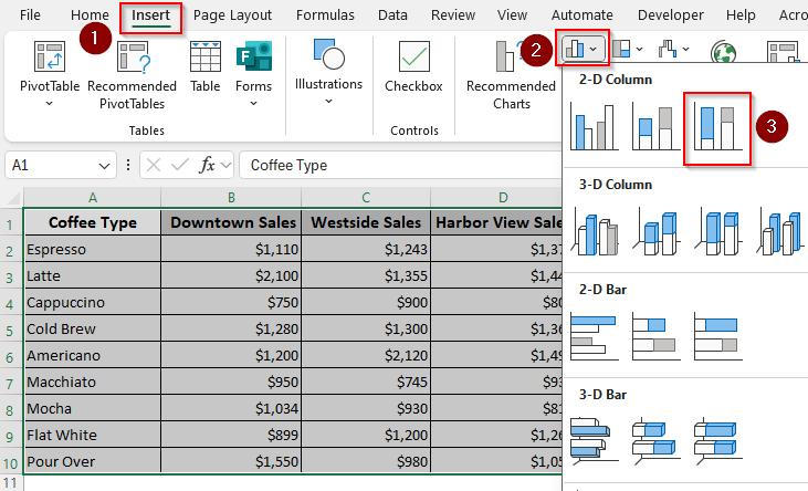
➤ Select your data range with the headers and go to the Insert tab.
➤ For Excel 365, you can click on the Recommended Charts in the Charts group to get a list of chart types to visualize your data.
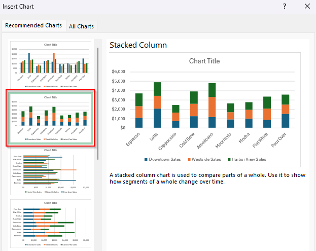
➤ Choose the Stacked Column chart from the given options.
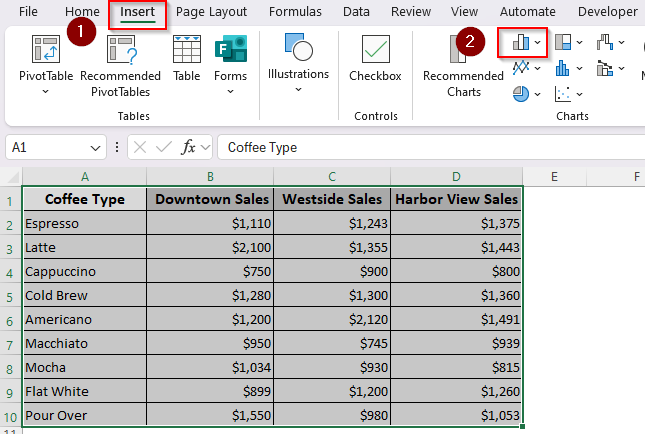
➤ Or, go to the Charts group and click on the Insert Column or Bar Chart icon.
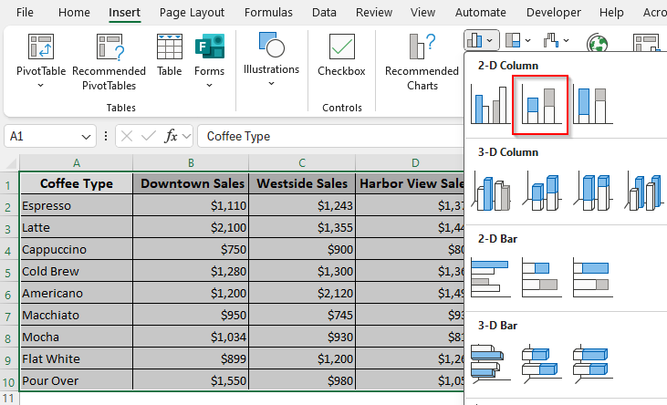
➤ From the options given under 2-D Column, select Stacked Column (it’s the second icon).
➤ Now, Excel will add a chart to your worksheet.
➤ To customize your chart, consider the following options:
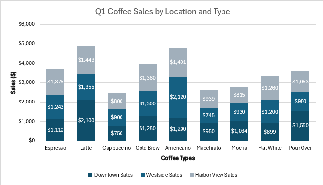
- Chart Title: Click on Chart Title to edit it. We added the title Q1 Coffee Sales by Location and Type.
- Axis Titles: Add them under the Add Chart Element button in the Chart Design To label our axes, we entered Coffee Types for the horizontal axis and Sales ($) for the vertical axis.
- Data Labels: For showing the exact value of each segment, click on the chart, then click the + sign next to it, and check the Data Labels
- Color and Size: Change the color scheme by clicking on the chart, going to the Chart Design tab, and selecting Change Colors.
Building a 2-D 100% Stacked Column Chart
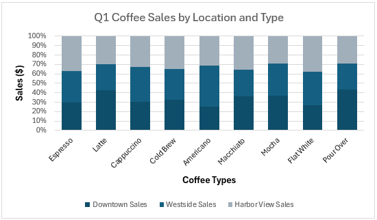
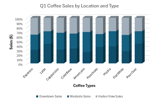
A 100% stacked column chart shows the percentage contribution of each component to the whole. Instead of comparing absolute totals, it focuses exclusively on the percentage distribution of the sub-categories.
This is useful when comparing relative performance (e.g., which product contributed the most in percentage terms). Here’s how to create one:
➤ Highlight your data range and click on the Insert tab >> Insert Column or Bar Chart icon.
➤ From the 2-D Column group, choose 100% Stacked Column (the third icon).
➤ As Excel adds a 100% stacked column, customize it according to your requirements. In our chart, you’ll see that while Downtown has the highest absolute sales, the 100% chart reveals that Americano makes up a larger relative portion of Westside‘s sales.
Adding a 3-D Standard Stacked Column Chart in a Worksheet
A 3-D chart adds a three-dimensional effect to the standard stacked column chart. Below are the steps to create one:
➤ Select cells containing the data and open the Insert tab >> Insert Column or Bar Chart icon.
➤ Choose the Stacked Column option ( the second icon) from the 3-D Column group.
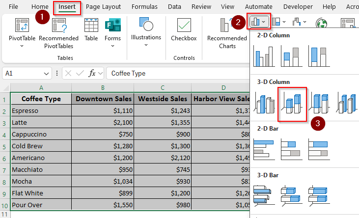
➤ Once the chart is created, customize it as needed.
Generating a 3-D 100% Stacked Column Chart in a Worksheet
To add a 3-D perspective to a regular 100% stacked column chart, follow the steps given below:
➤ Click and drag to choose your data range. Go to the Insert tab >> Insert Column or Bar Chart icon.
➤ Under the 3-D Column options, choose the 100% Stacked Column icon (the third icon).
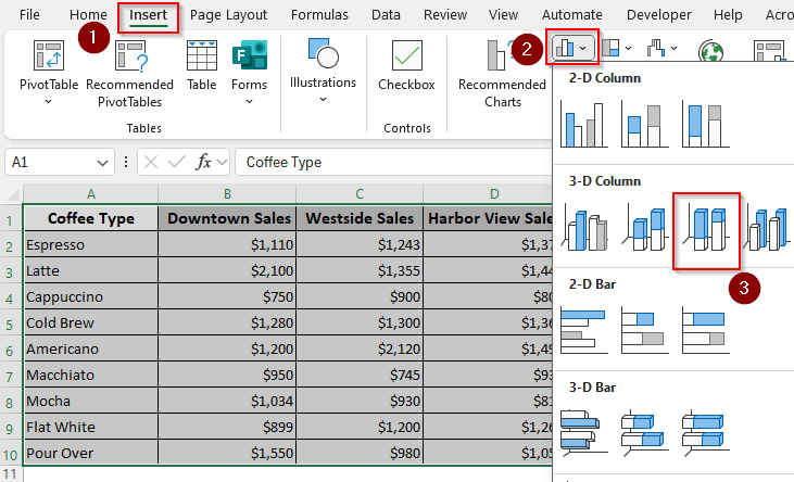
➤ Now, Excel will add a 3-D chart that you can customize.
Frequently Asked Questions
How to make a stacked column chart in Excel wider?
Right-click on any column in the chart and choose Format Data Series. In the pane, adjust the Gap Width (default is usually 150%). Reducing the gap width (e.g., 50%) makes the columns wider; increasing it makes them thinner.
How to create a stacked chart in Excel with totals on top?
Excel does not automatically add totals, but you can do it by manually adding labels. First, calculate totals in a separate column using the SUM function (e.g., =SUM(A2:D2)). Add a new line chart series for the Total column.
Once a thin series is added on top of your stacked columns, format the line to have No Line (right-click the line >> Format Data Series >> Line >> No Line) so only the labels show above each stacked column.
How to create a stacked combo chart in Excel?
A stacked combo chart combines a stacked column chart with another chart type (like a line). To create one, first, insert a stacked column chart using your dataset. Select the chart, go to Chart Design, and click on Change Chart Type. In the dialog box, choose Combo. Pick Stacked Column for your main series, and choose Line (or another type) for the secondary series. Enable Secondary Axis if the scales differ a lot.
Concluding Words
Depending on your need, you can choose a standard stacked (absolute values), 100% stacked (percentages), or 3-D stacked (visual appeal) charts. However, it’s better to avoid 3-D charts for precise data analysis. The 3-D perspective can distort the perception of the values of the segments, especially those at the back, making accurate comparison difficult.