Excel Charts
How to Create a Dynamic Range Chart in Excel (3 Simple Ways)
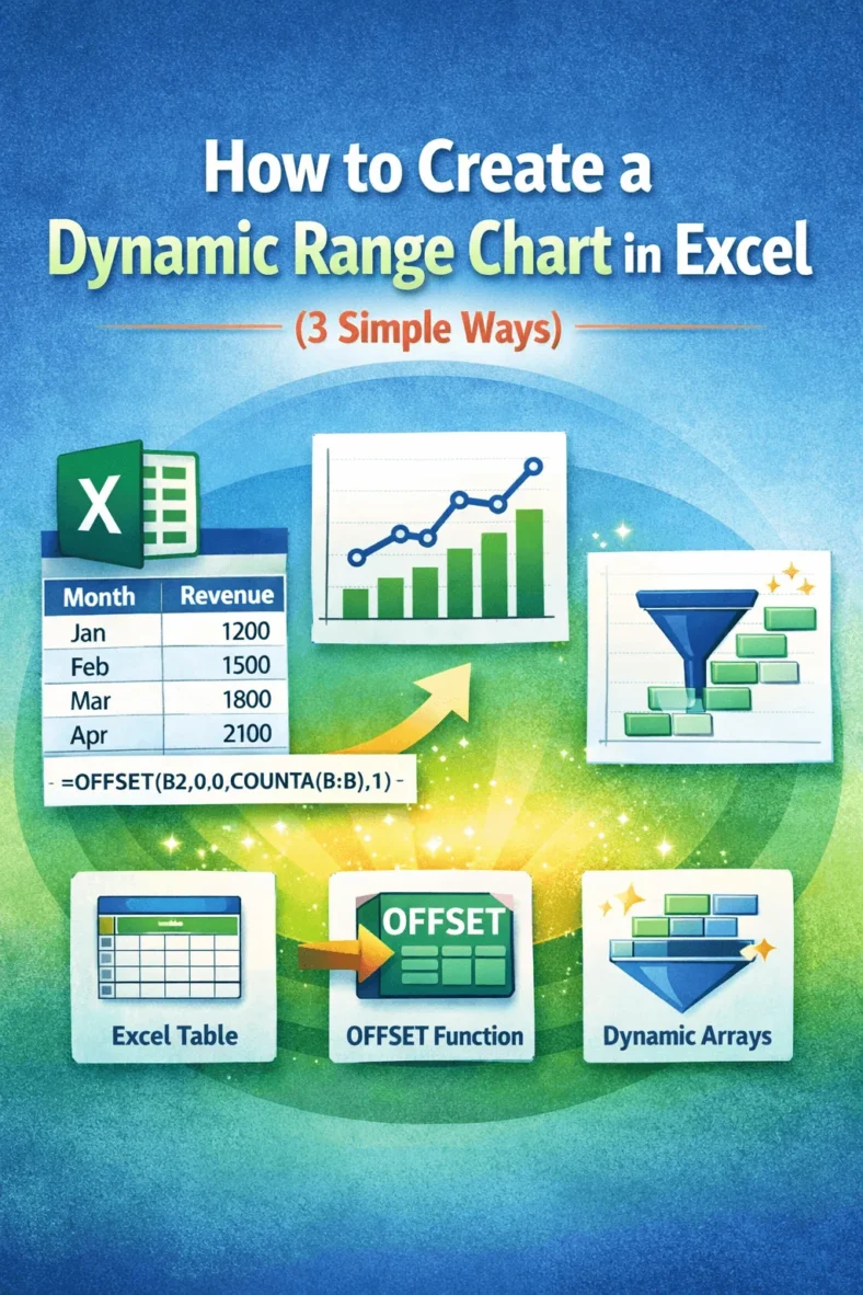
Charts are most useful when they reflect real-time changes in your data but static charts don’t update automatically when you add new entries. That’s where dynamic range charts come in.