Excel Charts
[Fixed] Histogram Bin Range Not Working in Excel
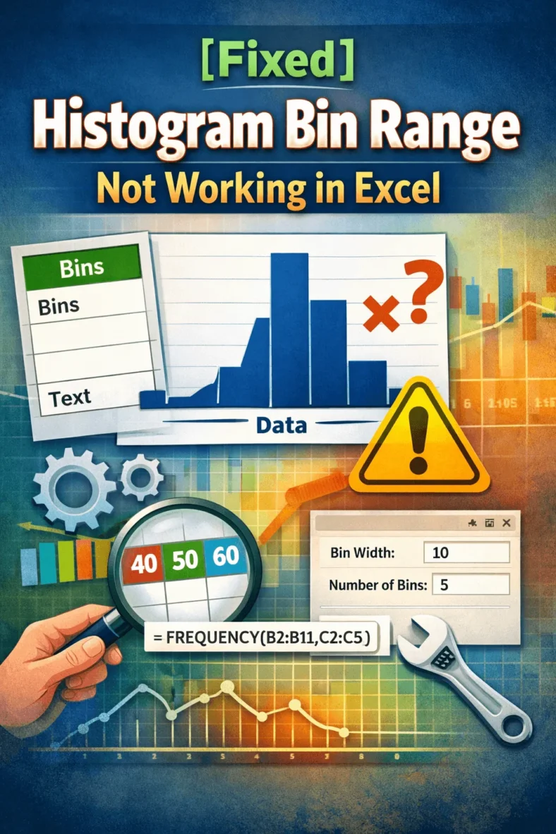
Histogram charts in Excel offer a great way to visualize how data is distributed across defined ranges or “Bins”. But sometimes, your bin range might not work as expected. Excel

Histogram charts in Excel offer a great way to visualize how data is distributed across defined ranges or “Bins”. But sometimes, your bin range might not work as expected. Excel
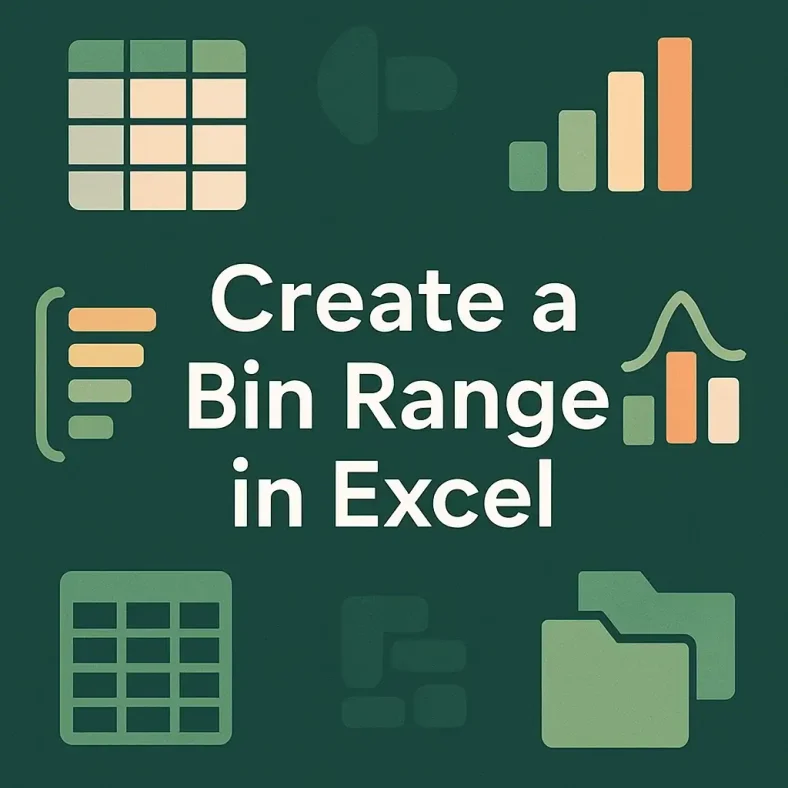
Creating a bin range in Excel helps you group continuous numeric data into intervals, making it easier to interpret trends, build histograms, or summarize large datasets. Whether you’re analyzing test
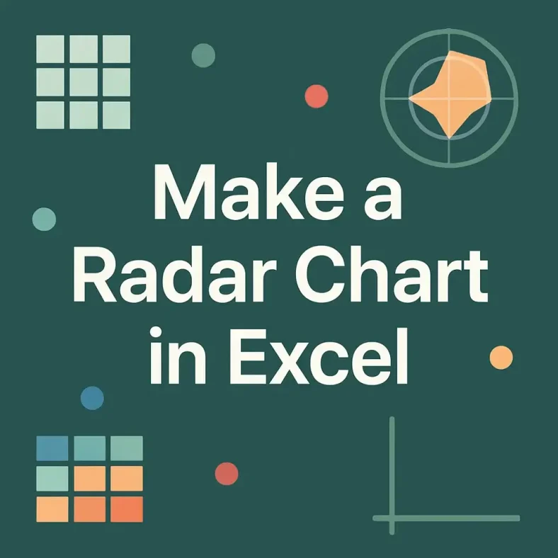
Radar charts, also called spider or web charts, are ideal for comparing multiple variables across different categories. They display data points radiating out from a central axis and connect them
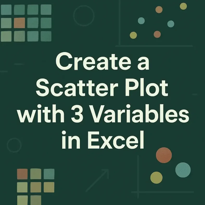
Scatter plots are commonly used to visualize the relationship between two numeric variables. When a third variable needs to be included, Excel offers a practical solution through the Bubble Chart.
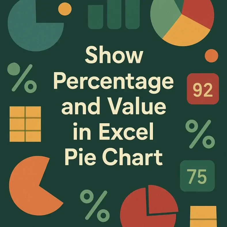
Pie charts are ideal for showing how individual categories contribute to a total, especially when visualizing survey results, spending breakdowns, or market share. But just showing percentages or just showing
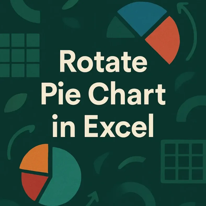
Pie charts are designed to show how parts of a dataset contribute to the whole. But sometimes, the default positioning of slices might make it hard to emphasize the most
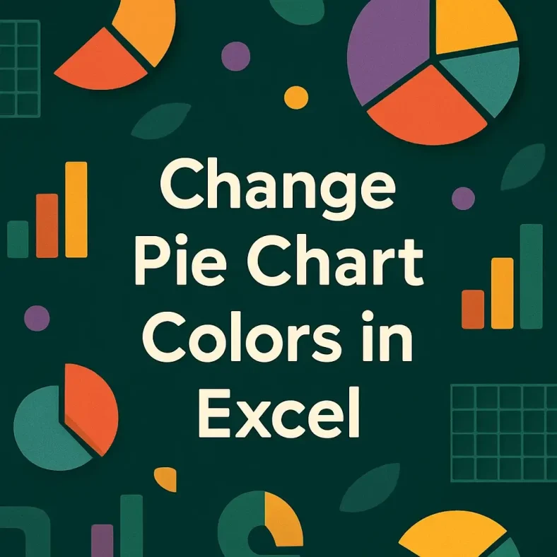
Changing the colors of your pie chart in Excel is a simple way to improve visual clarity and align the design with your presentation or brand. Whether you want to
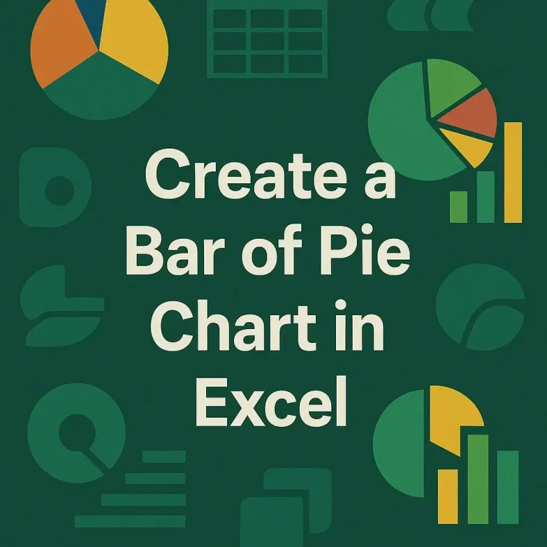
Pie charts are great for showing how individual parts contribute to a whole, but they can quickly become cluttered when too many small categories are involved. When the chart is
Pie charts are an excellent way to visualize how individual items contribute to a total. They’re commonly used in business reports, academic projects, or budgeting dashboards to display parts of