Excel Pro Tips
How to Create a Matrix in Excel (5 Different Examples)
A matrix in Excel is a structured arrangement of values in rows and columns which is similar to a table and often used for comparing data points, analyzing relationships, or

A matrix in Excel is a structured arrangement of values in rows and columns which is similar to a table and often used for comparing data points, analyzing relationships, or
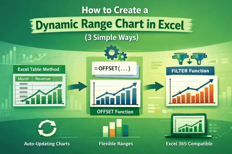
Charts are most useful when they reflect real-time changes in your data but static charts don’t update automatically when you add new entries. That’s where dynamic range charts come in.
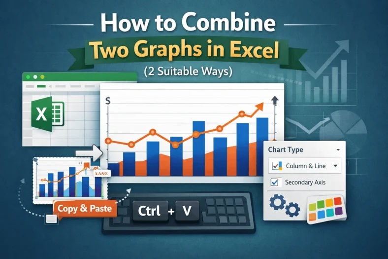
Combining two graphs in Excel lets you compare different data series within a single visual which is perfect for presentations, dashboards, or trend analysis. Whether you’re working with two different
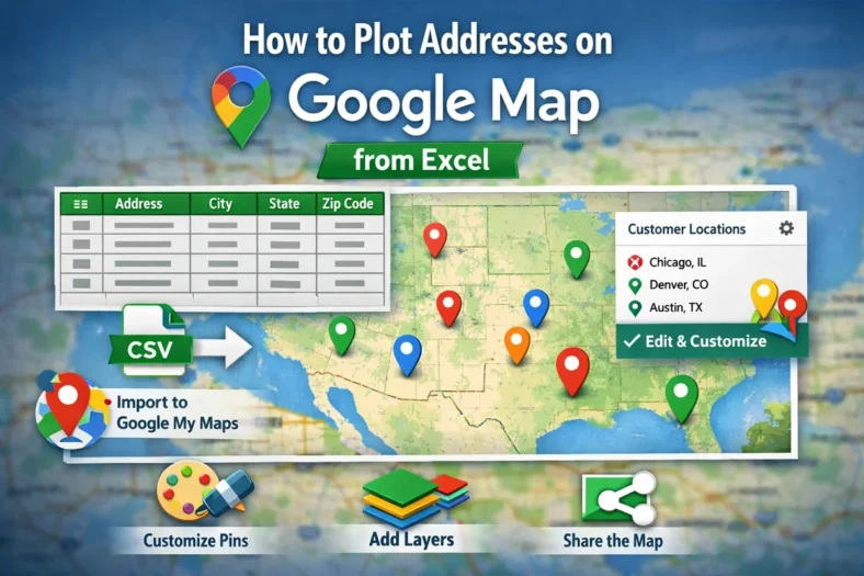
Whether you’re tracking customer locations, delivery routes, or real estate listings, plotting addresses from Excel onto Google Maps can turn your spreadsheet data into an interactive, visual experience. Manually entering
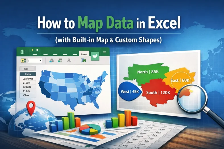
Mapping data in Excel lets you turn raw geographic information into excellent visuals that are easy to interpret. Whether you’re tracking regional sales, population by state, or user distribution across
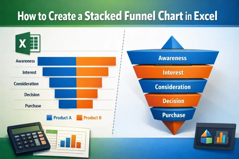
A stacked funnel chart is an excellent visual for tracking data through stages like marketing pipelines, sales funnels, or user journeys. Unlike the default funnel chart in Excel, which only
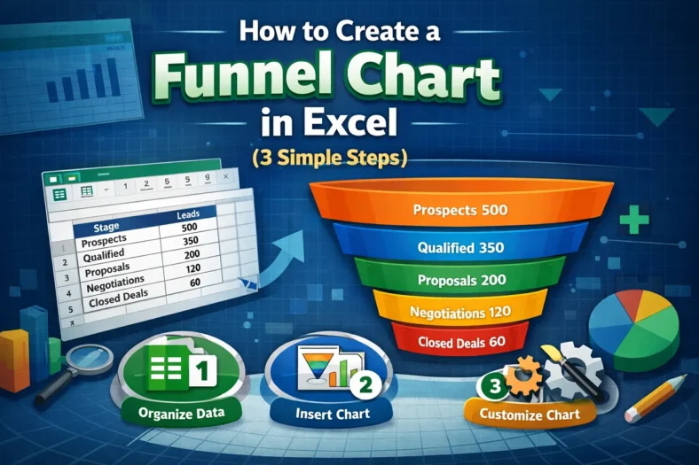
Funnel charts are an effective way to visualize data that flows through stages, such as sales pipelines, lead conversions, or recruitment processes. Each stage is represented as a horizontal bar,
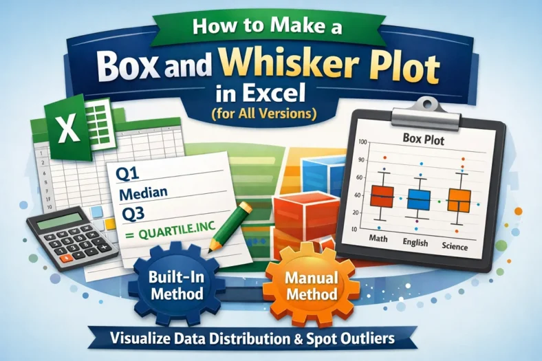
Box and Whisker plots, also called box plots, are excellent tools to visualize the distribution of data. They highlight key statistics like median, quartiles, and outliers, making them perfect for
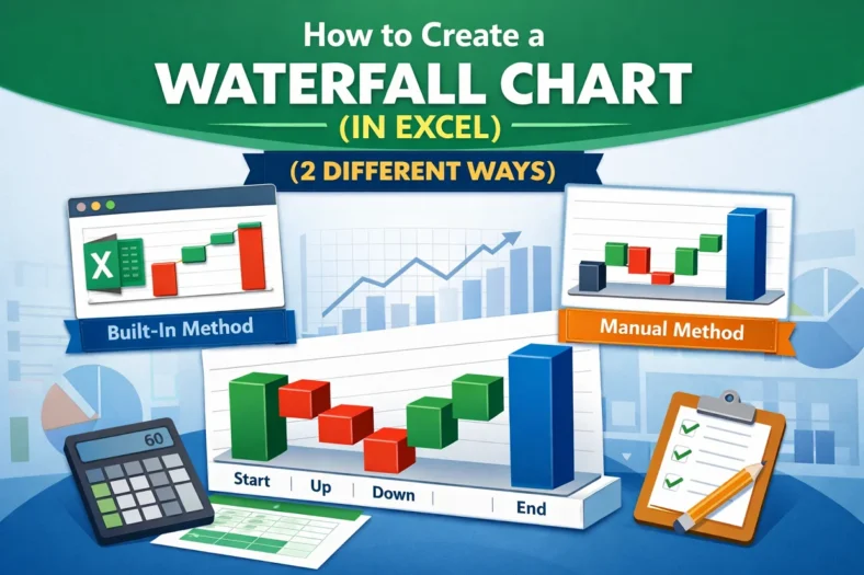
Waterfall charts are an excellent tool for visualizing the step-by-step changes that lead to a final result. Whether you’re tracking revenue growth, budgeting expenses, or analyzing inventory flow, a waterfall