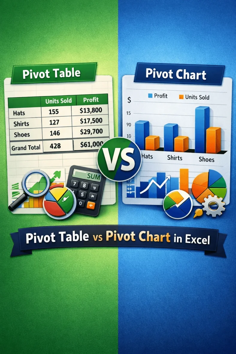
Differences Between a Pivot Table and a Pivot Chart in Excel
We use pivot tables to analyze and summarize large datasets while using pivot charts to visualize that summary. Suppose you want to check monthly sales by region of a store.


We use pivot tables to analyze and summarize large datasets while using pivot charts to visualize that summary. Suppose you want to check monthly sales by region of a store.

When we analyze large datasets in Excel, we usually use pivot tables to summarize and analyze data. However, one common issue we face is that these tables do not update

When we try to analyze large datasets in Excel, pivot tables help us to summarize and analyze information quickly. However, there are situations where the built-in fields and totals are

When we work with large datasets, including various categories in Excel, we often need to count the values of different categories that meet certain conditions only. In such cases, a

We often work with large datasets in Excel and use PivotTables to summarize and analyze our data quickly. However, most of the times, these datasets changes periodically. Or, sometimes, we

When we work with large datasets in Excel, we often need a quick way to filter and analyze information visually. In such cases, using slicers is the most common way.

When we work with large datasets in fields like business, research, or academics, simple formulas often fail to capture all the important insights. In such cases, we need more advanced

When we work with large datasets in Excel, it can get messier if we try to analyze the row data directly. That’s where we can use a summary report because

When we need to understand and visualize the distribution of a dataset, especially a large one, we use the histogram plot. Plotting a histogram allows us to group a large
