Error bars in a data point are the measurement of the accuracy of the data. Different values for individual error bars indicate different margins of error for different data points.An error bar ...
The value axis in Excel is the one that represents numeric values in a chart.In 2-D charts or graphs, this is usually the vertical or Y-axis. In some cases, it can be horizontal (X-axis) too. We ...
Error bars are the horizontal or vertical lines in each data point that show the uncertainty of the data. Adding error bars in Excel indicates adding those margins of error in the charts.Error ...
Sometimes you need to insert zeros before any numerical values in Excel for various purposes. But Excel has some default rules that may irritate you. You cannot put a zero before a number, according ...
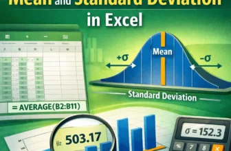
Excel functions allow you to easily and correctly calculate the mean and standard deviation. Understanding the correct statistical concepts is important whether you are analysing sales performance, ...
Data labels are text boxes that appear next to or on top of data points in the chart. "Outside end data labels" in Excel means the outside positioning of data labels that are just at the edge of the ...
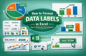
Data labels are part of the chart area that provide more context about data points or areas. It can be numeric values, series names, percentages, etc. In Excel, "Format data labels" can refer to text ...
In Excel, users can create a data entry form with a drop down list to enhance usability by limiting choices to predefined options, reducing errors and improving data consistency. Users need to ensure ...
Sometimes, you might need to count how many times specific characters appears in a cell in Excel. For example, you may want to check how often a certain digit appears in a product code, or find out ...