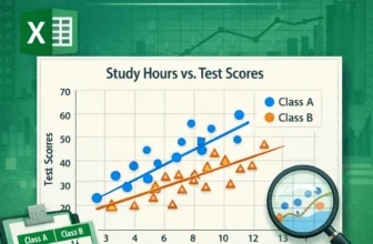
Scatter plots effectively visualize the relationship between two variables, vital for data analysis in business, science, and education. Microsoft Excel provides an easy way to create a scatter plot ...
A scatter plot in Excel is a powerful tool for identifying relationships between variables, analyzing data patterns, detecting outliers, conducting trend analysis, and comparing data sets. Whether ...
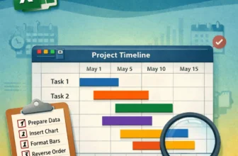
Gantt charts are an excellent way to visualize project timelines and track task progress in a clear, visual format. While Excel doesn’t have a dedicated Gantt chart type, you can create one easily ...
Sparklines are tiny, cell-sized charts that give you a quick visual representation of data trends right inside a single cell. Whether you’re tracking monthly sales, temperature changes, or stock ...
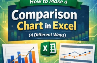
Comparison charts in Excel are excellent tools for spotting patterns, differences, and trends across categories or time periods. Whether you're comparing quarterly revenues, product ratings, or ...
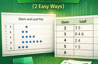
A stem and leaf plot in Excel helps you organize quantitative data in a way that reveals patterns, clusters, and outliers. While Excel doesn’t have a built-in function for this type of chart, you can ...
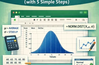
Visualizing data through a normal distribution curve is one of the most common ways to understand how your values are spread around the mean. This bell-shaped curve is widely used in statistics, ...
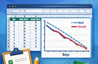
Burndown charts are an excellent tool for tracking project progress, especially in Agile or Scrum environments. They visualize how much work remains versus how much time is left, helping teams stay ...
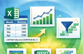
Charts are most useful when they reflect real-time changes in your data but static charts don’t update automatically when you add new entries. That’s where dynamic range charts come in. These charts ...