The axis scale is the range of values displayed along an axis. To change the axis scale in Excel, we need to access its maximum and minimum bounds.
An axis has a minimum (lower bound) and maximum (upper bound) value to show all the data within an interval (major and minor units). An accurate scale is important for a clear and accurate representation of data.
Sometimes, a data range falls within a specific range, and the charts in Excel don’t display it properly. We need to readjust them in these situations to highlight variations, compare them, and focus on relevant data and outliers.
To change the axis scale in Excel,
➤ Double-click on the axis.
➤ Select Axis Options in the Format Axis pane.
➤ Change the Minimum and Maximum values under Bounds.
In the latest version of Excel, all of the bounds and interval options are moved into the Format Axis pane. So, to change the axis scale, we need to open this pane. In this tutorial, we will demonstrate how we can open the Format Axis pane in different ways and make changes to change the axis scale in Excel.
Download Practice WorkbookQuick Video Tutorial: How to Modify Axis Scales in Excel Charts
Directly Accessing Format Axis Pane
Since all the axis scale options are available on the Format Axis pane, our goal for all the methods is to access this pane.
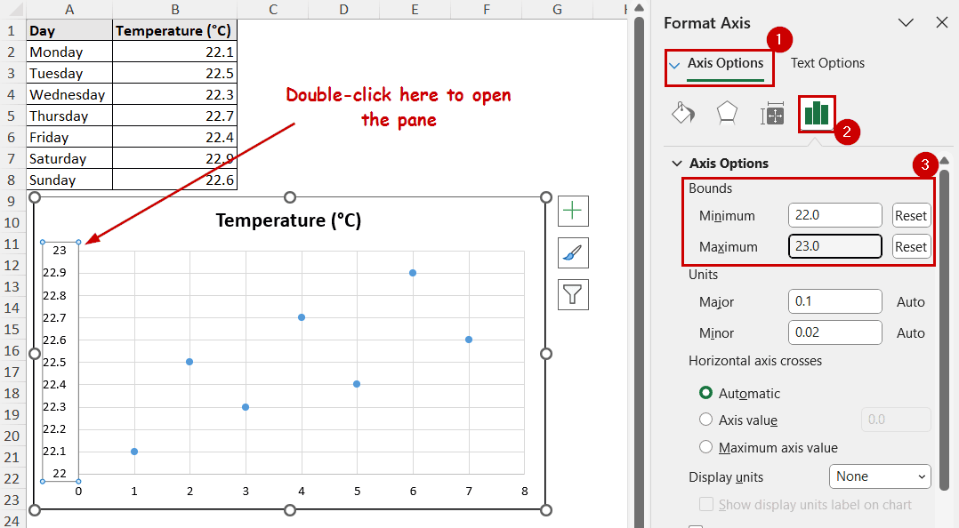
The easiest way to access this pane is to double-click on an axis.
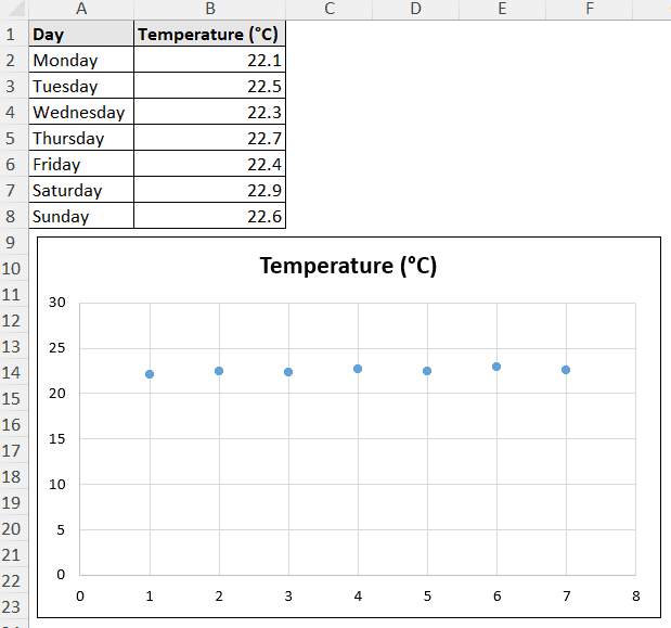
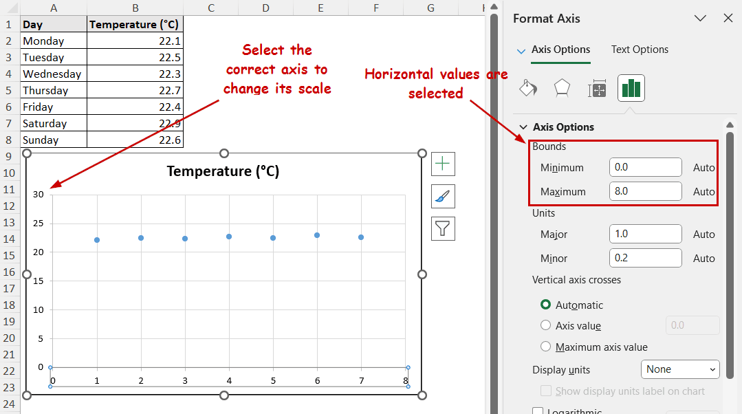
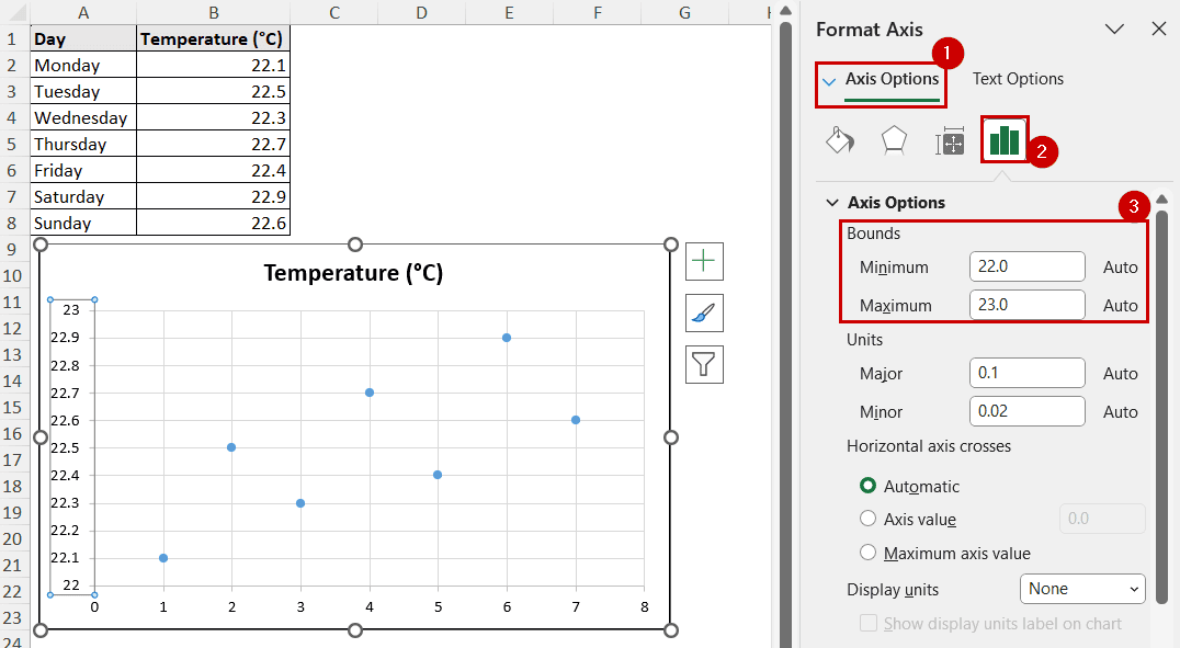
This is the data we are using for demonstration. It contains different temperature readings ranging between 22 and 23. However, the chart’s vertical axis has a wide range, and the points aren’t clearly visible.
Steps:
➤ Double-click on the axis you want to change (vertical in this case).
➤ Go to Axis Options in the Format Axis pane.
➤ Change the Minimum and Maximum values under Bounds for the lower and upper bounds for the axis.
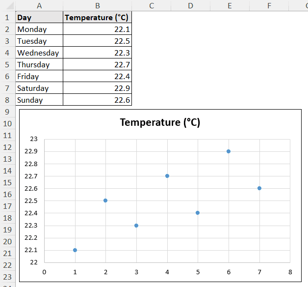
The axis scale will change and the chart will be clearer.
Using Chart Elements Button
The Chart Elements button is the plus (+) shaped icon on the top-right after selecting a chart.
It had options to add, remove, or modify different elements of the chart directly. The axis is among these modification options.
Steps:
➤ Select the chart.
➤ Go to Chart Elements >> Axes >> More Options.
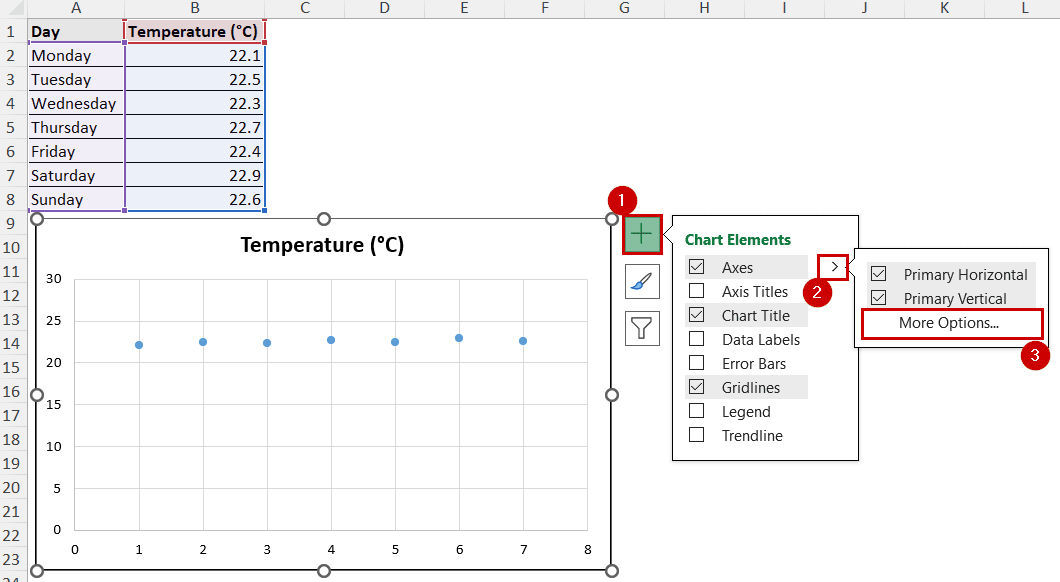
➤ If the correct axis isn’t selected, click on the axis to select it.
➤ In the Format Axis pane, select Axis Options >> set Minimum and Maximum values.
Using Format Tab
After selecting a chart, two additional tabs are available in the ribbon: Chart Design and Format.
Options for different chart elements are available in the Format tab too.
➤ Select the chart by clicking on it.
➤ Go to the Format tab and select Vertical (Value) Axis in the selection.
➤ Select Format Selection from the same tab.
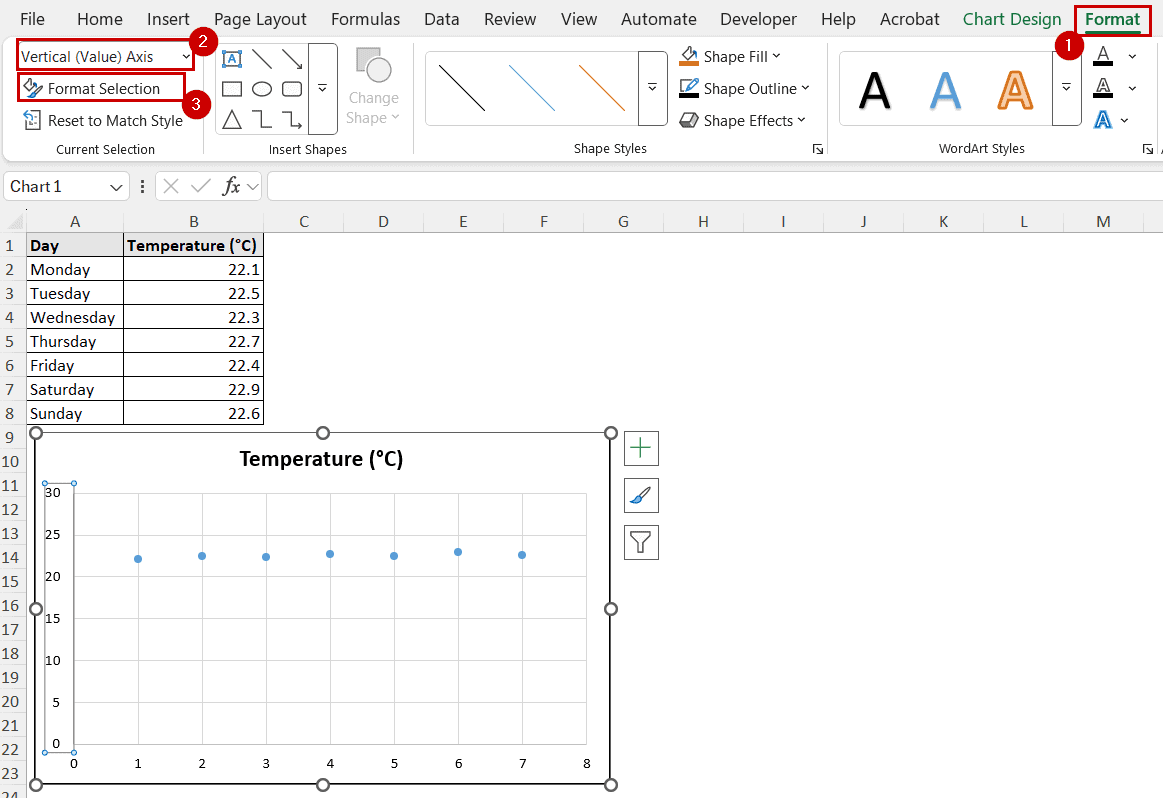
➤ In the Format Axis pane, select Axis Options and set Minimum and Maximum values.
Using Context Menu
The context menu is the right-click pop-up menu. The option to modify an axis is also available in the context menu.
Steps:
➤ Right-click on the axis you want to change the scale of.
➤ Select Format Axis from the context menu.
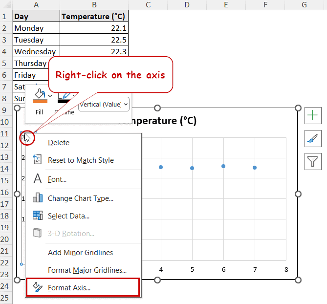
➤ In the Format Axis pane, change the Minimum and Maximum bounds under the Axis Options.
FAQ
Why does my chart look distorted after changing the scale?
The most common reason for a distorted chart after changing the scale is unusual upper and lower bounds and unit selection compared to the data.
Our data was in the range of 22 and 23. So, we have set those values as lower and upper bounds. If we had set 25 as a lower bound and 30 as an upper bound and a unit of more than one, it would get distorted because it doesn’t sit well with the data.
Ensure the axis bounds and units in the Format Axis pane are appropriate for the data range.
Can I use text values on the value axis?
The value axis (y-axis) is meant to store the values. The idea is to compare the values on an axis. So, it’s not possible to store text values on the vertical axis.
However, the horizontal axis (x-axis) can store different categories and store text values.
Is it possible to automate axis scaling?
Yes, it is possible to automate axis scales. If you select a custom bound, then there would be “Reset” buttons available beside the Minimum and Maximum values of bounds in the Format Axis pane. Click on them and Excel will automatically set them to a suitable value if it wasn’t there in the first place.
Concluding Words
In this tutorial, we demonstrated the method of changing the axis scale in Excel. As of the latest version of Excel, all of the scaling options for the axis are moved to the Format Axis pane. We have used four different methods to access the Format Axis pane: by directly double-clicking it, using the Chart Elements button, the Format tab, and the Context menu.
Feel free to download the practice workbook and give us your feedback.