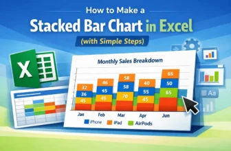
Creating a Stacked Bar Chart in Excel is an excellent way to display data when we want to show both the individual parts and the overall total in one view. Instead of listing numbers in a table, this ...
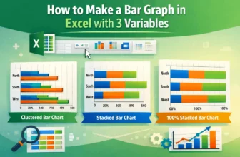
In Excel, a bar graph or chart displays data using horizontal rectangular bars, where each bar's length represents the data point's value. It’s one of the most effective ways to compare categories or ...
Bar charts are a great way to compare different categories in Excel, and sorting the bars from largest to smallest makes it easier to see the top values right away. But Excel doesn’t have a direct ...
When you're working with data in Excel, bar charts are a great way to compare values across different categories. They're especially useful for showing totals, counts, or any kind of grouped ...
When working with sales, survey data, or any comparison-based dataset, it’s often helpful to display two related data series side by side. A double bar graph, also known as a clustered column or ...