One of the most popular chart styles in Microsoft Excel is the clustered column chart, which is ideal for comparing results across several categories. For ease of comparison, vertical bars are grouped together side by side to represent each category. Clustered column charts provide a clear, visual depiction of the data which immediately improve the impact and clarity of your reports. Excel offers quick and efficient ways to personalize a chart with clustered columns.
➤ Select all the columns you want to include in the clustered column chart.
➤ Click on Insert tab and select Insert Column or Bar Chart icon.
➤ Choose the Clustered Column option of the 2-D Column group.
➤ Format the clustered column according to your preference using the Chart Design tab.
In this guide, we have explained step by step in detail how to insert a clustered column chart in Excel. The methods are very easy to grasp. We have also included directions on how you can format and customize the chart according to your preference.
Insert the Clustered Column Chart from Excel Ribbons
This is the most popular and approachable method for beginners. When your dataset is already structured in a worksheet, this method is the best. You may directly access all chart types and customization settings in one location by utilizing the Ribbon. For those who like complete control over chart selection from the start and don’t want to rely on Excel’s built-in recommendations, this approach is ideal.
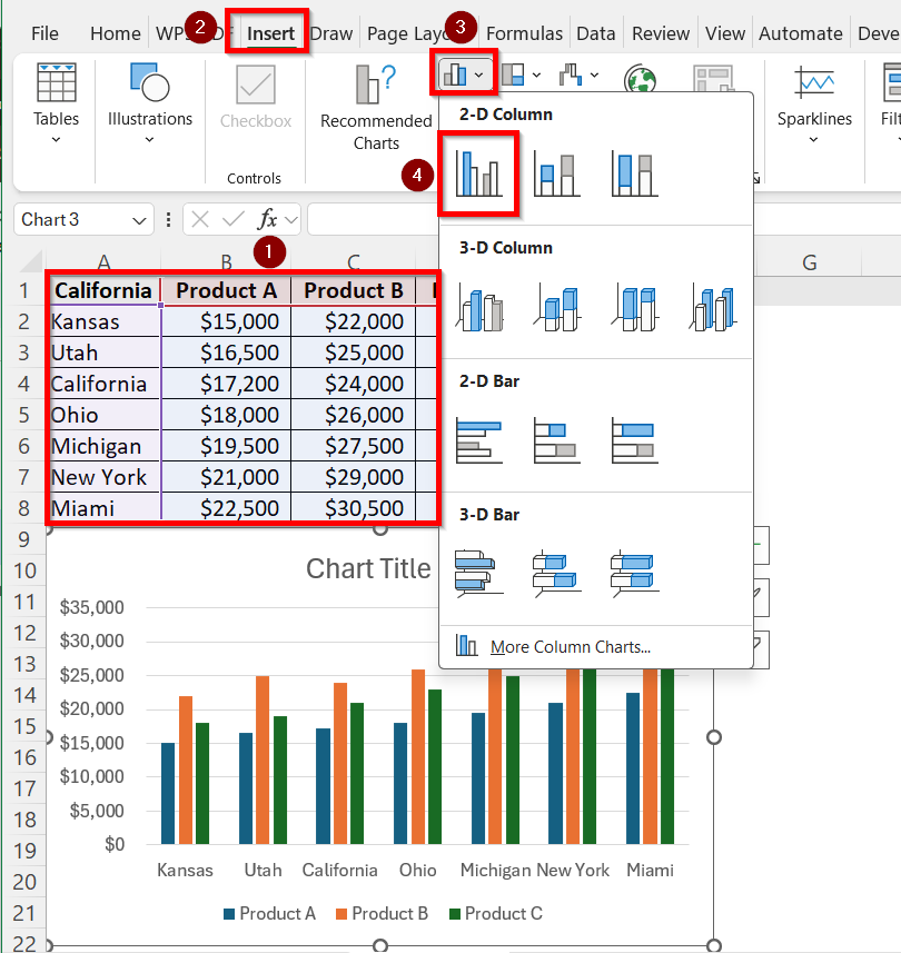
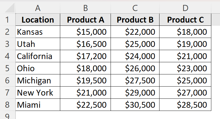
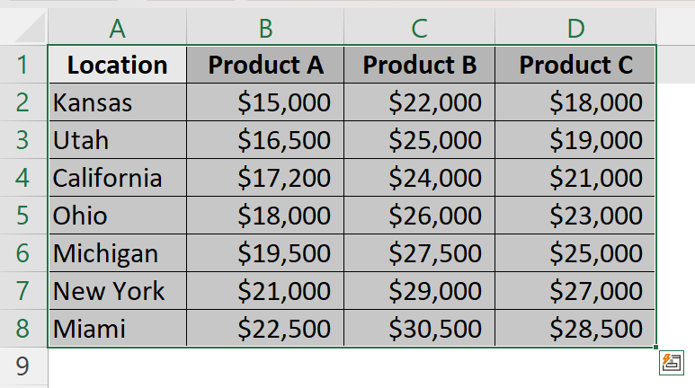
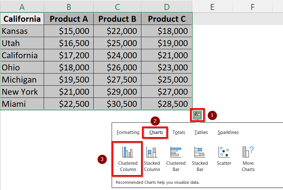
Suppose, this is our dataset which includes the sales values of three products in different locations:
Follow these steps to insert a clustered column of this dataset using the insert tab:
➤ Firstly, select all the columns you want to plot along with their headers. Since we want to create a cluster of all columns, press Ctrl and select all the columns A, B, C and D.
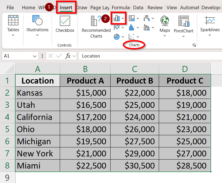
➤ Click on the Insert tab from the Excel ribbon.
➤ From the Charts group, select the Insert Column or Bar Chart icon.
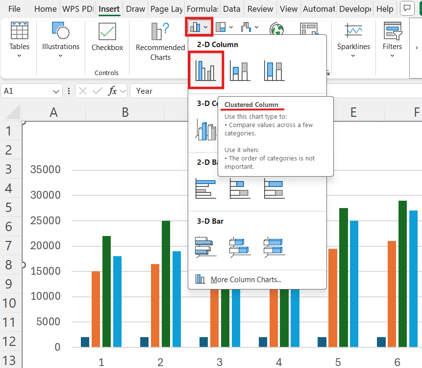
➤ Now, select the Clustered Column option of the 2-D Column group.
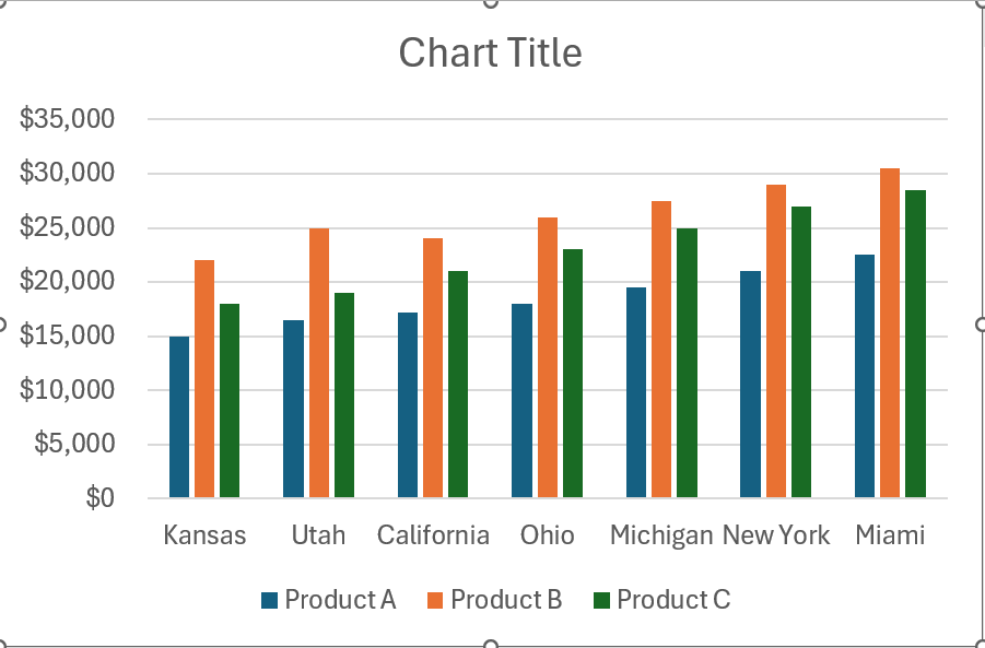
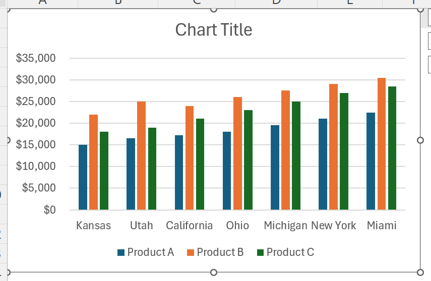
➤ You will get the following clustered column chart of your dataset. The column A will be at x-axis and the sales value of products will be shown with different coloured columns at the y-axis.
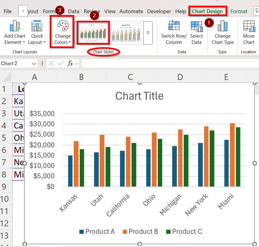
➤ You can now customize and format the chart style and columns in any way you want. Go to the Chart Design tab for this.
➤ In the Chart styles group, you can select the type of design you prefer.
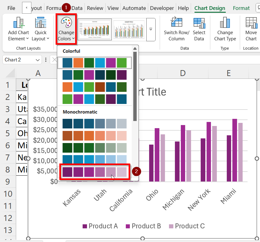
➤ Click on Change Colors option to give the chart columns new colour schemes.
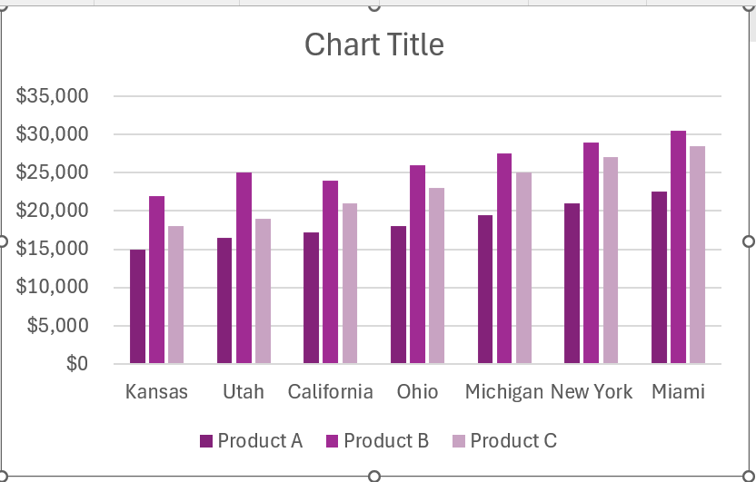
➤ For instance, we want to make the columns purple themed, so we chose monochromatic palette 5 which gives a purple gradient to the columns.
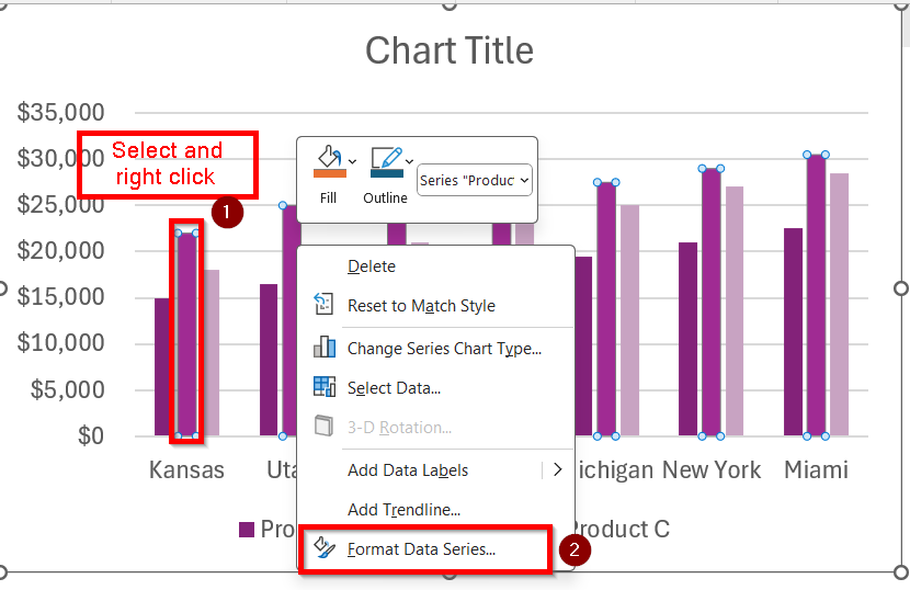
➤ If you want to manually customize any single column of the chart, select that specific column and right click on your mouse. For example, we are choosing the middle column of Product B to format manually.
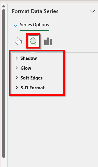
➤ Click on Format Data Series… option.
➤ Click on the Fill section and you will find Fill, Border, Color and other options to change that particular column however you like.
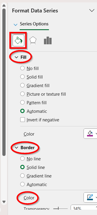
➤ Click on the Effects section and you will have the option of Shadow, Glow, Soft Edges and 3-D Format that you can choose according to your preference.
➤ Here is the finished result of our clustered column.
Utilize the Quick Analysis Tool
One of Excel’s more recent additions for accelerating data visualization is the Quick Analysis Tool. A little icon that provides rapid access to formatting, charts, totals, and other analysis tools displays in the selection’s bottom-right corner whenever you choose a range of data. For users who prefer to construct a clustered column chart with fewer clicks and without using the Ribbon options, this approach is ideal.
Follow the steps below to utilize the Quick Analysis Tool for creating a clustered column:
➤ Firstly, select all the columns you want to plot along with their headers. Since we want to create a cluster of all columns, press Ctrl and select all the columns A, B, C and D.
➤ Click on the Quick Analysis icon at the bottom-right corner of the selection. You can also press Ctrl + Q to access it.
➤ Click the Charts tab and then choose Clustered Column.
➤ The default clustered column chart of the dataset will show up.
Customize the Clustered Column Chart
Once you have inserted the clustered column chart, you can edit and format it however you want to. Formatting is what turns it from a basic graphic into a polished, unique image. You can customize many things such as titles, colors, axis labels, data labels, effects etc.
Here is how you can access the customization options:
➤ Click on your chart and go to the Chart Design tab in the ribbon.
➤ In the Chart styles group, you can select the type of design you prefer.
➤ Click on Change Colors option to give the chart columns new colour schemes.
➤ For instance, we want to make the columns purple themed, so we chose monochromatic palette 5 which gives a purple gradient to the columns.
➤ If you want to manually customize any single column of the chart, select that specific column and right click on your mouse. For example, we are choosing the middle column of Product B to format manually.
➤ Click on Format Data Series… option.
➤ Click on the Fill section and you will find Fill, Border, Color and other options to change that particular column however you like.
➤ Click on the Effects section and you will have the option of Shadow, Glow, Soft Edges and 3-D Format that you can choose according to your preference.
➤ Here is the finished result of our clustered column. You can make your own vision for the clustered column chart come true using these customization options.
Frequently Asked Questions
What Distinguishes a Stacked Column Chart from a Clustered Column Chart?
Columns for several series are arranged side by side in a clustered column chart. It is easier to compare between data by using clustered column charts. In contrast, a stacked column chart shows part-to-whole relationships by stacking values within a single column.
Can I Add Data Labels to Make Values Visible on the Chart?
Yes, it is very common to add data labels in clustered column charts. Right-click on a column, select Add Data Labels and Excel will display the values directly on the columns.
How Can I Update the Clustered Chart if My Data Changes?
Excel charts are dynamic. If your chart is linked to a specific data range, any changes in that range will automatically update the chart. So, when you add or remove new data in the selected columns, the clustered chart will automatically update to add or remove them.
How Do I Resize or Move the Clustered Column Chart?
Click on the chart. Drag the edges to resize the chart as you want. Furthermore, click-and-drag the entire chart to reposition it anywhere on the worksheet.
Wrapping Up
One of the simplest yet most powerful methods to visually represent data in Excel is via a clustered column chart. Learning several techniques gives you more freedom in how you design and alter your visuals. We have discussed the best two methods- Quick Analysis Tool and the Insert tab from Ribbon Menu to do this. After the chart is inserted, careful formatting guarantees that it is not only accurate but also interesting and simple to understand.
With these skills, you will be able to turn numerical data into visually striking insights for dashboards, reports, and presentations.