Combining two graphs in Excel lets you compare different data series within a single visual which is perfect for presentations, dashboards, or trend analysis. Whether you’re working with two different data types or tracking related metrics over time, Excel offers more than one way to merge your charts into a clear, readable format.
In this article, you’ll learn two effective methods to combine two graphs in Excel using a built-in Combo Chart and manually merging charts through copy-paste. Both approaches are useful, depending on how complex or customized your visualization needs to be.
Steps to combine two graphs in excel:
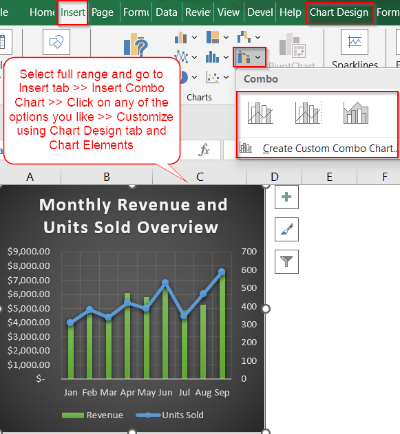
➤ Highlight the full data range that includes both data series. Make sure each series is in its own column with clear headers.
➤ Go to the Insert tab >> Click Insert Combo Chart >> Then select the Clustered Column chart or any other you may prefer.
➤ Excel will automatically create a combo chart based on your data.
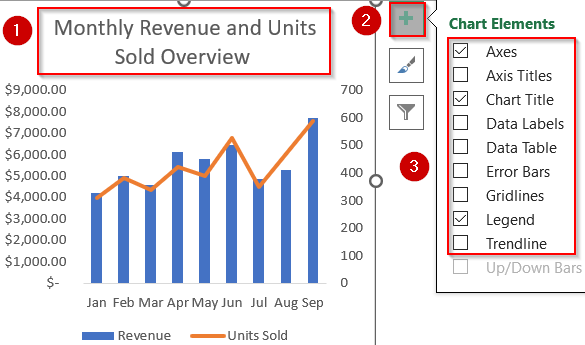
➤ Customize the chart title, legends, and axis labels to make the chart clear and presentation-ready. Turn off Gridlines for better clarity using the Chart Elements (+) icon.
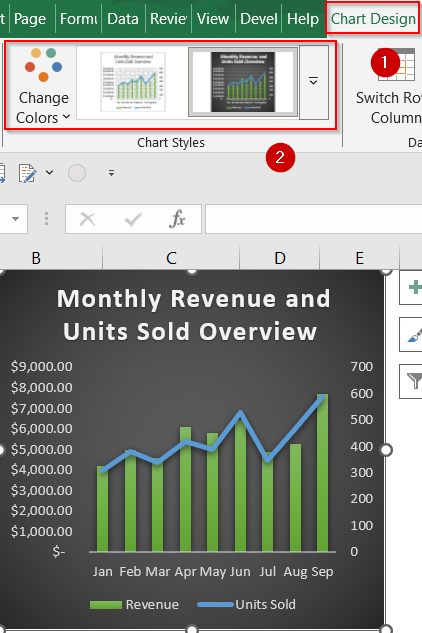
➤ Select the chart and head to the Chart Design tab >> Click on Change Colors or pick a preset style.
Use Excel’s Combo Chart Tool to Overlay Two Graphs
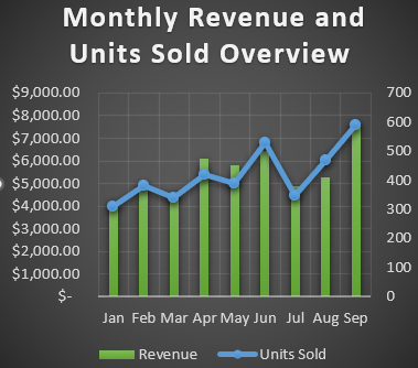
If your two data series like Revenue and Units Sold have different scales or chart styles, Excel’s Combo Chart is the best way to visualize them together. This method lets you assign different chart types to each series and even place one on a secondary axis, giving you a clear, unified graph that highlights both trends in one view.
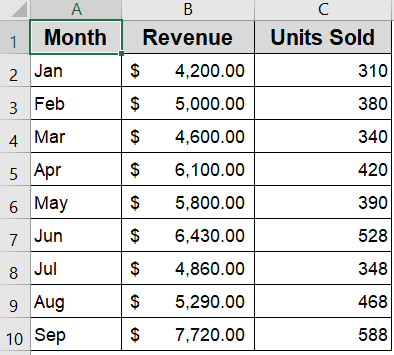
To demonstrate how to combine two graphs in Excel, we’ll use a sample dataset showing monthly Revenue and Units Sold from January to September. This allows us to visualize financial performance alongside sales volume in a single chart.
Steps:
➤ Highlight the full data range that includes both data series. Make sure each series is in its own column with clear headers.
➤ Go to the Insert tab >> Click Insert Combo Chart >> Then select the Clustered Column chart or any other you may prefer.
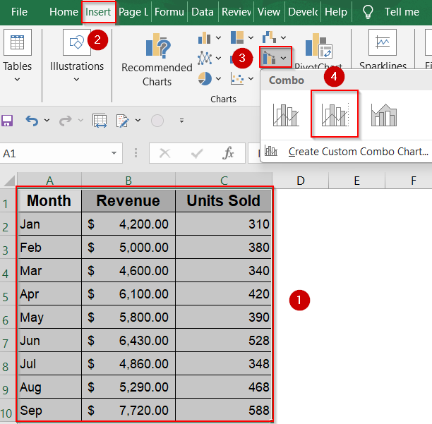
➤ Excel will automatically create a combo chart based on your data.
➤ Customize the chart title, legends, and axis labels to make the chart clear and presentation-ready. Turn off Gridlines for better clarity using the Chart Elements (+) icon.
➤ Select the chart and head to the Chart Design tab >> Click on Change Colors or pick a preset style.
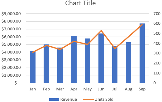
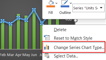
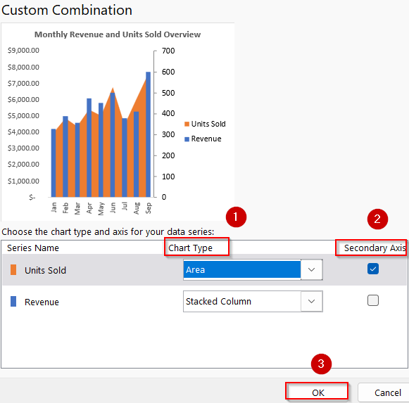
➤ If you want to change your chart type, right-click the line or bars and click Change Series Chart Type.
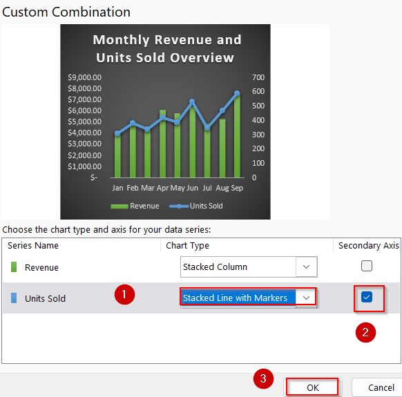
➤ For each data series, choose a suitable chart type (e.g., Line, Column, Area) from the dropdown.
➤ If your two datasets have different scales (e.g., Revenue vs. Units Sold), tick the Secondary Axis checkbox for one of the series.
➤ You can see your chart preview at the top. Click OK to insert the combo chart into your sheet.
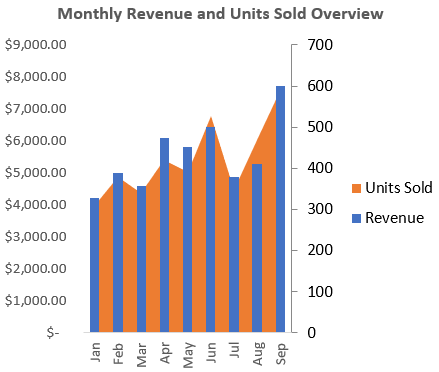
Now we have our fully customized Combo Chart inserted into our Excel sheet.
Manually Merge Two Charts Using Copy-Paste
If you already have two separate charts and want to place them together visually without adjusting the original data, this method offers a flexible, hands-on approach. By copying one chart and layering it over another, you can build a custom visual that highlights multiple trends, especially when Excel’s built-in combo charts don’t offer the control you need.
Steps:
➤ Click the first chart you want to merge >> Go to the Home tab >> Click Copy (or press Ctrl + C).
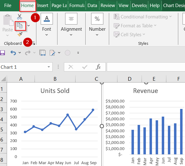
➤ Select the second chart, then press Ctrl + V to paste the first chart directly on top of it.
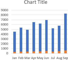
➤ Now you have your combined chart. Edit Chart Title and customize your chart according to your preference.
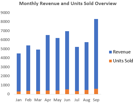
➤ You can also use the Change Series Chart Type feature by right-clicking on the bars and converting into a custom combination chart.
This approach gives more flexibility for creative layouts, though it takes more manual effort to sync axes and data scales.
Frequently Asked Questions
Can I combine more than two graphs in Excel?
Yes, you can combine multiple data series in a Combo Chart. Just keep adding more columns to your dataset and assign each series a unique chart type (line, column, area, etc.) in the Combo Chart settings.
What if my two graphs have different X-axis labels?
Combo Charts only work when all series share the same X-axis (like dates or months). If your graphs use different categories, try aligning or restructuring the data first. Otherwise, consider using the Copy and Paste method for more visual flexibility.
Why should I use a secondary axis?
If one data series has much larger values (like revenue vs unit sales), plotting both on the same axis would make smaller values unreadable. A secondary axis ensures both trends are visible without distortion.
Can I customize each chart type in a combo chart?
Yes. After creating the combo chart, right-click any data series and choose Change Series Chart Type. Then, pick a new style like Area, Line, or Column to customize according to your preference.
Wrapping Up
In this tutorial, we explored two methods for combining graphs in Excel by utilizing the Combo Chart feature for a structured integration of multiple data series, and the Copy-Paste method for manual overlay and customization. Each approach serves different purposes depending on the complexity of your data and the level of visual control you require. Feel free to download the practice file and share your feedback.