Whether you’re tracking customer locations, delivery routes, or real estate listings, plotting addresses from Excel onto Google Maps can turn your spreadsheet data into an interactive, visual experience. Manually entering each address into Google Maps is time-consuming but with the right process, you can map dozens or even hundreds of Excel entries all at once.
In this article, we’ll learn how to plot addresses on Google Maps directly from Excel. We’ll cover step-by-step how to prepare your address data and use Google’s tools to customize the map to suit our needs.
Steps to plot addresses on google map from excel:
➤ Format your Excel data with columns like Address, City, State, and Zip.
➤ Save your sheet as a .CSV file.
➤ Use Google My Maps to import your CSV file.
➤ Adjust marker style, labels, and layers for better visualization.
Steps to Plot Addresses from Excel to Google Maps
Let’s walk through how to turn your Excel address data into a live, interactive map using Google My Maps. For this example, we’ll use a dataset that includes 10 customer addresses from various cities.
Step 1: Prepare Your Address Data in Excel
Before uploading anything to Google Maps, you need to make sure your address data is clean and properly formatted. Google Maps relies on a consistent structure to recognize and map each location.
Steps:
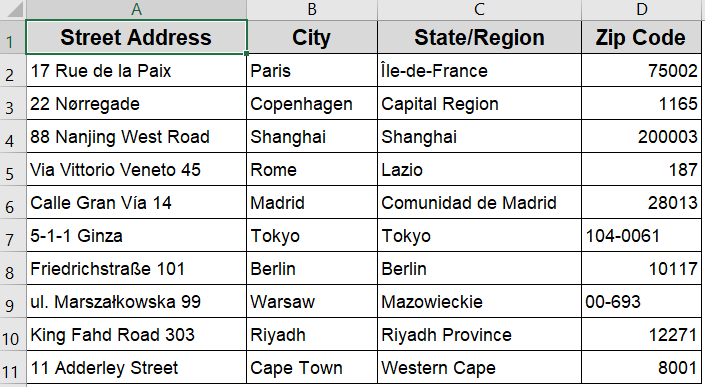
➤ Create a new Excel sheet and enter your addresses in separate columns such as Column A for Street Address, Column B for City, Column C for State, Column D for Zip Code.
➤ Ensure all rows are filled in without typos or missing fields.

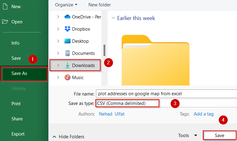
➤ Once done, go to File >> Save As >> Choose CSV (Comma delimited) (*.csv) as the format and hit Save to your desired location.
This step ensures that your file is compatible with Google’s import system.
Step 2: Open Google My Maps and Start a New Map
Once your dataset is saved as a CSV file, it’s time to move over to Google My Maps which is a useful free tool by Google that lets you visualize geographic data from spreadsheets. You can plot hundreds or even thousands of addresses in just a few clicks.
Steps:
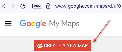
➤ Go to Google My Maps and sign in with your Google account.
➤ Click Create a New Map on the welcome screen.
➤ A blank map will open with a default layer labeled “Untitled Layer”.
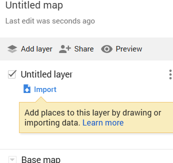
You’re now ready to import your CSV file into the map.
Step 3: Import Your Excel Data
With your map ready, the next step is to upload the address list from your CSV file. Google My Maps will use the location data (Street, City, State, Zip) to place pins on the map. It’s a fast and highly accurate process, provided your address formatting is correct.
Steps:
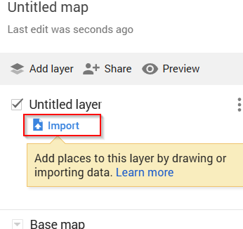
➤ On your new map, click Import on the Untitled Layer box.
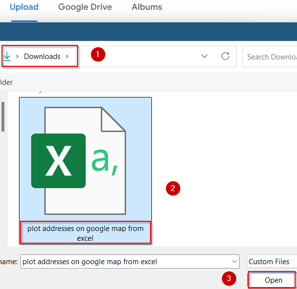
➤ Upload your CSV file from your computer or drag it into the import box from your saved location and hit Open.
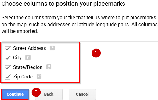
➤ Select the columns that contain location data (usually Address, City, State, Zip) and click Continue.
➤ Choose a column to label your map pins such as Customer Name or City and click Finish.
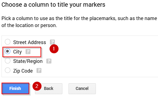
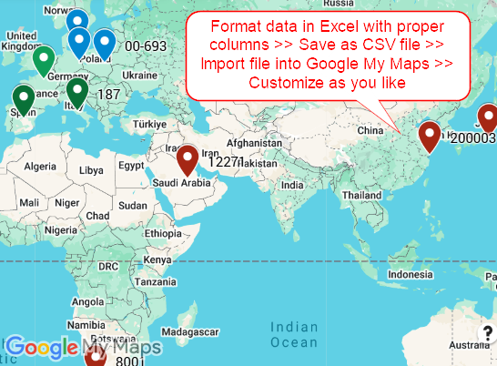
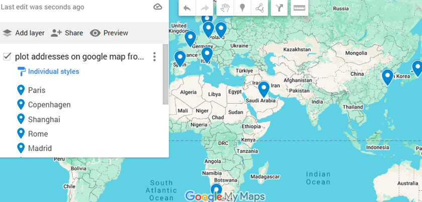
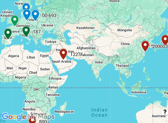
Google My Maps will then automatically plot each address onto the map using colored pins.
Step 4: Customize Map Appearance and Labels
Once your data is plotted, the real value comes from customizing the visuals. Google My Maps gives you full control over how your map looks from pin colors to labels to layer organization. This is especially useful for presentations, client demos, or internal data reviews.
Steps:
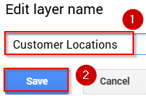
➤ Double-click the Layer Name to rename it (e.g., “Customer Locations”) and hit Save.
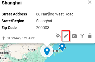
➤ Click on a pin to edit its info or change its color.
➤ Use the Style button to apply uniform or category-based colors to different locations.
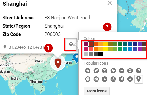
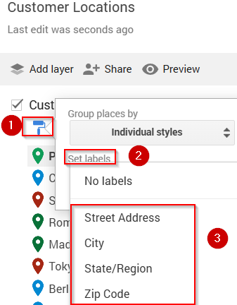
➤ To show labels, click Set Labels from the paintroller icon and select the column (e.g., Customer Name or Zip Code) to display next to each pin.
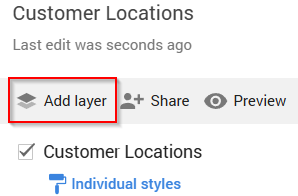
➤ Add additional layers if you want to separate data types or regions.
This helps you personalize the map layout for presentation or analysis.
Frequently Asked Questions
Can I use regular Excel files without converting to CSV?
No, Google My Maps only supports CSV format. You must save your Excel file as a .CSV file first. Simply go to File >> Save As and select “CSV (Comma delimited)” format to ensure compatibility.
What if my addresses don’t show up correctly?
If your addresses aren’t appearing properly, make sure they’re split into proper columns (like street, city, zip code) and free of typos. Even small errors or missing data can prevent Google Maps from recognizing the location.
Is there a limit to how many addresses I can plot?
Yes. Google My Maps allows up to 2,000 rows per layer. If you have more than that, you’ll need to either split your dataset across multiple layers or create separate maps for different segments.
Can I edit the map later?
Yes. Once your map is created, it’s saved to your Google Drive. You can revisit it anytime to update locations, add new addresses, delete points, or adjust formatting just like editing a Google Doc.
Is there a way to share the map with others?
Yes. Click the Share button in the upper menu. You can generate a public or private link, invite people via email, or even embed the interactive map into your website or blog post.
Wrapping Up
In this tutorial, we learned how to plot addresses on Google Map from Excel by formatting our data, converting it to CSV, and uploading it through Google My Maps. With this workflow, you can instantly visualize customer data, business locations, or event spots on a live map without manual entry. The ability to label, style, and organize your pins gives you flexibility for planning, analysis, or presentation. Feel free to download the practice file and share your feedback.