
A population pyramid illustrates how a population is distributed by age and gender. You have likely seen one before in demographic studies or population reports. For reports, demographic studies, or policy planning, researchers and analysts need to know how to make a population pyramid in Excel. In this tutorial, you will learn about the definition and significance of a population pyramid and the detailed steps to make your own population pyramid.
➤ A population pyramid is a visualization of the age and gender distribution. In this article, we’ll learn about the population pyramid and how to make a population pyramid in Excel using a 2D Stacked Bar Chart. Additionally, we’ll learn to make inferences from the population pyramid.
➤ Calculate the total population for both male and female genders.
➤ Insert a negative sign before any one of the genders and obtain percentages.
➤ Select Data >> Insert >> 2D Stacked Bar Chart.
➤ Format Data Series >> Set Gap Width >> Set Border color.
➤ Apply correct number formatting to x-axis labels >> Change the position of y-axis labels.
➤ Choose Fill Colors >> Chart title >> Remove Gridlines.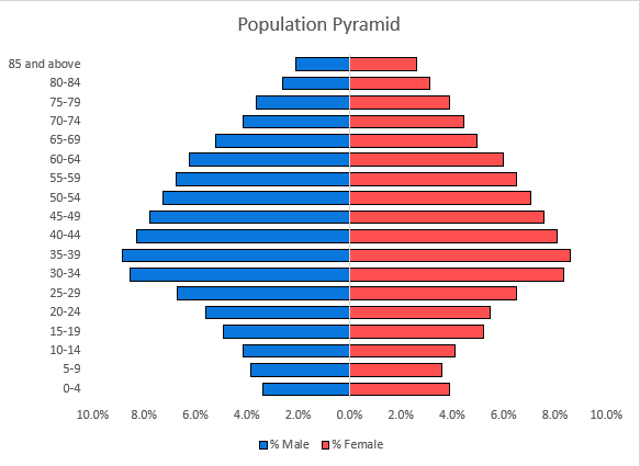
What Is Population Pyramid in Statistics?
A population pyramid is a visual representation of the distribution of different age groups within a population, categorized by gender. Generally, the horizontal (x) axis shows the proportion of males (on the left) to females (on the right). The vertical (y) axis shows age groups like 0-4, 5-9,…80-84, 85 and above.
The shape of the population pyramid reveals valuable insights into a population’s growth, stability, or decline.
- Triangular shape: The pyramid has a wide base and a narrow top. This suggests high birth rates and a growing population.
- Rectangular shape: An even distribution among the age groups. A sign of a stable population, and low birth and death rates.
- Inverted pyramid shape: A narrow base and wider at the middle or the top. This represents a declining population and an aging society.
- Concave shape: A large number of young people with few older people. This signifies high mortality rates, common in developing countries.
Steps for Making a Population Pyramid in Excel
Consider the population dataset containing the age group, male population, and female population from columns A through C.
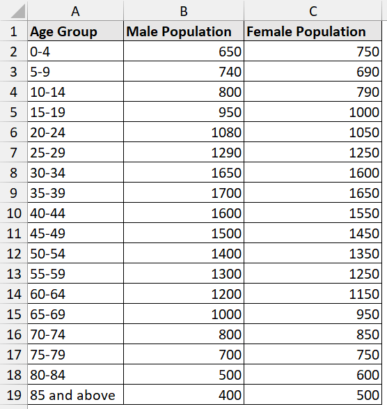
Let’s say you are a policy analyst working on a demographics report. You want to see the distribution of the male and female populations by age group using the dataset above. The population pyramid makes it simple to determine whether the nation’s population is young or elderly.
To make a population pyramid in Excel, we’ll use bar charts and apply some formatting. This is a simple approach that works with percentages and absolute values and is compatible with all versions of Excel. One thing to note, the values of the male population need to be changed to negative to show up on the left side of the chart.
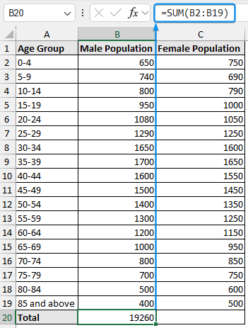
Step 1: Find Out the Total Populations of Male & Female Separately
➤ Select the output cell B20 >> Use the SUM function to calculate the total male population.
=SUM(B2:B19)
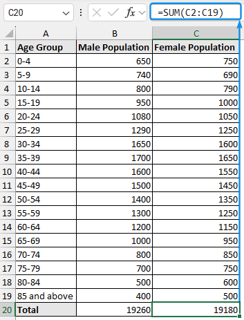
➤ Similarly, calculate the total female population.
=SUM(C2:C19)
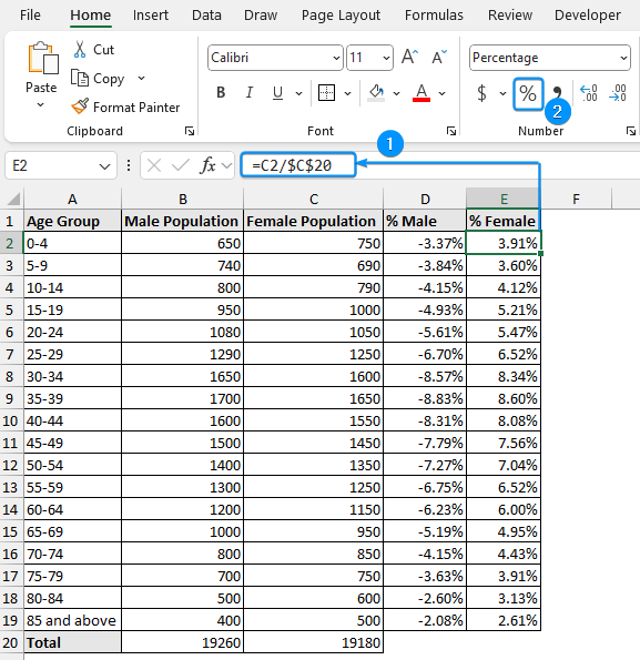
Step 2: Determine the Male-Female Percentage
➤ Obtain the percentage of the male population for each age group and apply percentage formatting.
=-B2/$B$20
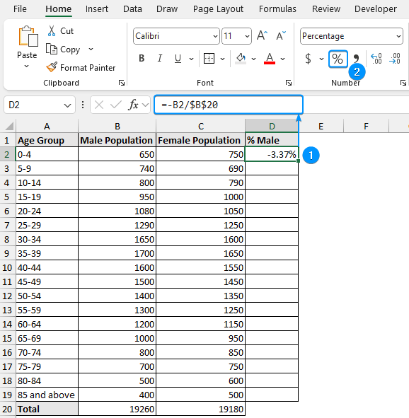
➤ Use the Fill Handle tool to fill in the cells below.
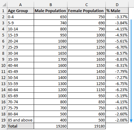
➤ Repeat the same formula (without the negative sign) to get the percentage of the female population.
=C2/$C$20
Step 3: Apply Column or Bar Chart for the Output Percentage
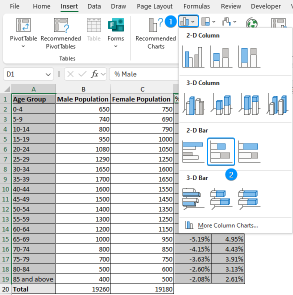
➤ Select A1:A19 cells >> Hold Ctrl key >> Select the range D1:E19 range >> Insert >> Column or Bar Chart.
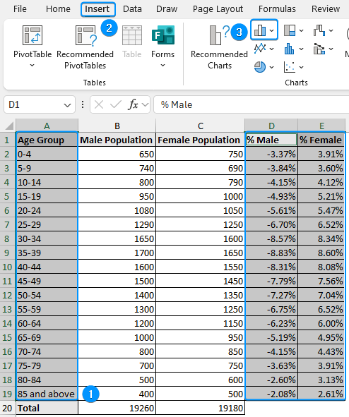
➤ Insert >> Column or Bar Chart >> 2D Stacked Bar Chart.
Step 4: Format the Chart
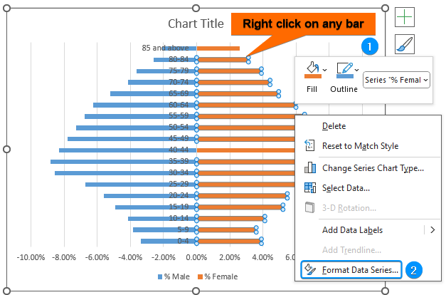
➤ Right click on any of the bars >> Format Data Series.
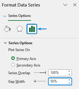
➤ Set the Gap Width to 50%.
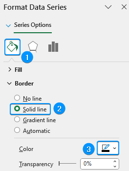
➤ Go to Fill & Line >> Border >> Solid line >> Color (Black). Repeat the process for both genders.
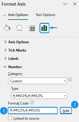
➤ Right click on the x axis >> Format Axis.
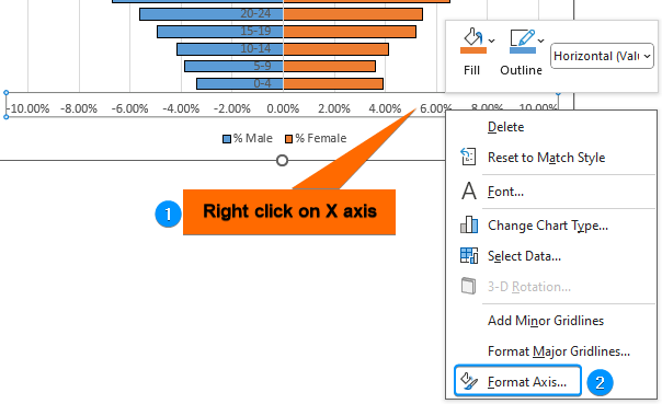
➤ In the Format Code field, enter the code below to correctly format the x-axis labels.
#,##0.0%;#,##0.0%
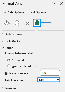
➤ Right click on the y-axis >> Format Axis.
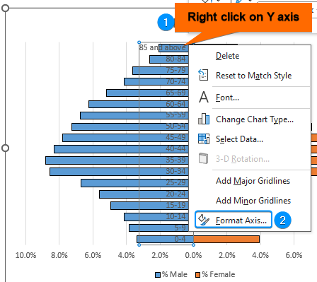
➤ Labels >> Label Position >> Low.
➤ Change the Fill Colors >> Set a suitable Chart title >> Remove Gridlines.
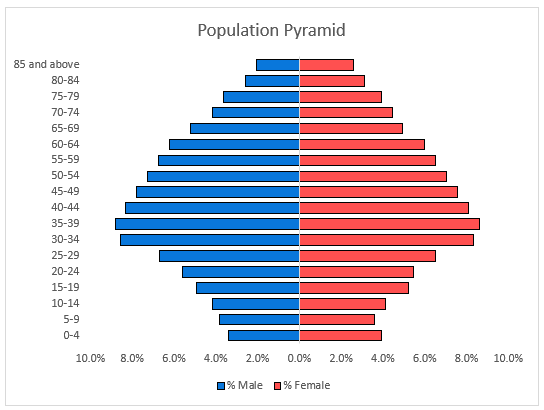
➥ The working age population (30-44) constitutes the biggest percentage, indicating a healthy working age population supporting economic production.
➥ The population pyramid has a rectangular rather than a triangular shape, a sign that the nation is steadily transitioning from a young population to an older one.
➥ Females outnumber males in the older age categories (65+), which shows females have higher life expectancy than males..
➥ There is a comparatively balanced distribution of males and females in the younger and middle ages. This means the male and female life expectancies are similar up to the middle age bracket.
Frequently Asked Questions (FAQs)
What is a population pyramid?
A population pyramid represents the age and gender distribution of a population. It helps visualize population trends like birth rates, aging populations, gender imbalances, etc.
Why are the male population values negative?
Male population values are set as negative, appearing on the left side of the population pyramid, while female values are positive and appear on the right.
How to analyze a population pyramid?
➤ Triangular shape: A wide base and a narrow top suggest high birth rates and a growing population.
➤ Rectangular shape: Even distribution among the age groups indicates a stable population, and low birth and death rates.
➤ Inverted pyramid shape: Narrow base and wider at the middle or the top represent a declining population and an aging society.
➤ Concave shape: Lots of young people and fewer old people signify high mortality rates common in developing countries.
How do I create a population map in Excel?
Select the data range >> Insert >> Maps >> Filled Maps.
Wrapping Up
In this tutorial, we’ve learned about the population pyramid and how to make a population pyramid in Excel using the 2D stacked bar chart. Feel free to download the practice file and share your thoughts and suggestions.