Presenting data effectively often means going beyond spreadsheets. While Excel is perfect for creating and analyzing charts, PowerPoint is where those visuals truly shine in front of an audience. However, many users waste time trying to recreate charts in PowerPoint, leading to formatting issues, mismatched data, or lost details. A direct way to move your chart from Excel into PowerPoint not only saves time but also ensures accuracy and consistency.
In this article, we’ll walk you through the simplest and most reliable ways to insert an Excel chart into PowerPoint. Whether you want a static image that stays exactly as you insert it, or a dynamic, linked chart that updates automatically when your Excel data changes, you’ll find clear, step-by-step instructions for both techniques.
Steps to insert Excel chart into PowerPoint:
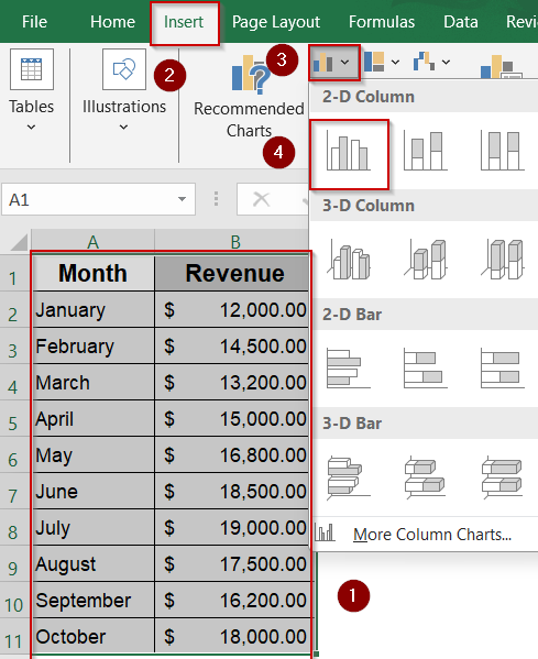
➤ In Excel, highlight your dataset and insert a chart from the Insert tab.
➤ Select the chart and press Ctrl + C (or Command + C on Mac) to copy.
➤ In PowerPoint, go to your target slide.
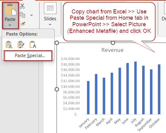
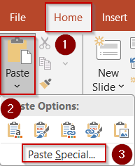
➤ Click the Home tab >> Click the Paste dropdown >> Choose Paste Special.
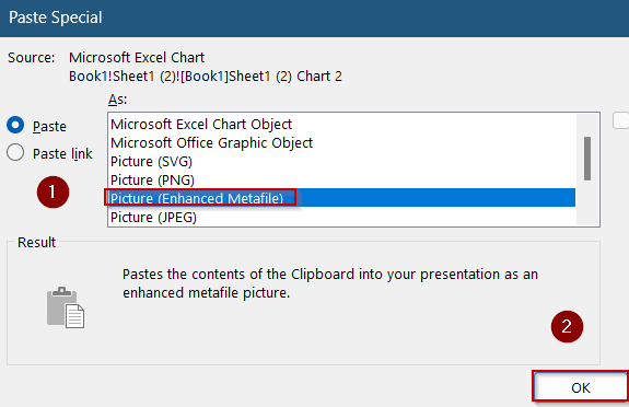
➤ In the dialog box, select Picture (Enhanced Metafile) and click OK.
Insert Excel Chart into PowerPoint as a Static Image
If you want a fixed version of your chart that won’t change when the Excel data updates, inserting it as a static image is the way to go. This method embeds your chart as a high-quality picture, allowing you to freely resize and move it without worrying about broken links or accidental edits. It’s perfect for sharing presentations where the data snapshot should remain constant.
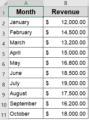
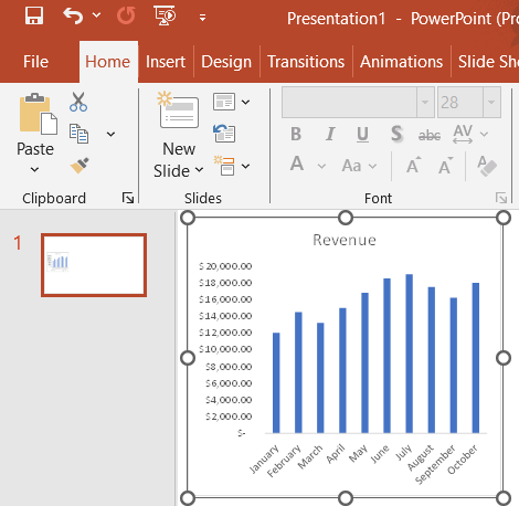
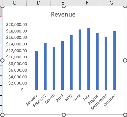
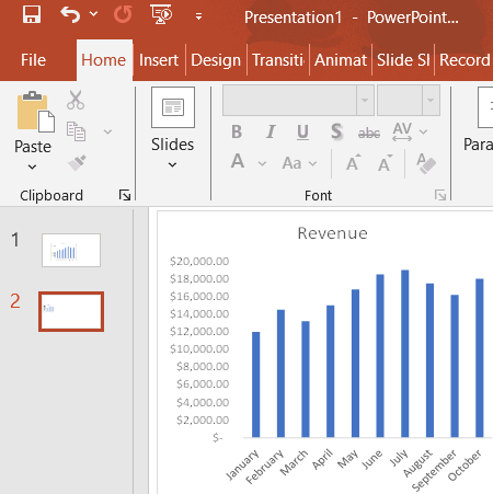
We’ll use a column chart from a sample dataset that contains monthly revenue figures over a ten-month period. We’ll use it to create a column chart in Excel and insert that chart into PowerPoint.
Steps:
➤ In Excel, highlight your dataset and insert a chart from the Insert tab.
➤ Select the chart and press Ctrl + C (or Command + C on Mac) to copy.

➤ In PowerPoint, go to your target slide.
➤ Click the Home tab >> Click the Paste dropdown >> Choose Paste Special.

➤ In the dialog box, select Picture (Enhanced Metafile) and click OK.
The chart is now embedded as a high-quality image, which can be freely resized and moved without linking back to Excel which is clean and self-contained.
Use a Live Link to Insert Excel Chart into PowerPoint
For charts that need to update automatically when your Excel data changes, linking your chart to PowerPoint keeps everything in sync. This method embeds a live connection to the original Excel file, so any changes you make in Excel will reflect in your presentation after updating links. It’s ideal for dynamic reports and dashboards that require accurate, real-time data.
Steps:
➤ In Excel, copy your chart with Ctrl + C (or Command + C on Mac).
➤ In PowerPoint, go to the slide >> Click Home >> Paste >> Paste Special.
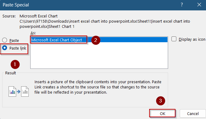
➤ Select Paste Link >> Choose Microsoft Excel Chart Object and click OK.
➤ Alternatively, go to Insert tab >> Click on Object to create a linked connection.
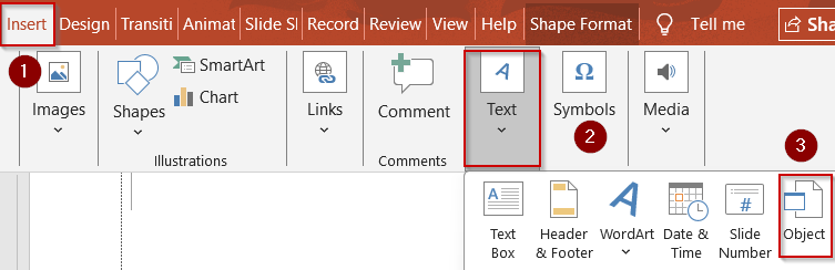
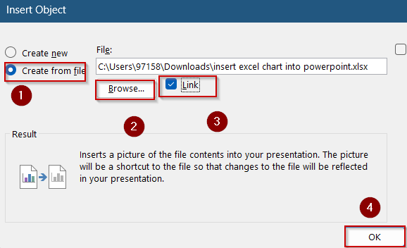
➤ Select Create from File >> Browse and select your Excel file >> Check Link and click OK.
➤ When opening the presentation later, click “Update Links” if prompted, to sync data from Excel.

This method keeps the chart synced to the Excel file. Any changes made to the original data will reflect automatically in PowerPoint after updates.
Frequently Asked Questions
Can I edit the chart after inserting it into PowerPoint?
Yes, if the chart is inserted as a linked object or embedded workbook, double-clicking it in PowerPoint will open it in Excel for editing. However, charts inserted as images can’t be edited, only resized or formatted.
What happens if I move the original Excel file?
If your PowerPoint chart is linked to the Excel file, moving or renaming the source file will break the connection. To avoid issues, keep the Excel file in the same folder or update the link manually.
Should I use image or link for team presentations?
For team or shared presentations, using an image is safer to avoid link errors. However, for live internal reports or dashboards where data may change, a linked chart is better to reflect real-time updates.
Does the image method reduce quality?
No, if you use the “Enhanced Metafile” format, your chart maintains high visual quality and can be resized without pixelation. This is a much better option than using a regular screenshot or bitmap.
Can I insert multiple charts from Excel into one slide?
Yes, you can copy and paste multiple charts from Excel into the same PowerPoint slide. Each one can be resized, repositioned, and formatted independently to create a clean, professional layout.
Wrapping Up
In this tutorial, you’ve learned how to easily insert Excel charts into PowerPoint using two effective methods catering to your needs. Whether you choose to paste the chart as an image for straightforward formatting or link it to keep your presentation automatically updated with Excel data, you now have the tools to make your presentations more dynamic and professional. Feel free to download the practice file and share your feedback.