
For data involving uncertainty, such as scientific experiments or survey results, error bars in charts visually represent the value range. Google Sheets allows you to add error bars to columns, bars, lines, and scatter charts, enabling your audience to view both data points and uncertainty levels.
In this article, we’ll show you how to add error bars in Google Sheets using different methods, including fixed values, percentages, and standard deviation.
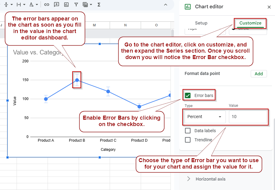
Steps to add error bars to charts in Google Sheets:
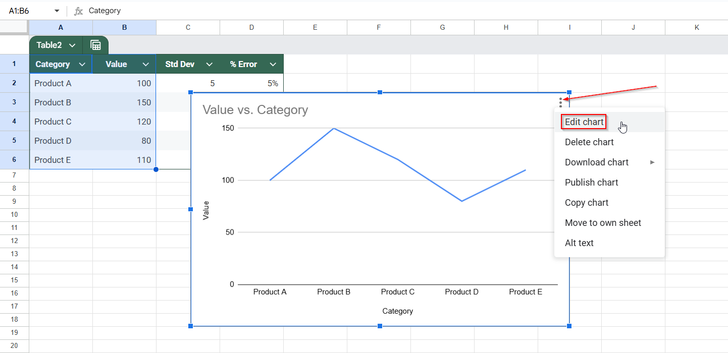
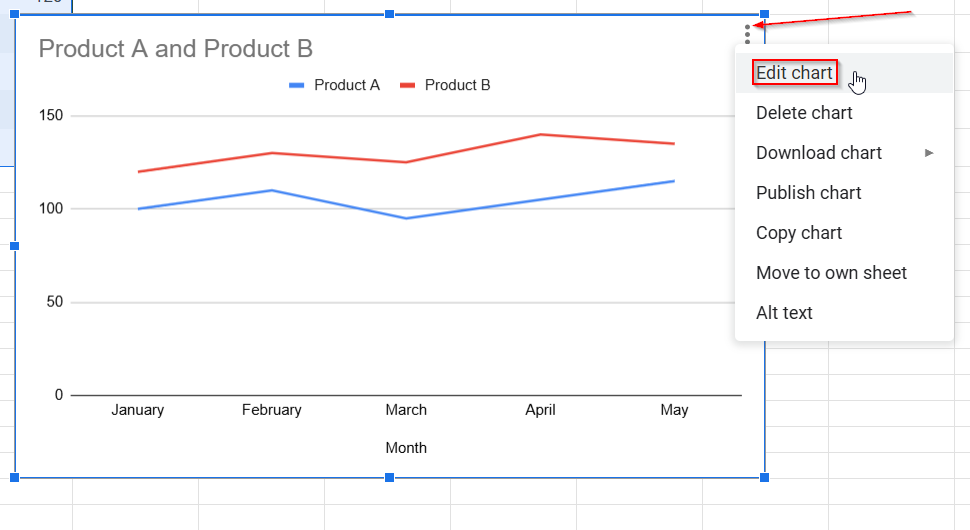
➤ Select your chart and click the 3-dot menu >> Edit chart
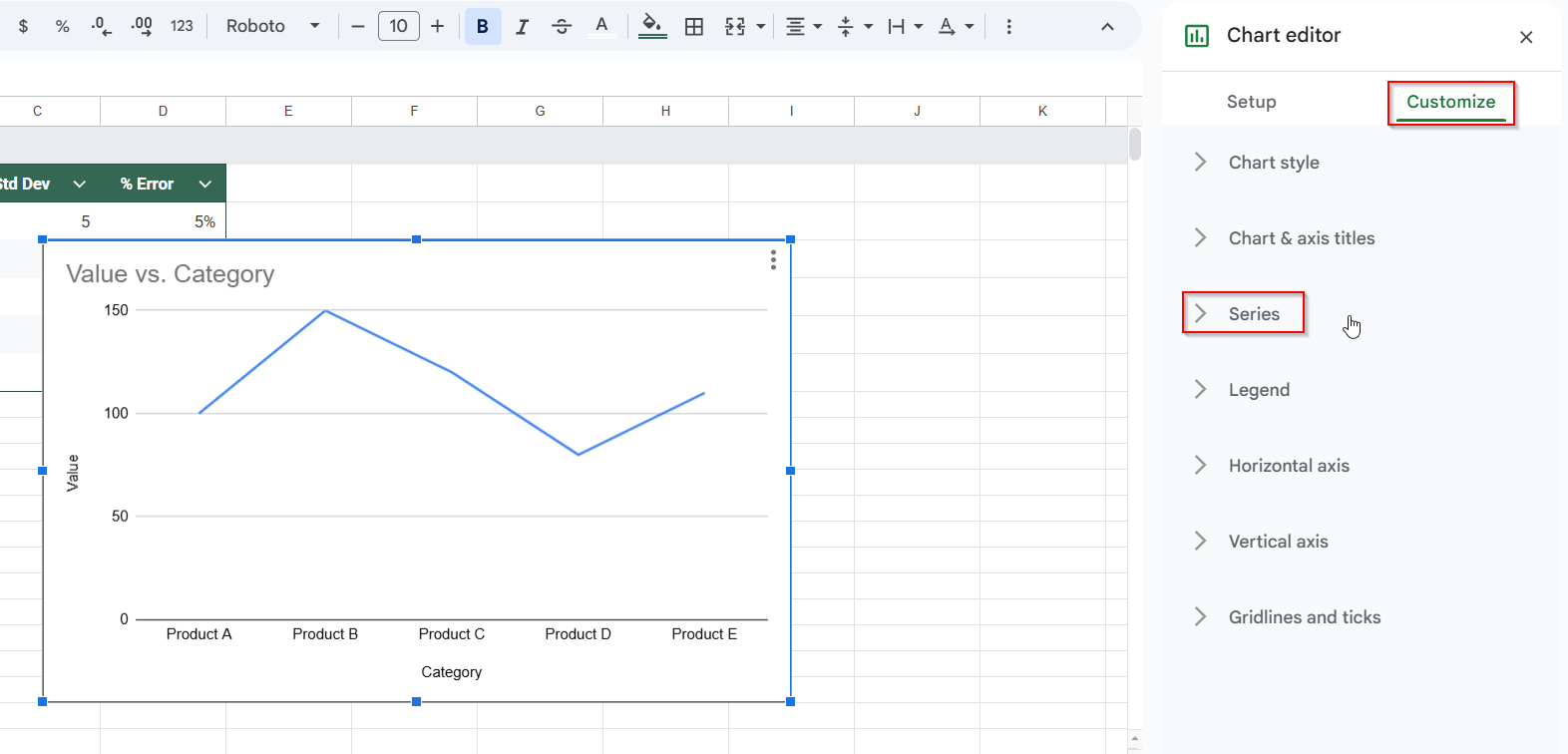
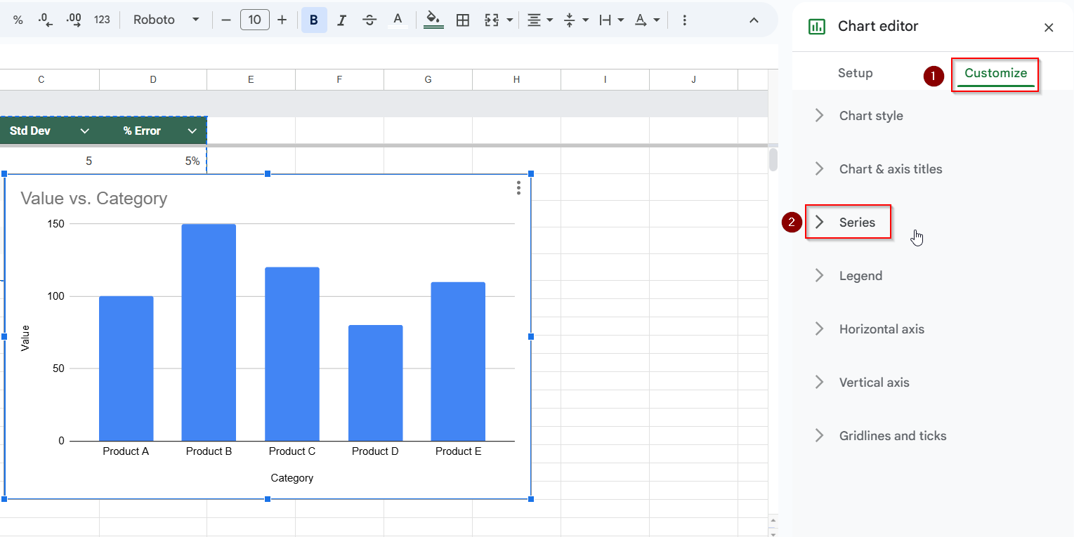
➤ In the Chart Editor, go to the Customize tab, and expand the Series section
➤ Scroll down and check the Error bars option
➤ Choose from Constant, Percent, or Standard deviation
➤ Enter the desired value (e.g., 10 for constant, 15% for percent)
➤ Repeat for each data series if needed
Add Error Bars Using a Fixed Value in Google Sheets
If your dataset has the same uncertainty level or error margin for every data point, adding error bars using a fixed (constant) value is the simplest method. This creates symmetrical vertical bars above and below each data point to indicate possible variation visually. It’s beneficial in cases like product testing or estimated metrics where each category shares the same margin of error.
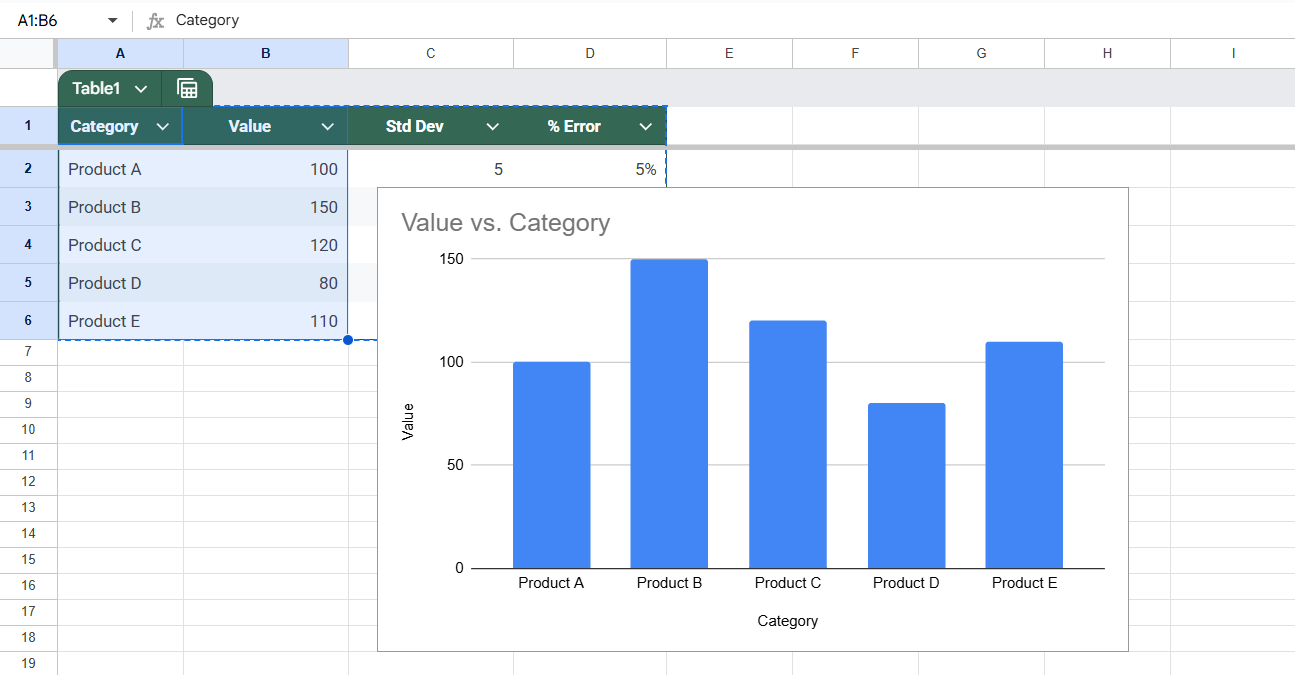
We’ll use the following dataset for demonstration, where each product has a value and a known constant error of ±5 units:
Steps:
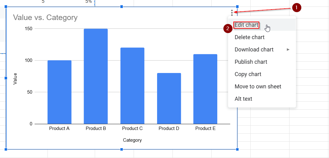
➤ Click on your chart in Google Sheets.
➤ Click the 3-dot menu on the chart and choose Edit chart.
➤ In the Chart editor sidebar, go to the Customize tab.
➤ Expand the Series section.

➤ Scroll down and check the Error bars option.
➤ For Type, select Constant.
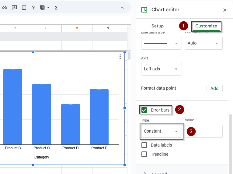
➤ Enter the error amount (e.g., 5) in the box.
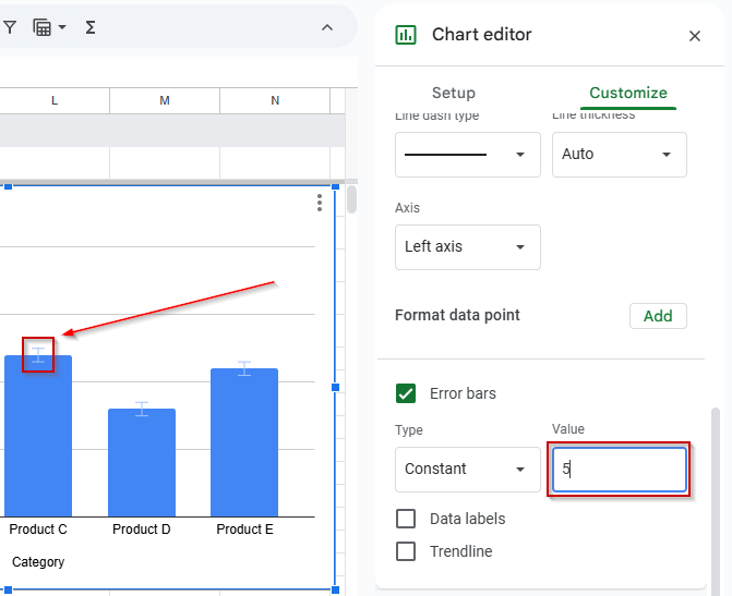
You’ll now see vertical error bars of a fixed size applied to each data point.
Apply Percentage-Based Error Bars in Google Sheets
Google Sheets also lets you add percentage-based error bars using the same chart editing tools as before. Instead of a fixed value, the error margin is calculated as a percentage of each data point. This is ideal when uncertainty scales with the data, like in forecasts or survey results.
We’ll follow the same steps as before, but this time choose Percent as the error bar type and enter the desired percentage.
Steps:
➤ Click on the chart to select it (make sure it’s a Column chart or Line chart).
➤ Click the 3-dot menu on the chart and select Edit chart.
➤ In the Chart Editor sidebar on the right, go to the Customize tab.
➤ Expand the Series section
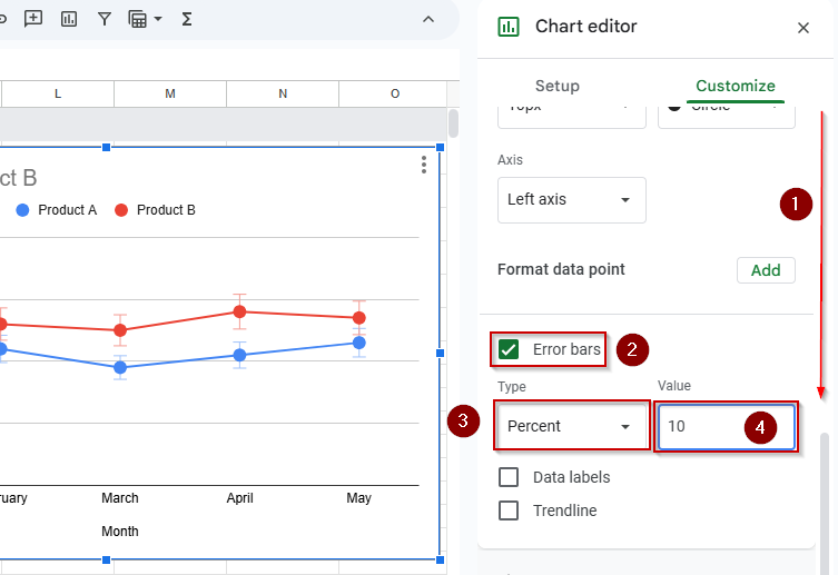
➤ Scroll down and check the box labeled Error bars to enable it
➤ From the Type dropdown, choose Percent
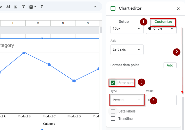
➤ In the Value field, enter the percentage you want to use (e.g., 10)
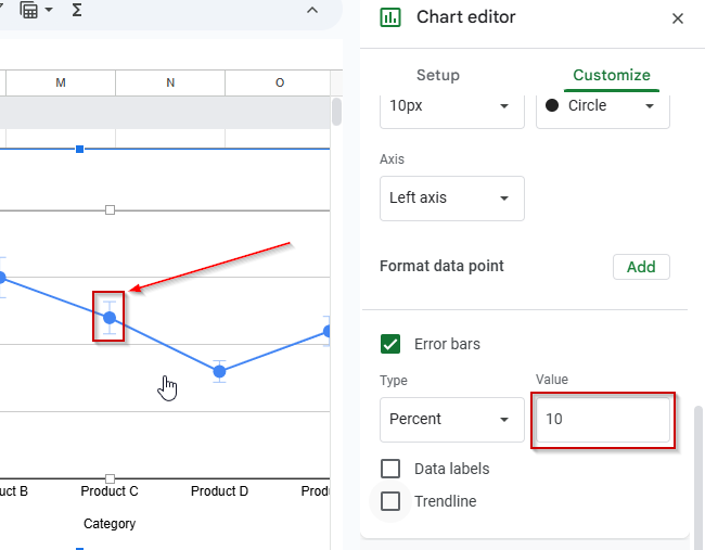
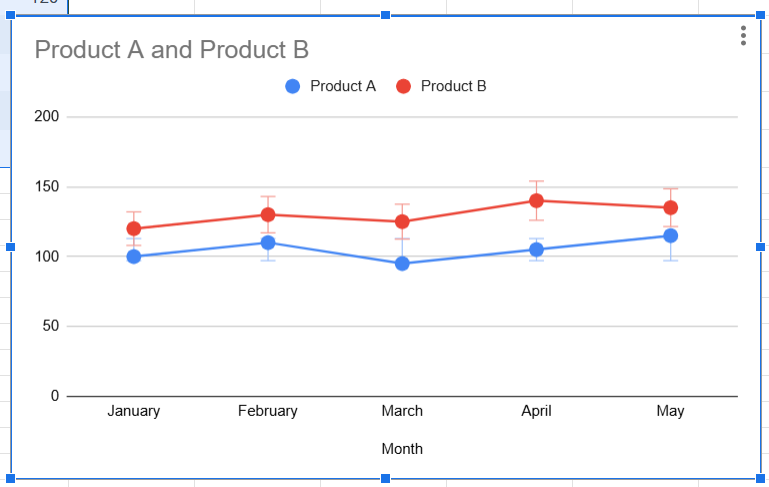
Sheets will now calculate and apply vertical error bars that represent ±10% of each data point’s value, giving you a visual representation of scaled uncertainty.
Use Standard Deviation to Create Dynamic Error Bars in Google Sheets
Just like adding constant or percentage-based error bars, Google Sheets also allows you to show standard deviation as error bars using the same chart editing tools. The difference here is that instead of entering a fixed value or a percent, Sheets will automatically calculate the statistical variability of your data and display that range. This is useful for representing the spread or consistency within your data points.
Steps:
➤ Click on your chart to select it.
➤ Click the 3-dot menu in the top-right of the chart and choose Edit chart.
➤ In the Chart editor panel that appears on the right, click on the Customize tab.
➤ Expand the Series section.
➤ Scroll down and check the box labeled Error bars.
➤ From the Type dropdown, select Standard deviation.
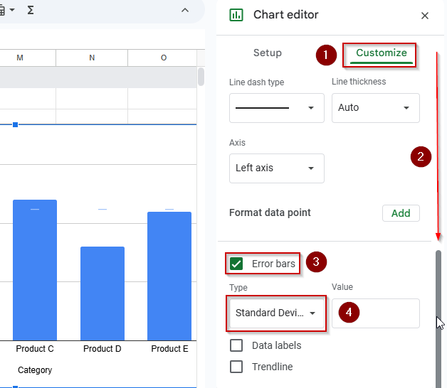
➤ Google Sheets will now calculate the standard deviation of your dataset and apply vertical error bars accordingly
Note:
Your dataset should contain enough numerical values for Sheets to calculate a meaningful standard deviation. This option works best when your chart includes multiple data points in a series.
Customize Error Bars for Individual Data Series in Google Sheets
This time, we’ll focus on charts with multiple series. Instead of applying one setting across the entire chart, Google Sheets allows you to configure each data series independently, giving you precise control over how error bars appear for each line or column.
This is especially useful when each data series has a different type or magnitude of error, for example, when comparing sales forecasts between regions with varying uncertainty levels.
Steps:
➤ Click once on your chart to select it
➤ Click the 3-dot menu in the corner of the chart and choose Edit chart
➤ In the Chart editor sidebar, go to the Customize tab
➤ Expand the Series section
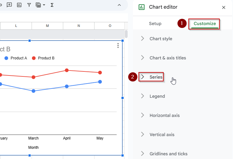
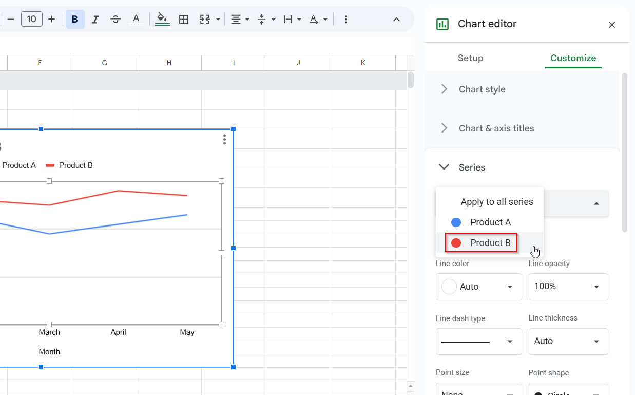
➤ Click the dropdown menu labeled “Apply to all series”
➤ Choose the first series you want to customize (e.g., “Product B”)
➤ Scroll down and check the Error bars box
➤ Choose the Type of error bar you want to apply:
- Constant for a fixed value across all data points
- Percent for error bars based on a percentage of each value
- Standard deviation to let Sheets calculate the variation from the dataset
➤ Enter the error value or percentage as needed
➤ Repeat the process for each additional series by selecting a different one from the dropdown
You’ll now have error bars customized to each series, all in a single chart, which is ideal for layered comparisons or grouped data visualizations.
Frequently Asked Questions
Can I add custom error values in Google Sheets charts?
No, Google Sheets currently doesn’t support custom error bars from cell values. You can only add constant, percent-based, or standard deviation error bars.
What chart types support error bars in Google Sheets?
You can add error bars to column charts, bar charts, line charts, and scatter plots. They are not available for pie charts or area charts.
Can I change the color or style of error bars?
No, as of now, error bars use the default chart color and style and cannot be individually styled or formatted.
Why don’t I see the Error bars option?
Make sure you’ve selected a supported chart type. Also, check that your data has numeric values, as Error bars won’t appear on text-based charts.
Is there a way to simulate custom error bars from a column?
While Google Sheets doesn’t allow this directly, you can create a second data series showing upper and lower bounds and add that to the chart to simulate error ranges.
Wrapping Up
Adding error bars in Google Sheets is a great way to make your charts more transparent and statistically accurate. Whether you’re working with survey data, experiments, or performance metrics, using fixed, percentage-based, or standard deviation error bars helps communicate variability. With a few simple steps, you can improve the quality of your visualizations and make your data stories more complete.