Sparklines are small charts. It fits in a single cell in Google Sheets. Without creating full-size charts, you can understand the data more clearly using sparklines. When you’re working with monthly growth, project progress, or sales data, you can get the information without cluttering your spreadsheet. In this article, you can learn in detail about sparklines, including examples with colour customization and a sparkline progress bar with text.
What is a Sparkline in Google Sheets?
In Google Sheets, a sparkline is a small and simple chart. It is so small and fits within a single cell. It doesn’t require a large space to display visual trends or patterns in a set of numbers, such as sales growth, website traffic, or test results. Sparklines do not have axes, titles, or labels like other charts.
You can use sparklines for:
- Showing visual trends.
- Showing dashboards and reports.
- Saving space compared to large charts.
- Comparing multiple rows of data.
Sparkline Examples with Color Customizations in Google Sheets
There are different types of sparklines in Google Sheets. Line Chart Sparkline, Column Chart Sparkline, Bar Chart Sparkline, and Win/Loss Sparkline are some of the types of sparklines in Google Sheets. You can use any type of sparkline to quickly visualise trends in your data. Follow these steps to explore different examples with sparkline in Google Sheets.
Line Chart Sparkline
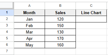
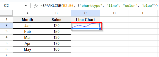
A Line Chart Sparkline is a small line graph inside a single cell that displays a trend or progression in your data. You can use line charts to show changes over time without creating a full chart. Let’s look at the dataset below, where you’re tracking the monthly sales for a product. Follow these steps to create a line chart sparkline.
➤ Click on cell C2 and type this formula:
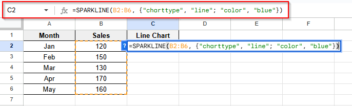
➤ Press Enter and see the blue color line chart in cell C2.
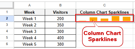
Column Chart Sparkline
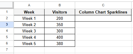
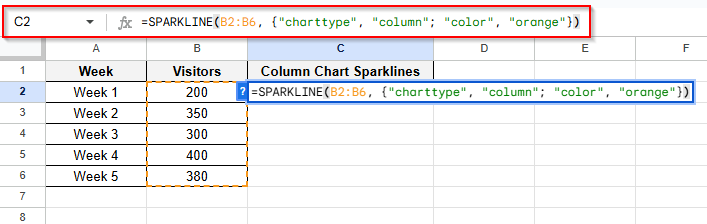
A column chart sparkline is used to show comparisons like weekly traffic, monthly sales, or test scores. Let’s look at the dataset below, where you are tracking weekly visitors. Follow these steps to create a column chart sparkline in Google Sheets.
➤ Click on cell C2 and type this formula:
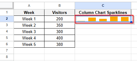
➤ Press Enter and see the orange color column chart in cell C2.
Bar Chart Sparkline
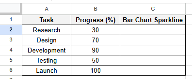
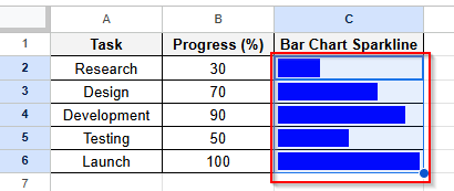
A Bar Chart Sparkline shows a horizontal bar that represents a single value in a cell. It’s used to create progress bars or compare values visually across a list of items. Let’s look at the dataset below, where you are showing multiple tasks’ progress. Follow these steps to create a bar chart sparkline in Google Sheets.
➤ Click on cell C2 and type this formula:
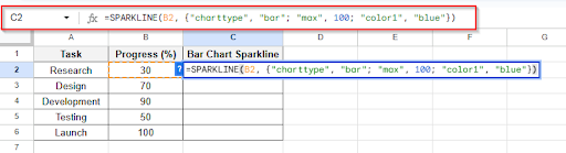
➤ Press Enter and see the blue color bar chart in cell C2
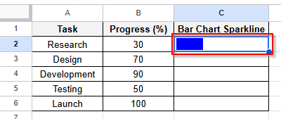
➤ Drag the formula to see the other cells’ bar chart.
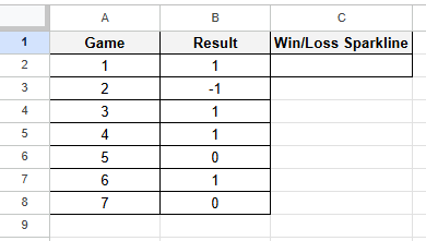
Win/Loss Sparkline
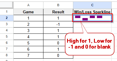
A Win/Loss Sparkline is a chart in a cell that shows binary results like win vs loss, success vs failure, or yes vs no. You can use this chart to see binary values. Let’s look at the dataset below, where the dataset is about gaming results. Follow these steps to create a win/loss chart sparkline.
➤ Click on cell C2 and type this formula:
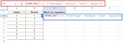
➤ Press Enter and see the purple color win/loss chart in cell C2. A high bar for wins (1), A low bar for losses (-1), A blank space for ties or 0
Sparkline Progress Bar with Text in Google Sheets
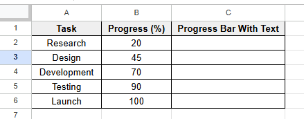
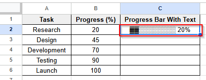
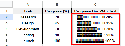
A Sparkline Progress Bar with Text is basically a bar chart sparkline that shows a percentage label in the same cell with text. This chart is very useful to monitor project progress, student grade tracking, budget dashboard and target visualization. You can get a more polished, professional look for your spreadsheet by using this chart. Let’s look at the dataset below, where the task progress is shown. Follow these instructions step by step to show a sparkline progress bar with text.
➤ Click on cell C2 and type this formula:
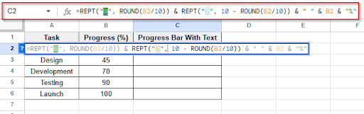
➤ Press Enter and see the progress bar with text in cell C2
➤ Drag down the formula and see the result that shows a progress bar with text.
Frequently Asked Questions
Is it possible to update the sparklines automatically?
Yes, as the data in the source range changes, the sparklines update in real-time automatically.
Is it possible to print sparklines?
Yes, you can print sparklines in Google Sheets like other cell content. To print sparklines in Google Sheets, use the Print > Layout options.
How can I increase a line sparkline’s thickness?
You can increase a line sparkline’s thickness by using this formula:
=SPARKLINE(B2:F2, {"charttype", "line"; "linewidth", 2})
Concluding Words
Sparkline in Google Sheets is a space-efficient way to visualize your data within a cell. It’s very small, but it is very useful when you’re tracking progress, identifying trends, or comparing performance. You don’t need to add a full-size chart or graph to visualize your data. You only need one formula to transform numbers into an easily readable sparkline. We described in detail about sparkline example with color customization and the sparkline progress bar with text in this article. If you have any questions or get stuck in any step, feel free to share your problem in the comment box.