Pie charts are great for showing how individual parts contribute to a whole, but they can quickly become cluttered when too many small categories are involved. When the chart is overloaded with tiny slices, it becomes hard to read and loses its visual impact. To solve this problem, Excel provides a built-in Bar of Pie chart, which pulls the smaller values into a separate bar chart, making your data easier to interpret at a glance.
In this article, you’ll learn how to create and customize a Bar of Pie chart in Excel with step-by-step instructions. We’ll also show you how to adjust the way your data splits between the main and secondary charts, format labels for clarity, and decide when this chart type is the best fit for your dataset.
Steps to create a bar of pie chart in Excel:
➤ Select your dataset that includes category names and their values (e.g., product names and sales).
➤ Insert a Bar of Pie chart from the Insert tab >> Charts menu to automatically group small slices into a separate bar.
➤ Adjust the split using the Format Data Series pane to control how many small slices move to the bar section.
➤ Customize labels, layout, and design by formatting data labels, applying pie explosion, adjusting gap width, and resizing the second plot for a more readable chart.
Steps to create a bar of pie chart in Excel
Creating a Bar of Pie chart in Excel is quick and straightforward. It involves selecting your data, inserting the chart, and customizing how the smaller values are displayed in the secondary bar. We’ll use a sample dataset with 10 products and their sales figures to get started.
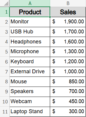
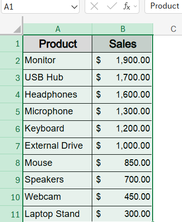
Step 1: Select the Dataset in Excel
Before creating the chart, you need to select the data that will be visualized. This includes the product names and their corresponding values.
Steps:
➤ Open your Excel worksheet containing the data.
➤ Click and drag to highlight the range A1:B11, including both product names and sales figures.
This selection ensures Excel knows exactly which data to include in your Bar of Pie chart.
Step 2: Insert a Bar of Pie Chart from the Ribbon
Once your data is selected, you can insert the Bar of Pie chart from Excel’s Chart options.
Steps:
➤ Go to the Insert tab in the Excel ribbon.
➤ Locate and click the Pie Chart icon within the Charts group.
➤ From the dropdown, choose Bar of Pie (hover to preview before selecting).
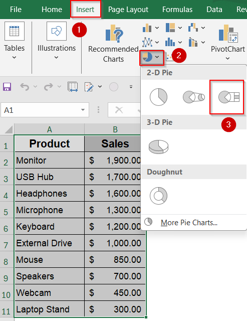
➤ Excel will automatically create the Bar of Pie chart, pulling smaller slices into the secondary bar chart.

Now you have the basic chart framework ready for customization.
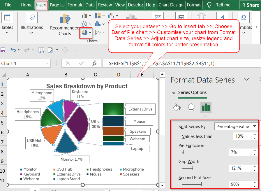
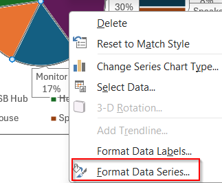
Step 3: Adjust the Split Between Pie and Bar
Excel moves the smallest three slices to the secondary bar chart by default, but you can customize which data appears there.
Steps:
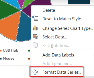
➤ Right-click any slice of the main pie chart.
➤ Select Format Data Series from the context menu.
➤ In the Format Data Series pane on the right, find the Split Series By dropdown.
➤ Choose an option such as Position, Value, or Percentage depending on how you want to split your data.
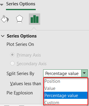
➤ Then you’ll see “Value less than” with a slider/input box.
➤ For example, if you set it to 10, all slices less than 10% of the total will be moved to the bar chart.
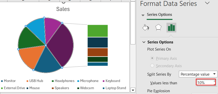
Customizing the split ensures the secondary chart highlights the slices you want to emphasize.
Step 4: Add and Customize Data Labels
Data labels help clarify what each slice and bar represents. You can add and format them to improve your chart’s readability.
Steps:
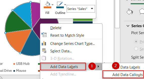
➤ Click once on the chart to select it.
➤ Click again on any slice to select all slices.
➤ Right-click and choose Add Data Labels and select Add Data Callouts or More Options for label customization.
➤ Click on the percentage labels to open the Format Data Labels sidebar.
➤ In the Format Data Labels pane, check options such as Category Name, Value, or Percentage based on your preference.
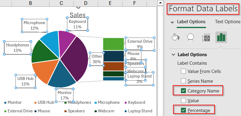
Adding labels makes your chart easier to understand at a glance.
Step 5: Format the Bar of Pie Chart
You can fine-tune the appearance of your chart elements to make the chart more visually appealing and easier to interpret.
Steps:
➤ Right-click on any chart element (e.g., bar, pie slice, legend) >> Choose Format Data Series.
➤ Then, adjust fill colors, borders, or effects according to your preference.
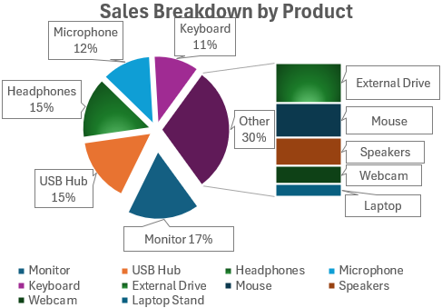
➤ Click on the Chart Title to rename it (e.g., “Sales Breakdown by Product”).

➤ Resize Chart Area by selecting the boxes manually and dragging with the double-arrowed handle.

➤ Also, drag or resize the Legend to optimize layout and clarity
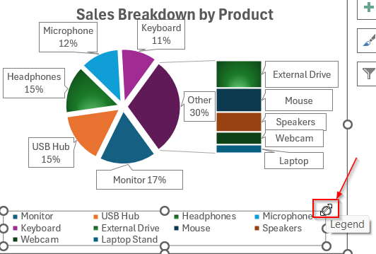
➤ Use consistent colors for related categories to enhance visual understanding.
➤ Adjust the Second Plot Size slider to control bar chart size relative to the pie.
➤ Use the Gap Width slider to increase or reduce spacing between bars and Point Explosion slider in Format Data Series to separate slices visually.
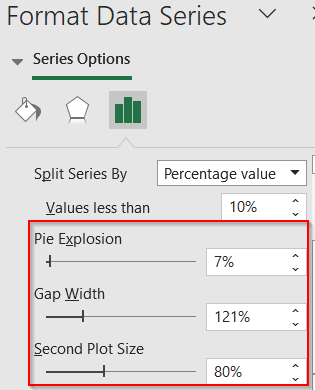
Proper formatting helps your chart look professional and communicate data clearly.
Frequently Asked Questions
What is a Bar of Pie chart in Excel?
A Bar of Pie chart in Excel visually separates the smaller slices from a pie chart and displays them in a connected bar chart, helping readers interpret complex or cluttered pie charts more easily.
When should I use a Bar of Pie chart instead of a regular pie chart?
Use a Bar of Pie chart when your dataset contains many small categories that make a regular pie chart hard to read. This chart provides a clearer breakdown by isolating minor values in a second visual.
Can I change the number of items shown in the bar chart?
Yes, Excel allows you to control how many categories appear in the secondary chart. You can adjust this using the Format Data Series pane by setting a position, value, or percentage-based threshold.
What’s the difference between Pie of Pie and Bar of Pie?
While both chart types split smaller slices into a secondary visual, Pie of Pie uses another pie chart, whereas Bar of Pie uses a bar chart. Choose based on the style that best suits your data layout.
Can I use percentages instead of actual values?
Yes. Excel offers flexible data labeling options. You can display actual values, percentages, or both in your chart, depending on how you want to present the proportions and emphasize key insights.
Wrapping Up
In this tutorial, we learned how to create a Bar of Pie chart in Excel to better visualize small data categories. With just a few clicks, Excel lets you pull minor slices out of a clustered pie chart and display them more clearly in a bar. Whether you’re showcasing product sales, survey results, or budget splits, this chart type is a great way to enhance clarity. Feel free to download the practice file and share your feedback.