Radar charts, also called spider or web charts, are ideal for comparing multiple variables across different categories. They display data points radiating out from a central axis and connect them to form shapes that reveal patterns, strengths, gaps, and overall balance across various categories. Whether you’re comparing employee skills, product features, survey responses, or performance metrics, radar charts help highlight both outliers and consistencies at a glance.
In this article, we’ll walk you through how to create and customize a radar chart in Excel using built-in tools and formatting options to make your chart both functional and visually effective. Let’s get started.
➤ You need a well-structured table with categories in rows or columns and values across multiple series.
➤ Use the Insert Radar Chart option to generate a standard, filled, or marker-style chart.
➤ Customize the chart title, legend, and axes to make it more readable.
Steps to Make a Radar Chart in Excel:
Making a radar chart in Excel is simple once your data is ready. We just need to follow some quick steps to create and format a chart that clearly compares values across multiple categories. Each row in our sample dataset represents a skill category, and each column shows the scores of three employees. We’ll use this to generate a radar chart comparing skill sets.
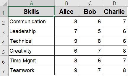
Step 1: Select the Dataset in Excel
Before inserting a radar chart, it’s important to organize your data in a way Excel can interpret. Radar charts work best when you have a set of categories to compare (such as skills or metrics) and at least two series of numeric data (like employees or products). Each row should represent a category, while each column holds values for a different series.
Steps:
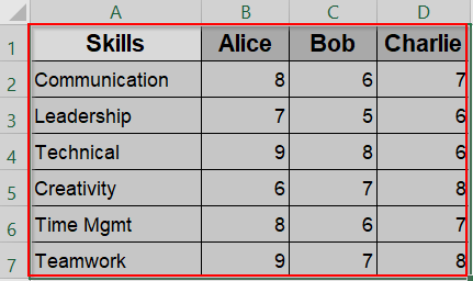
➤ Highlight the full table, including headers (range A1:D7).
➤ Ensure your first column contains category names (skills), and each series (employee) is in its own column.
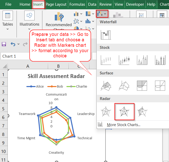
Step 2: Insert a Radar Chart
Once your data is ready, Excel makes it easy to visualize it through a radar chart. This type of chart plots each data series in a circular format, with spokes representing categories. Excel offers three radar chart variations, each useful depending on your visual preference and clarity needs.
Steps:
➤ Go to the Insert tab.
➤ In the Charts group, click the small arrow in the Insert Waterfall, Funnel, Stock, Surface, or Radar Chart icon.
➤ Under Radar, choose Radar for a basic chart, Radar with Markers to highlight points, or Filled Radar to show area differences more clearly.
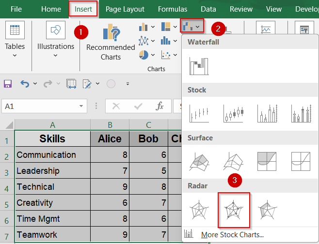
For clearer comparison, “Radar with Markers” is often easiest to interpret.
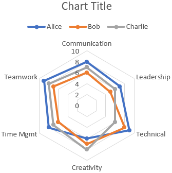
Step 3: Format and Customize the Chart
After creating the radar chart, formatting it properly can make a big difference in how your data is understood. Customizing elements like chart title, axis bounds, legend, or series colors allows you to create a visually appealing and informative chart that communicates your data more clearly.
Steps:
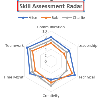
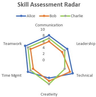
➤ Click on the Chart Title >> Rename to something descriptive like “Skill Assessment Radar”.
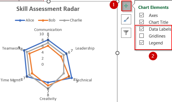
➤ Use the Chart Elements (+) icon to toggle gridlines, data labels, and legend.
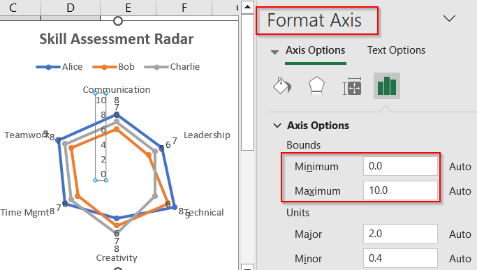
➤ Right-click on axes to adjust the minimum/maximum bounds or label font size.
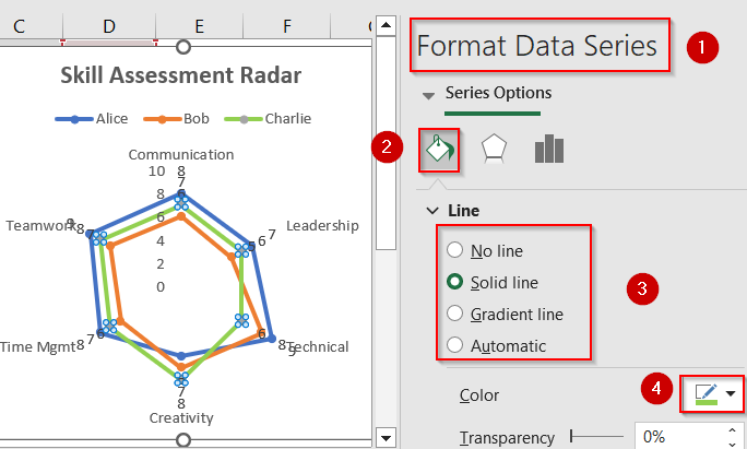
➤ Click on each data series (e.g., Alice) >> Format Data Series >> Change line style or color.
➤ You can also remove Data Labels from Chart Elements or modify line styles to reduce clutter.
Now you have your customized Radar chart in Excel.
Frequently Asked Questions
Can I use radar charts for non-numeric data?
Radar charts only support numeric values. Text or categorical data without numerical scores cannot be plotted, as the chart relies on quantitative measurements to display points accurately along each axis.
How many data series can I include?
You can include multiple data series in a radar chart, such as comparing different individuals or departments, but it’s best to limit it to 3–5 series to keep the chart clear and readable.
What’s the difference between radar and filled radar charts?
A radar chart displays just the outlines connecting data points. A filled radar chart shades the area within the shape, making it easier to visually compare the size and spread of different data series.
Can I rotate the radar chart?
Radar charts are circular and don’t rotate like bar or column charts. However, you can adjust the starting axis by reordering your data manually or using a helper column to shift the first category.
How do I show values on the chart?
Click the chart and use the green plus icon to enable data labels. Then right-click on the labels and choose Format Data Labels to adjust their position, visibility, and number formatting as needed.
Wrapping Up
In this tutorial, you learned how to create and customize a radar chart in Excel to effectively visualize multi-dimensional data. Whether you’re analyzing employee performance, tracking project KPIs, or comparing survey responses, radar charts provide a clear and compelling way to highlight patterns and insights across multiple categories. With thoughtful formatting, they can become a standout feature in your reports or dashboards. Feel free to download the practice file and share your feedback.