Gantt charts are an excellent way to visualize project timelines and track task progress in a clear, visual format. While Excel doesn’t have a dedicated Gantt chart type, you can create one easily using a stacked bar chart combined with some formatting tweaks. This approach helps you monitor start dates, durations, and the overall flow of your project at a glance.
In this article, you’ll learn how to build and customize a Gantt chart in Excel with step-by-step instructions. We’ll walk through preparing your data, inserting the chart, formatting bars to represent tasks correctly, and adjusting the timeline for maximum clarity.
Steps to create a Gantt chart in Excel:
➤ Prepare a dataset with tasks, start dates, and durations.
➤ Insert a stacked bar chart based on the Start Date column to visualize the timeline.
➤ Add Duration as a new series and format the Start Date series to be invisible so only durations show.
➤ Reverse the task order on the vertical axis for natural top-to-bottom flow.
➤ Customize labels, colors, and chart layout to improve readability.
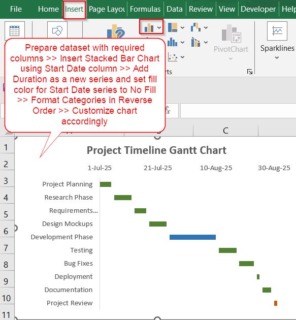
Steps to Create a Gantt Chart in Excel
Creating a Gantt chart in Excel is straightforward once you understand the role of stacked bars and how to format them. We’ll use the following sample dataset to illustrate the process.
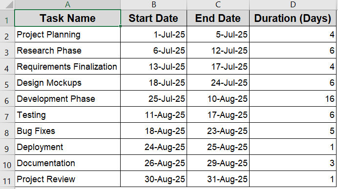
Step 1: Set Up Your Dataset and Insert a Stacked Bar Chart
Before creating a Gantt chart, it’s essential to start with a clean, well-structured dataset. Your dataset should include Task Name, Start Date, End Date and Duration inserted in separate columns. The Start Date and End Date should contain valid date values, while the Duration should be purely numeric to reflect the number of days each task will take.
Steps:
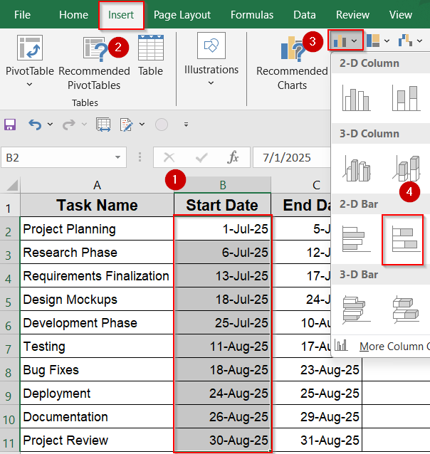
➤ Once your data is ready, select the Start Date column (B2:B11).
➤ Go to the Insert tab >> Choose Bar Chart >> Select Stacked Bar.
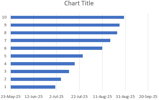
Excel will insert a stacked bar chart where each bar is divided into two parts, one for the start date and another for the duration. These two segments are the building blocks of your Gantt timeline.
Step 2: Add Task Names and a New Series
By default, Excel doesn’t label the vertical axis with your task names, making the chart harder to interpret. Let’s see how to display task labels clearly on the side and add another series to the chart to create the Gantt effect.
Steps:
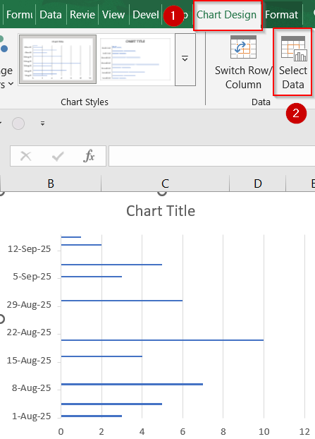
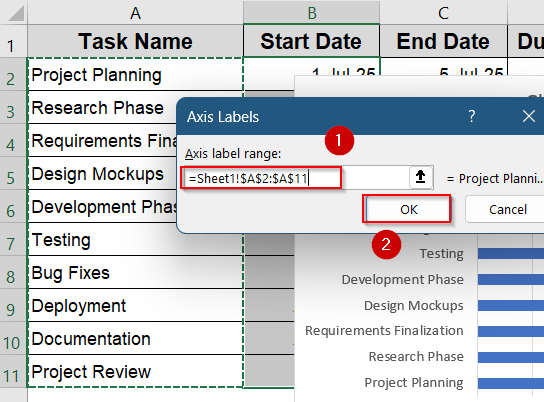
➤ Select the chart and go to the Chart Design tab >> Choose Select Data.
➤ Under Horizontal (Category) Axis Labels, click Edit.
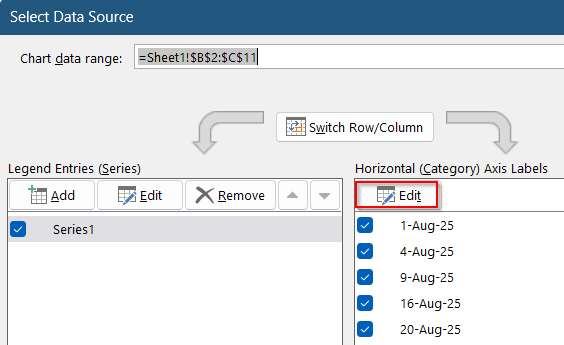
➤ Select the range A2:A11 ( Task column) >> Click OK to display all the names at the vertical axis.
➤ Click on Add in the same dialog to add Duration as your new series.
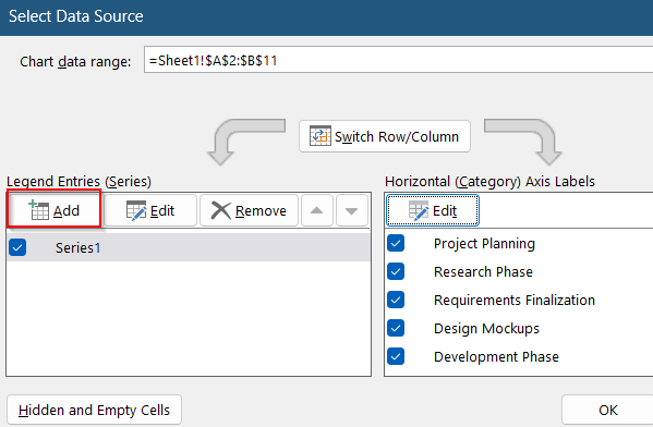
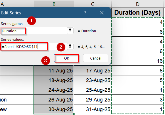
➤ Select range D2:D11 as your series values and give a relevant name like Duration.
➤ Click OK to confirm.
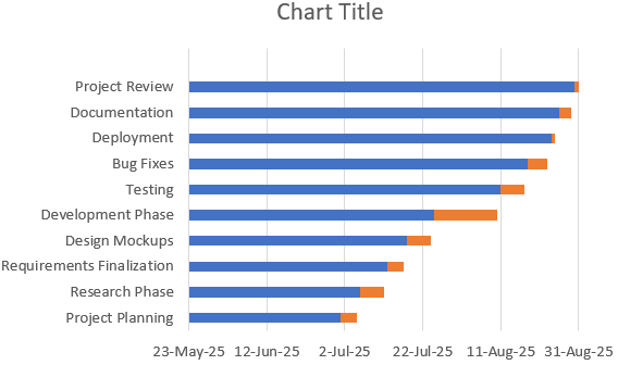
Now we have our chart showing Task Names along with a new series Duration in orange.
Step 3: Hide the Start Date Bars for a True Gantt Look
To make the Gantt chart visually accurate, you need to hide the Start Date portion of each bar. This step leaves only the Duration section visible, aligning the bars with the actual start time.
Steps:
➤ Click on any of the Start Date bars (usually the blue portion) to select all.
➤ Right-click the bars >> Click on Fill drop-down and select No Fill.
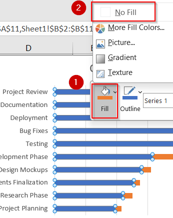
This effectively removes the visual block that represents the Start Date while retaining its spacing function, producing the classic Gantt layout.
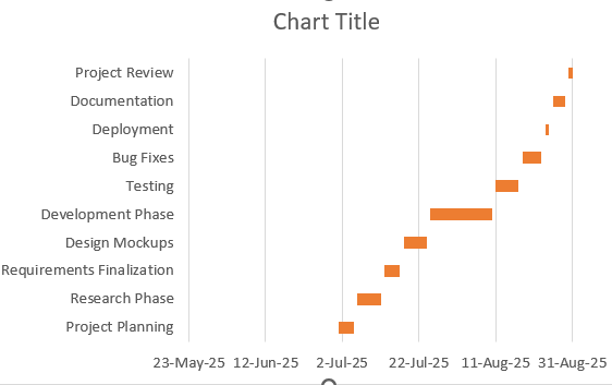
Step 4: Reverse Task Order for a Top-to-Bottom Timeline
Excel naturally lists tasks from bottom to top, which can feel counterintuitive. Reversing the order makes the top of the chart reflect the beginning of your task list.
Steps:
➤ Right-click on the vertical axis >> Choose Format Axis.
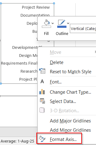
➤ Scroll down and check Categories in reverse order.
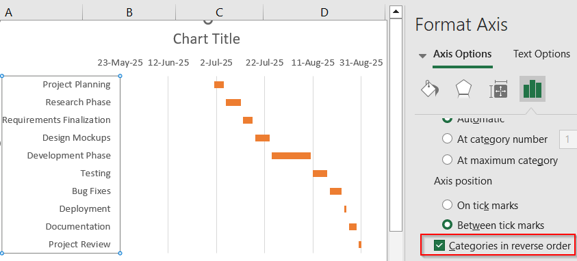
Now, your task list will flow from top to bottom like a traditional Gantt chart layout.
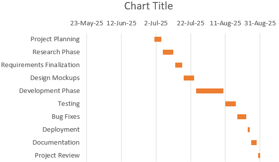
Step 5: Format the Gantt Chart for Clarity and Visual Appeal
A well-formatted Gantt chart not only looks professional but also communicates your project plan more effectively. In this final step, you’ll polish the design for readability and style.
Steps:
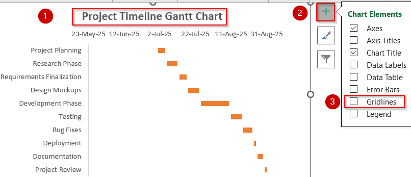
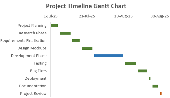
➤ Add a clear chart title, such as “Project Timeline Gantt Chart“.
➤ Go to the Chart Elements (+) icon and uncheck Gridlines for better clarity.
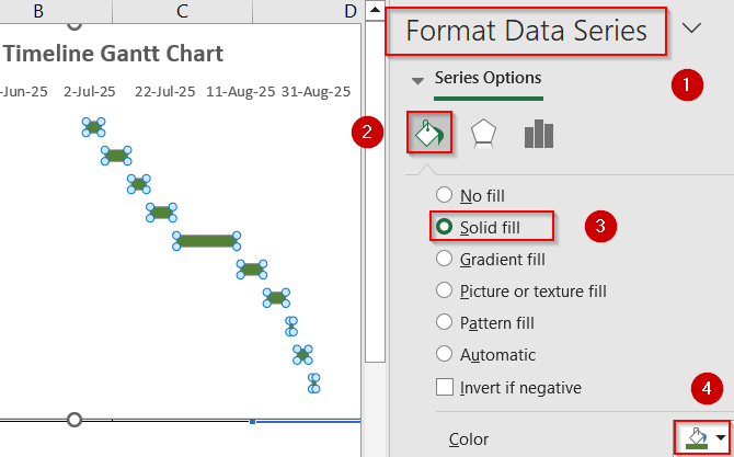
➤ Right-click the Duration bars and click Format Data Series >> Click on Fill & Line to change their color and use different colors to show phases or categories.
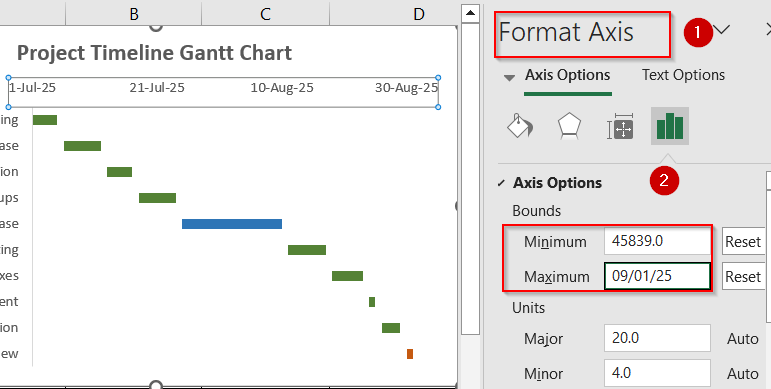
➤ Right-click horizontal dates and open the Format Axis pane.
➤ In the Bounds section, set the Minimum value to match your earliest Start Date (Excel will convert it into a serial number automatically).
➤ Set the Maximum value to slightly exceed your latest End Date to allow space for the full project timeline.
Now you have your fully customized Gantt chart ready for presentation.
Frequently Asked Questions
What is a Gantt chart used for?
A Gantt chart is used to visually represent project tasks along a timeline. It helps teams plan, schedule, and monitor progress by showing start dates, durations, and dependencies clearly in a horizontal layout.
Can Excel update the Gantt chart automatically?
Yes, by using functions such as TODAY and referencing dynamic date ranges, your Gantt chart can refresh automatically to reflect the current date and task status, making it useful for ongoing project tracking.
Can I show progress in the Gantt chart?
Yes. You can add a third series to the stacked bar chart that represents task completion. Format this portion with a different color to show which parts of each task are already completed.
Is there a built-in Gantt chart in Excel?
No, Excel doesn’t include a built-in Gantt chart type. However, you can create one manually using stacked bar charts and formatting tricks, which gives you flexibility to customize and manage timelines effectively.
Wrapping Up
In this tutorial, we learned how to create a functional Gantt chart in Excel using stacked bar charts and a clear project dataset. By carefully formatting the start dates and durations, reversing task order, and customizing colors and labels, you can build an effective timeline visualization. Whether you’re managing a simple to-do list or a complex project, this Gantt chart method helps keep your schedule on track and your team aligned. Feel free to download the practice file and share your feedback.

