When working with large datasets, finding data quickly can be a challenge. Google Sheets makes this easier with pivot tables that let you summarize your data in just a few clicks. Whether you are tracking sales, comparing performance, or spotting trends, pivot tables help you see the bigger picture without writing complex formulas. In this article, we’ll walk you through everything from creating and customizing pivot tables to using advanced features like calculated fields, filters, and pivot charts.
What is a Pivot Table in Google Sheets?
A pivot table is a powerful feature in Google Sheets that lets you reorganize and summarize your data with ease. Instead of scrolling through rows and columns, you can instantly group information, calculate totals, and highlight patterns in a clean, interactive table. It’s one of the fastest ways to turn raw data into meaningful insights without writing any formulas.
Creating a Pivot Table in Google Sheets
Using the Insert option, you can create a pivot table in Google Sheets. You need to choose your data range and click the Pivot table option to create a pivot table.
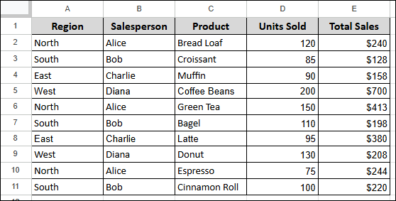
Suppose we have a sample dataset containing Region, Salesperson, Product, Units Sold, and Total Sales. Now, we will demonstrate how to create a pivot table to summarize the units sold for each product.
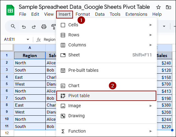
➤ To begin, select your entire data range and click Insert > Pivot table from the menu bar.
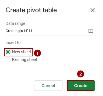
➤ In the Create pivot table dialog box, select New sheet and hit Create.
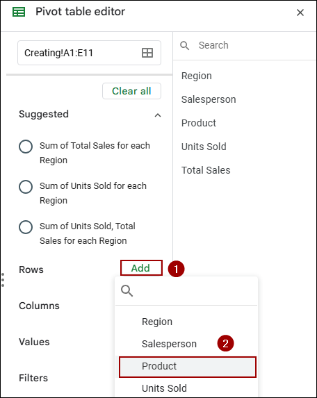
This will open a new sheet with an empty pivot table and the Pivot table editor on the right side of your screen.
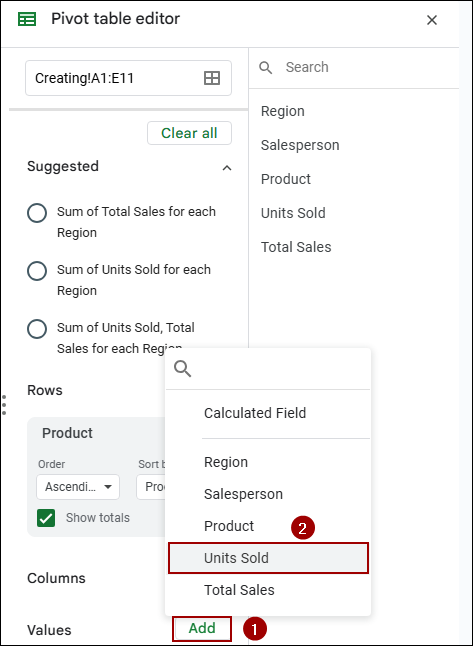
➤ In the Pivot table editor, under Rows, click Add and select Product.
This will list each unique product as a row in your pivot table.
➤ Next, to sum the units sold for each product, under Values, click Add and select Units Sold.
The pivot table will automatically default to summarizing by SUM, which is what we need.
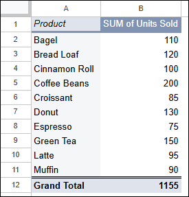
As a result, your pivot table will instantly populate, displaying each unique product and the total SUM of Units Sold for that product, along with a Grand Total. This demonstrates how easily you can use pivot tables to gain quick insights from your raw data.
Customizing Rows, Columns, and Values in Pivot Table
Pivot tables in Google Sheets are highly flexible when it comes to how your data is arranged. You can change what appears in rows, columns, or values with just a few clicks. In this section, we will show you how to customize each part to show Total Sales broken down by Salesperson and Region.
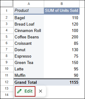
➤ Start by clicking the Edit option from the pivot table.
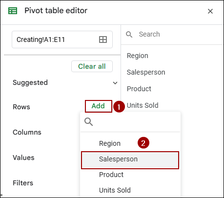
➤ In the Pivot table editor, under Rows, click Add.
➤ Choose Salesperson from the dropdown menu.
➤ Under Columns, click Add.
➤ Select Region from the dropdown menu.

➤ Under Values, click Add.
➤ Choose Total Sales from the dropdown menu.
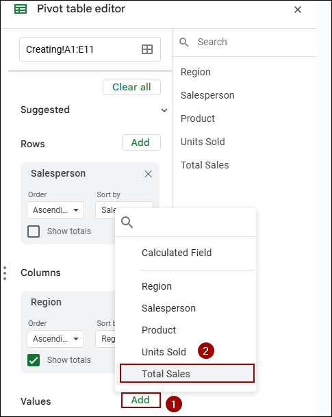
Finally, the pivot table will display the SUM of Total Sales for each salesperson across different regions, along with row and column Grand Total summaries.

Sorting Pivot Table Data
You can easily change the sort order of your pivot table data from the Pivot table editor. Here, we will sort by the sum of total sales.
➤ In the Pivot table editor, under the Rows section for Product, locate the Sort by dropdown menu.
➤ Click the dropdown and select SUM of Total Sales.
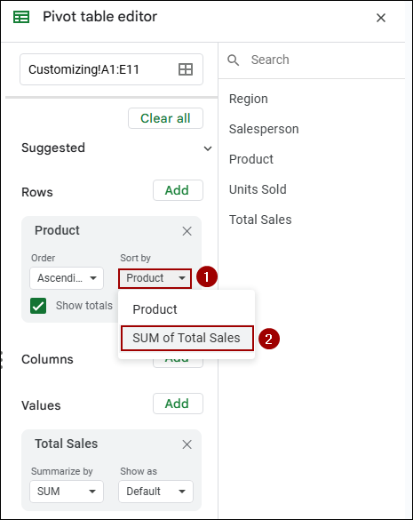
As a result, the products in your pivot table will now be sorted based on their SUM of Total Sales. This allows you with a quick overview of top-performing or lowest-performing products.
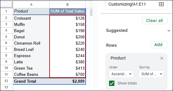
Visualizing Pivot Tables with Pivot Charts
Charts help turn your pivot table insights into clear, visual stories. Instead of analyzing raw numbers, you can instantly see trends, comparisons, and patterns. In this section, we will show you how to create pivot charts directly from your pivot table in Google Sheets.
➤ Select the data range in your pivot table that you want to chart, including the headers and the Grand Total row.
➤ Click Insert > Chart from the menu bar.
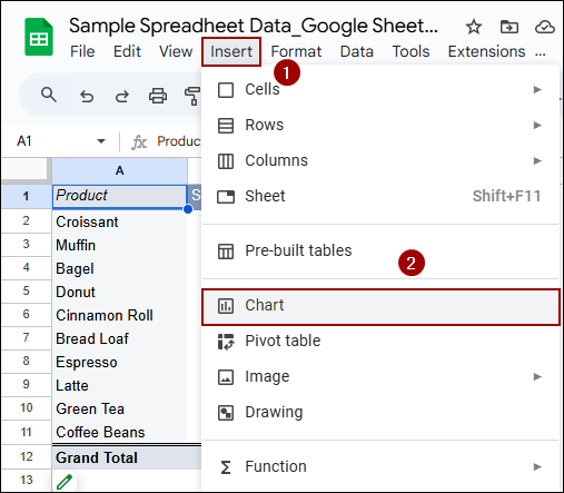
This action will open the Chart editor sidebar.
➤ In the Chart editor, under the Setup tab, select Pie chart as the Chart type.
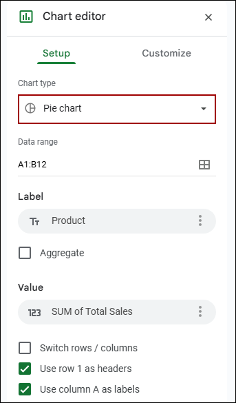
As a result, a pie chart will be generated, visually representing the proportion of each product’s total sales, along with their respective percentages.

Using Calculated Fields in Pivot Tables
Sometimes you need more than just basic totals or counts in your pivot table. Calculated fields let you create custom formulas within the pivot, such as averages or profit margins. In this section, we’ll show you how to add and use calculated fields to generate the average price.
➤ In the Pivot table editor, under the Values section, click Add.
➤ Select Calculated Field from the dropdown menu.

➤ Now, rename the calculated field to Average Price.

➤ In the Formula box for Calculated Field 1, enter the following formula.
='Total Sales' / 'Units Sold'
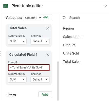
This formula divides the Total Sales by Units Sold to give the average price.
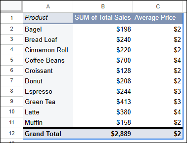
This way in the new column named Average Price, will display the calculated average price for each product.
Grouping Data Inside Pivot Tables
Grouping helps you organize raw data into meaningful categories, like sales ranges or product types. Instead of analyzing every single item, you can view summaries for grouped data. In this section, we will show you how to group sold units of products according to their count inside your pivot table.
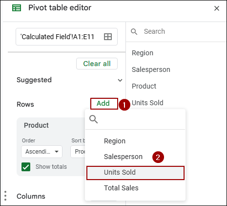
➤ In the Pivot table editor, under Rows, click Add.
➤ Choose Units Sold from the dropdown menu.
Now, we will create a grouping rule for the Units Sold to categorize them into specific intervals.
➤ Right-click on any cell within the Units Sold column in your pivot table.
➤ From the context menu, select Create pivot group rule.
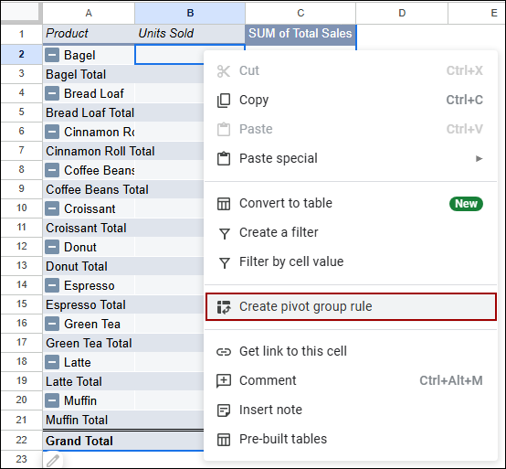
This will open the Grouping rule dialog box.
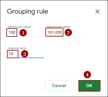
➤ In the Grouping rule dialog box, specify your grouping criteria: Minimum value: 100, Maximum value: 101-200, and Interval size: 10.
➤ Click OK.
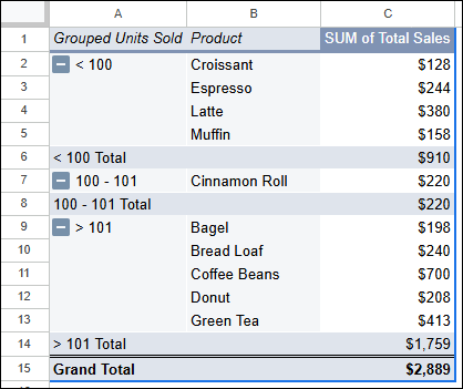
As a result, the Units Sold in your pivot table will be grouped into the defined intervals, providing a summarized view of products within those sales ranges.
Filtering Pivot Tables with Custom Formulas
Pivot tables become even more powerful when you can filter data using your own rules. With custom formulas, you can apply advanced logic, like filtering based on text conditions or numerical limits. In this part, we will show you how to use formula-based filters to show products that start with C.
First, we need to add Product to the Filters section of your pivot table.
➤ In the Pivot table editor, under Filters, click Add.
➤ Choose Product from the dropdown menu.

➤ Under the Filters section, click the drop-down menu for Product.

Here, we will apply a custom formula to filter the products.
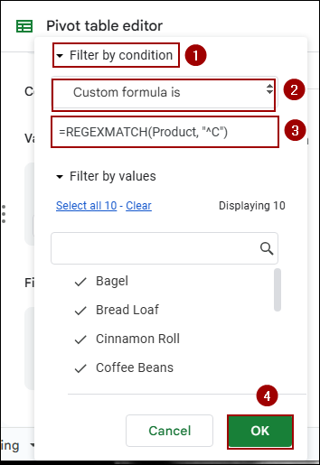
➤ From the options, select Filter by condition.
➤ In the next dropdown, choose Custom formula is.
➤ In the formula box, enter the following regular expression formula.
=REGEXMATCH(Product, "^C")
This formula will match any product name that begins with the letter “C“.
➤ Finally, click OK.
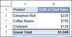
As a result, your pivot table will now display only products whose names start with “C“, such as Cinnamon Roll, Coffee Beans, and Croissant, along with their corresponding SUM of Total Sales.
Refreshing Pivot Tables after Data Changes
Pivot tables don’t always update automatically when your source data changes. If you’ve added new rows or modified values, you may need to refresh the pivot to see the latest results. In this part, we will show you how to manually refresh a pivot table in Google Sheets.
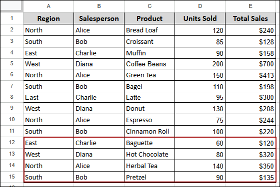
First, add your new data to the original dataset. For instance, new sales records for Baguette, Hot Chocolate, Herbal Tea, and Pretzel have been added to rows 12-15 in the source data.
Now, we will refresh the pivot table to include this newly added data.
➤ Click Edit from the pivot table.
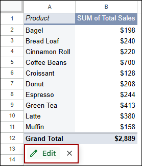
This will open the Pivot table editor sidebar.
In the Pivot table editor, check the Data range at the top. Ensure it now covers all your data, including the newly added rows. If not, manually adjust the range.
➤ Adjust the range to: Refreshing!A1:E15.
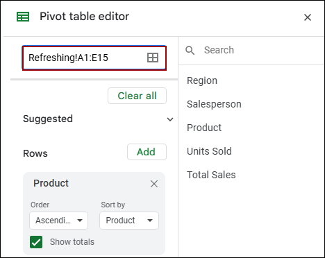
As a result, your pivot table will update, including the new products and their corresponding sales.

Deleting a Pivot Table in Google Sheets
Once you are done analyzing data, you can remove the pivot table from your sheet.
➤ Select all the cells that comprise your pivot table.
➤ Press the Delete button on your keyboard.
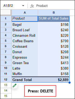
Finally, the entire pivot table, along with its content, will be removed from your sheet.
Frequently Asked Questions
What’s the difference between a pivot chart and a regular chart?
A pivot chart is linked to a pivot table and updates automatically based on the pivot’s structure. A regular chart is built directly from the raw data and doesn’t offer the same dynamic grouping.
Is there a limit to how much data I can use in a pivot table?
Pivot tables in Google Sheets handle large datasets well, but performance may slow down with tens of thousands of rows.
Can I filter pivot tables using conditions or custom logic?
Yes. Google Sheets allows filtering using basic dropdowns or custom formulas using conditions like text match or number thresholds.
Concluding Words
Above, we have explored all the essential methods to use pivot tables effectively in Google Sheets. Starting from building your first pivot to applying advanced features like filters, grouping, and calculated fields. Now you can confidently organize and analyze your datasets with just a few clicks. If you have any questions, feel free to drop them in the comment section below.
