In most workplaces, the ability to display visual data for presentation is a highly required skill. In this case, Excel is one of the best tools that help people to make graphs, charts, and tables to show presentations in a better way.
And creating a line graph in Excel is one of the easiest and most effective ways to compare trends over time or across categories. Instead of just looking at raw numbers in a table, a line graph helps you clearly see how values go up and down.
So, in this article, we’re going to learn how to make a line graph in excel with sets of data. Let’s dive in.
➤ Firstly, arrange your data in two data sets.
➤ Now highlight the datasets.
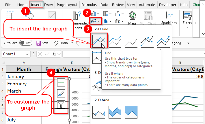
➤ Then go to Insert → Charts → Line → Line with Markers (or simple Line).
➤ Excel will insert a line graph with both data sets displayed in different colors.
➤ Customize the chart by adding a title, axis labels, data markers, and a legend for better understanding.
Now let’s have a step-by-step guideline on making a line graph and giving it a final look with some additional troubleshooting tips.
Overview of a Line Graph in Excel
A line graph in Excel connects data points with straight lines, making it easier to see trends, changes, and comparisons over time.
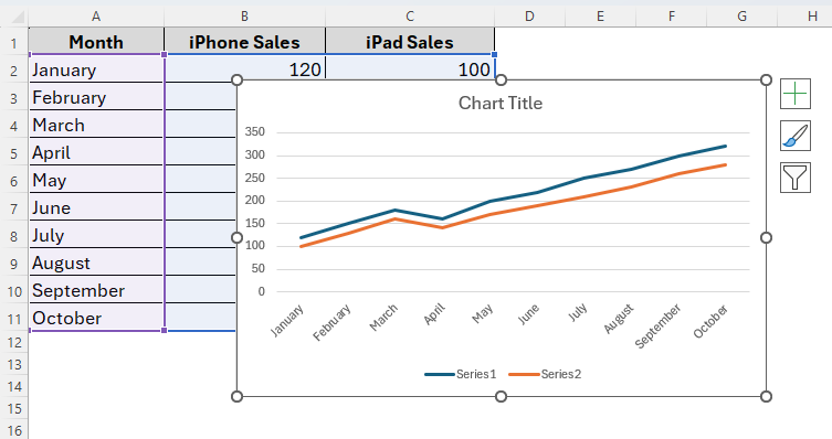
For example, imagine you want to compare sales of iPhones and iPads over 10 months. If you just list the numbers in a table, it’s hard to spot trends. But with a line graph, you can instantly see which months had higher sales, when one product outperformed the other, and how both products are growing overall.
Using line charts has a number of benefits. Especially they’re useful when:
- You want to show trends over time like sales, revenue, or temperatures.
- You need to compare two or more data sets at once.
- You want a clear and professional visualization for presentations or reports.
Steps to Make a Line Graph with Two Sets of Data
Excel offers a variety of charts and graphs. But a line graph would be one of the best varieties of excel charts that’s especially suited for finding similarities or differences between two sets of data. It showcases changes over time. So, unlike bar graphs in excel, a line graph makes it easier to determine small changes and compare data sets.
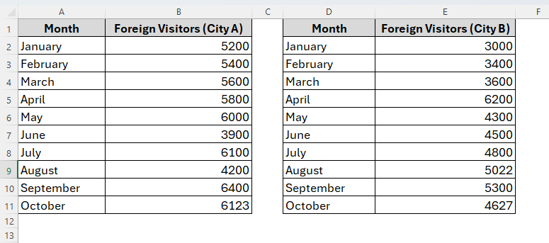
For example, today we’ve two data sets illustrating the number of foreign visitors in two different cities from January to October. Now we’ll find out the increase and decrease in the numbers of foreign visitors in both cities by creating a line chart.
Below are the steps to follow.
Step 1: Inserting the Line Graph
➤ To begin with, select both data ranges with non-adjacent selection.
➤ Firstly, drag to select A1:B11 (left table). Then hold Ctrl (Windows) or Cmd (Mac), and then also select D1:E11 (right table).
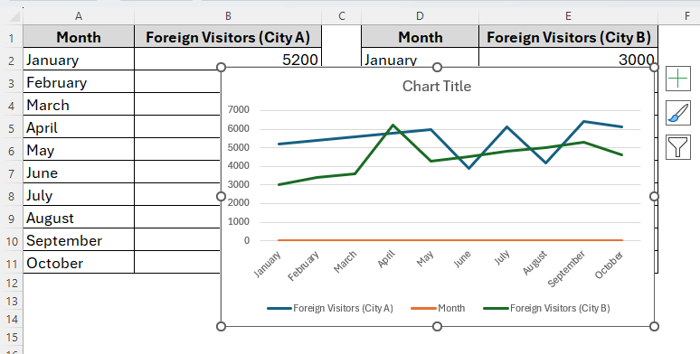
Now we have two separate blocks selected as we can see in the image above.
➤ Once we’ve selected the datasets, then go to Insert → Charts → Line (2-D Line). You can also choose a 3-D line if you prefer.
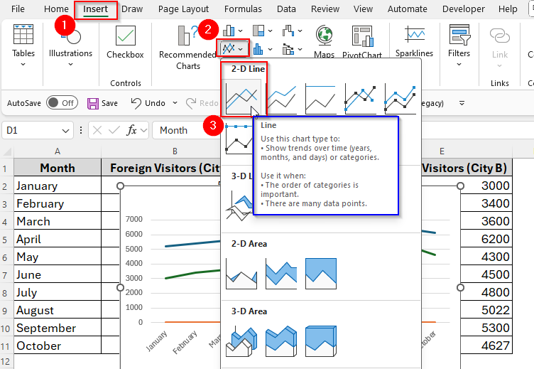
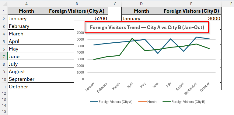
➤ By doing so, excel will create a chart with Months from A2:A11 on the horizontal axis and two lines (one from column B and one from column E) comparing the number of Foreign Visitors.
If Excel doesn’t line up the months correctly, don’t worry. We’ll fix it in the next step.
Step 2: Making Sure the Axis and Series are Correct
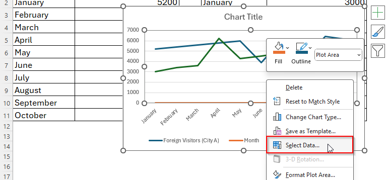
Sometimes Excel can make mistakes while indicating the axis and series properly to the datasets. In this case, we can still fix them after the line graph has been created and here’s how it works.
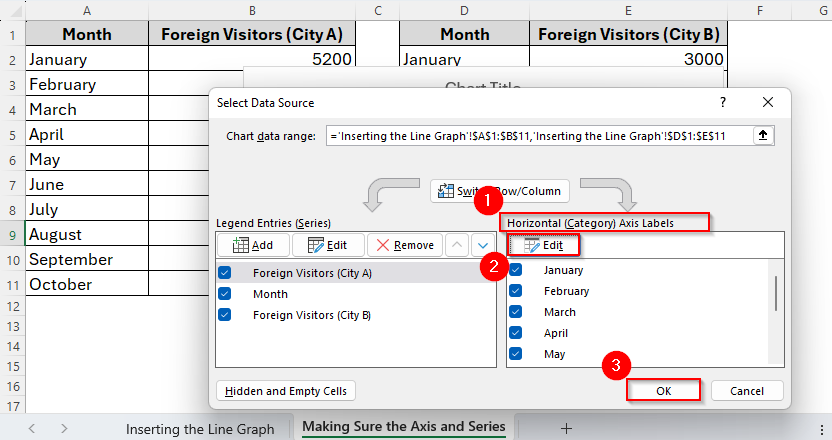
➤ Right-click the chart and choose Select Data.
➤ Under the Legend Entries (Series), you’ll see three different series. Firstly, click on the Foreign Visitors (City A) series and select Edit.
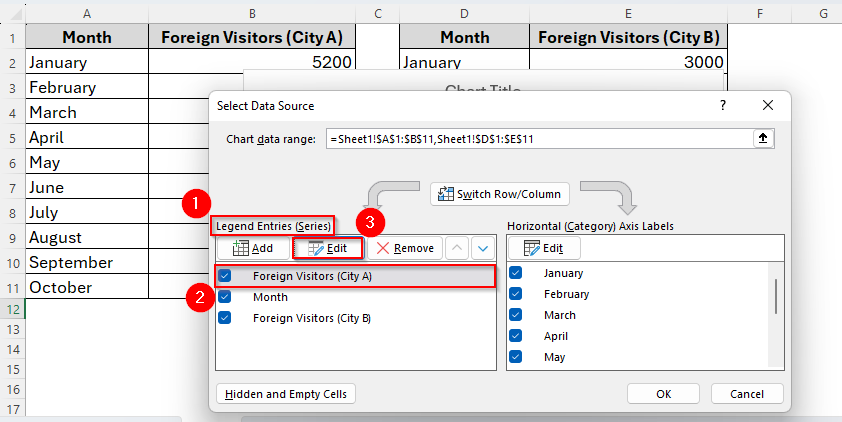
➤ Now we can fix the Series Name and Series Values accordingly. Then click Ok as the following image.

We can also fix the second and third series in the same way. But as our references are accurate in both series based on our datasets, we just choose Ok and move to the next step.
➤ Next, go to the Horizontal (Category) Axis Labels → Edit. Then select A2:A11 and click OK to close.
Now both lines should share the same Month axis (Jan–Oct) and plot correctly, if they weren’t before.
Step 3: Customize the Graph
As we have already created the line chart, now it’s time to customize it to give it a clearer visual. For example, by default, the chart won’t have a title. So, we’ll give it a suitable title. Also, we can adjust the colors if the default colors are not suited. Additionally there are some other features we can change accordingly and here we go:
➤ Chart Title: Click on the Chart Title and type something you like or better suited to the datasets. For example, here our title is Foreign Visitors Trend — City A vs City B (Jan–Oct).
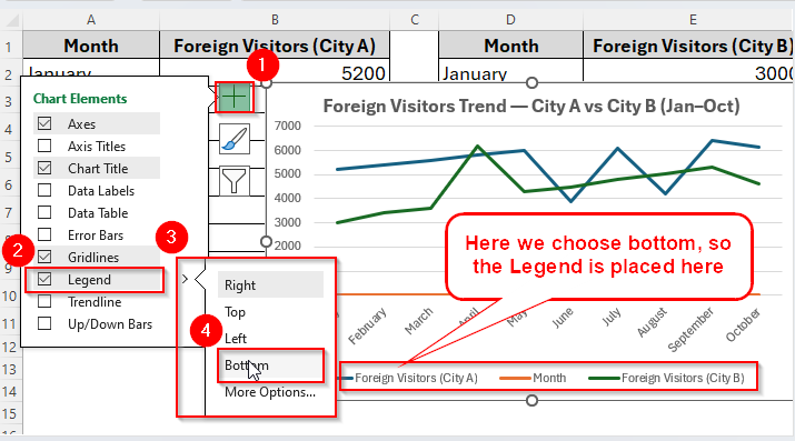
➤ Legend: To move the Legends position, click on the chart and go to Chart Elements, enable Legend if it is not and then choose your required position.
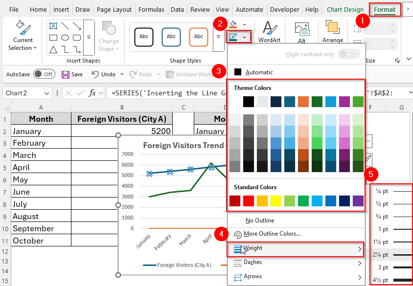
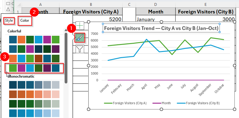
➤ Colors/line thickness (optional): We can also change the colors and thickness of the lines. To do so, select a line, go to Format from the Ribbon and adjust Line thickness or style or color so both lines are distinct.
➤ Therefore, we can change the color and style from the Chart Style and then choose the suitable color and style as the image shows below.
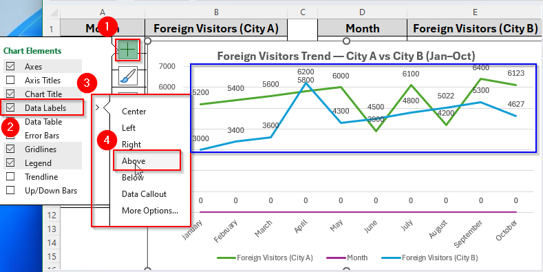
➤ Data Labels: To add Data Labels, select Chart Elements → Data Labels → choose Above or Right to show values.
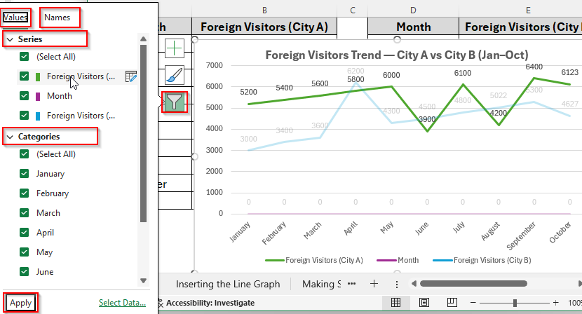
➤ Additionally, you can make some other changes like the values and names from the Chart Filters as in the following image.
Additional Quick Troubleshooting Tips
While creating a line graph we may often face some minor problems and we can also fix them with some simple steps. Here we discuss some common issues and possible ways to solve them.
➤ Problem-1: Months show as 1,2,3… instead of names
- Re-set the Horizontal Axis Labels to A2:A11 (Step 2).
➤ Problem-2: You get many tiny series instead of two lines
- In Select Data, click Switch Row/Column.
➤ Problem-3: Two series have the same name in the legend
- Edit each series name (Step 2) to unique names like City A and City B.
Frequently Asked Questions (FAQs)
Can I add more than two data sets in a line graph?
Yes, you can add as many as you want. Excel will simply add more colored lines to the same graph.
What’s the difference between a Line Chart and a Line Chart with Markers?
A simple Line Chart only shows connected lines, while Line with Markers shows dots at each data point. Markers are helpful when you want to highlight exact positions.
Can I switch the axis like show products on the horizontal axis instead of months?
Yes, you can. To do so, just right-click the chart → Select Data → Switch Row/Column. This changes how Excel plots the data.
Concluding Words
Now that you know how to make a line graph with two sets of data in Excel, you can easily use it to track and compare trends. Whether it’s sales, expenses, performance, or survey results, a line graph makes your data more meaningful and easier to explain.
With just a few clicks, you can turn plain numbers into a professional chart that shows clear insights. Next time you’re working on a report or presentation, try a line graph, it may be the simplest yet most powerful way to tell your data’s story.