Excel Pro Tips
How to Remove Outliers in Excel (5 Different Ways)
Learn how to remove outliers in Excel using TRIMMEAN, IQR logic, standard deviation, or manual methods to clean up your data analysis.
Read article

Tasmia Rahim holds a B.Sc in Electrical Engineering with a focus on automation and embedded systems, supporting logic-driven spreadsheet workflows. With 2 years of Excel and Google Sheets experience, she works with conditional formatting and basic automation. She is interested in using macros and ActiveX controls to simplify Excel tasks and improve usability.
Articles by Tasmia Rahim are developed under the guidance of ExcelInsider’s core training program and are technically reviewed by Nehad Ulfat, lead spreadsheet consultant, to ensure accuracy and user-centric value.
Learn how to remove outliers in Excel using TRIMMEAN, IQR logic, standard deviation, or manual methods to clean up your data analysis.
Convert Word to Excel with columns by using plain text import or automate the process with VBA to extract tables accurately into Excel.
Extract data from PDF to Excel using copy-paste, Power Query, Word, or Adobe Acrobat to convert tables while preserving structure.
Learn how to split text into columns automatically in Excel using formulas like LEFT, MID, RIGHT, FILTERXML, TEXTSPLIT, and more.
Learn how to combine multiple Excel files into one workbook with separate sheets using manual methods, Power Query, or VBA automation.
Learn how to convert decimal values to hexadecimal in Excel using the DEC2HEX function or custom formulas for colon-separated hex formats.
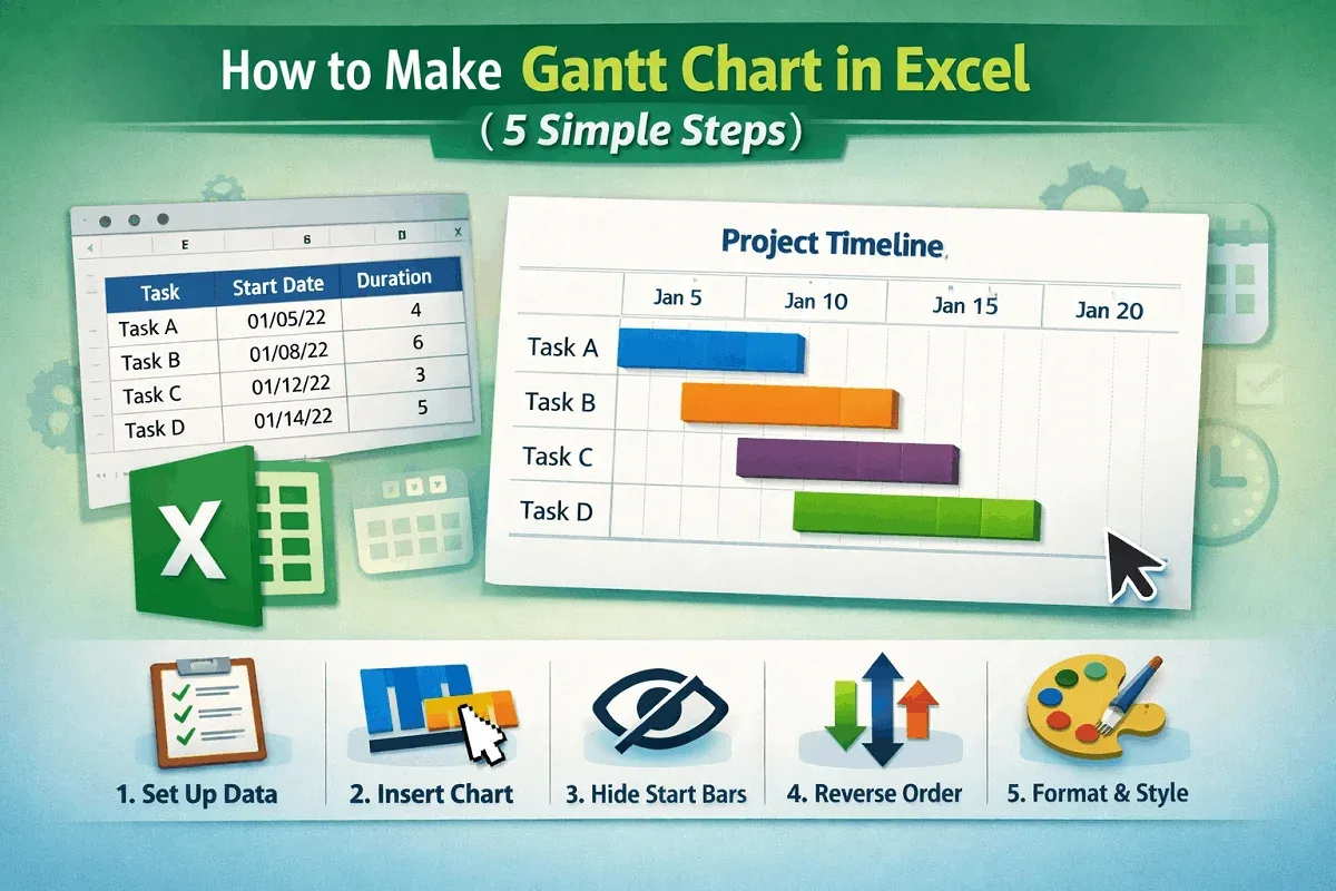
Learn how to make a Gantt chart in Excel by setting up tasks, inserting a stacked bar chart, hiding start dates, and formatting for clarity.
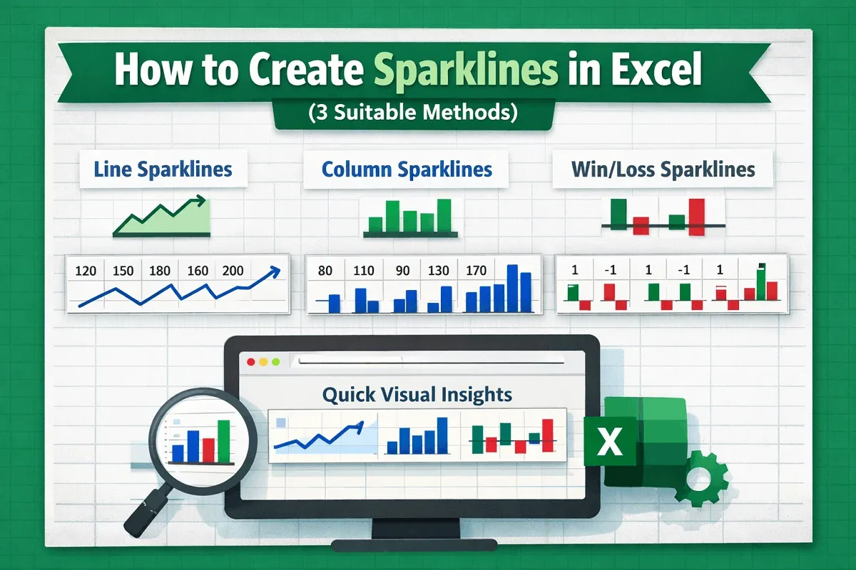
Learn how to create sparklines in Excel with line, column, and win/loss styles to visualize trends, highs and lows, and value comparisons.
Learn how to make a comparison chart in Excel using clustered columns, scatter plots, combo charts, or Pivot Tables with line charts.
Learn how to create a stem and leaf plot in Excel using a scatter chart for visualization or by manually building a traditional plot.
Learn how to plot a normal distribution in Excel by calculating mean, standard deviation, using NORM.DIST, and inserting a customized chart.
Learn how to create a burndown chart in Excel by entering your dataset, inserting a line chart, and customizing it for project tracking.