Trend analysis is the method of identifying patterns or data shifts over time. To calculate trend analysis, Excel provides different features and functions.In trend analysis, the main goal is to ...
The slope is a measurement of steepness and direction. It can be the steepness of a line or the steepness of the tangent (for a point in a curve). Finding the slope of a trendline in Excel is useful ...
When working on a spreadsheet, we often need to analyze our data in numerous ways. Sometimes, we might want to check every other row to find a pattern or sort some data. Removing every other row for ...
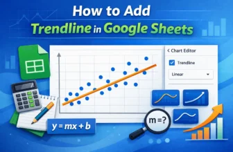
Trendlines are often used to understand the pattern of a dataset. If you want to track and analyze your data better, you might have to create a trendline after making a chart. In this article, you ...
A trendline is a line that represents the general direction of the data. To extend a trendline in Excel, we need to increase the forward, backward, or both values of the forecast.It simplifies ...
While recording data, it is not unusual to insert duplicate information by mistake. Sometimes, due to slow servers or due to recording errors, your excel sheet can end up with multiple transactions ...
The unknown value in a graph refers to the non-existent values in the source. Finding an unknown value in an Excel graph requires the equation of the trendline.The goal of every form of data ...
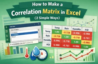
A correlation matrix is the ideal tool for examining data containing multiple variables and determining their relationships. This tutorial explores how to make correlation matrix in Excel with built ...
The key to data analysis is understanding how variables are related. In this tutorial, you will learn how to find the correlation coefficient in Excel and interpret the findings. By calculating the ...