Excel makes it easy to calculate uncertainty, which helps you determine your data's consistency. Understanding uncertainty is important for improving performance and establishing reasonable ...
Error bars are horizontal or vertical lines in data points that show the confidence level of the data in the sample. Custom error bars in Excel represent different variability for different data ...
Conditional formatting allows users to highlight the Excel cells based on the given conditions. This feature is quite beneficial for visual representation. For example, you can use it to highlight ...
Error bars in a data point are the measurement of the accuracy of the data. Different values for individual error bars indicate different margins of error for different data points.An error bar ...
The value axis in Excel is the one that represents numeric values in a chart.In 2-D charts or graphs, this is usually the vertical or Y-axis. In some cases, it can be horizontal (X-axis) too. We ...
Error bars are the horizontal or vertical lines in each data point that show the uncertainty of the data. Adding error bars in Excel indicates adding those margins of error in the charts.Error ...
Sometimes you need to insert zeros before any numerical values in Excel for various purposes. But Excel has some default rules that may irritate you. You cannot put a zero before a number, according ...
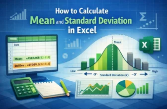
Excel functions allow you to easily and correctly calculate the mean and standard deviation. Understanding the correct statistical concepts is important whether you are analysing sales performance, ...
Data labels are text boxes that appear next to or on top of data points in the chart. "Outside end data labels" in Excel means the outside positioning of data labels that are just at the edge of the ...