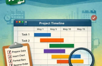
Gantt charts are an excellent way to visualize project timelines and track task progress in a clear, visual format. While Excel doesn’t have a dedicated Gantt chart type, you can create one easily ...
Converting numbers to text in Google Sheets means turning numeric values into plain text. Once converted, the text can no longer be used for calculations or automatic formatting. This is useful when ...
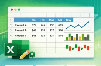
Sparklines are tiny, cell-sized charts that give you a quick visual representation of data trends right inside a single cell. Whether you’re tracking monthly sales, temperature changes, or stock ...
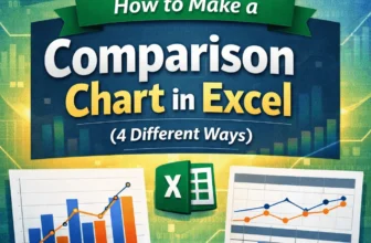
Comparison charts in Excel are excellent tools for spotting patterns, differences, and trends across categories or time periods. Whether you're comparing quarterly revenues, product ratings, or ...
Grouping columns in Google Sheets helps keep your large dataset more organized. You can collapse sections you don’t need to see all the time. By grouping columns, you can focus on the parts that ...
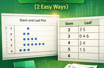
A stem and leaf plot in Excel helps you organize quantitative data in a way that reveals patterns, clusters, and outliers. While Excel doesn’t have a built-in function for this type of chart, you can ...
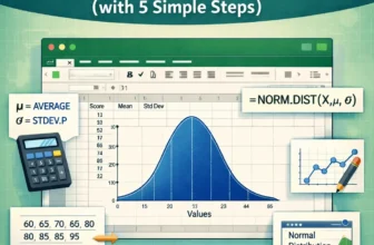
Visualizing data through a normal distribution curve is one of the most common ways to understand how your values are spread around the mean. This bell-shaped curve is widely used in statistics, ...
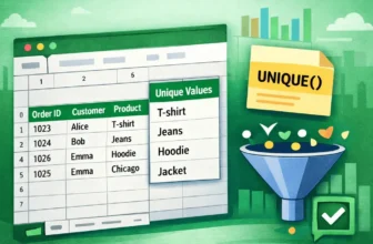
When working in Google Sheets, you’ll often come across duplicate entries. A product name might appear several times in sales data, a customer may place multiple orders, or the same city might be ...
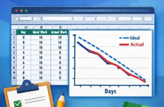
Burndown charts are an excellent tool for tracking project progress, especially in Agile or Scrum environments. They visualize how much work remains versus how much time is left, helping teams stay ...