When working in Google Sheets, you’ll often come across duplicate entries. A product name might appear several times in sales data, a customer may place multiple orders, or the same city might be ...
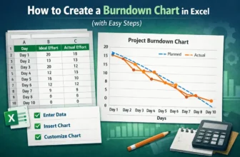
Burndown charts are an excellent tool for tracking project progress, especially in Agile or Scrum environments. They visualize how much work remains versus how much time is left, helping teams stay ...
A matrix in Excel is a structured arrangement of values in rows and columns which is similar to a table and often used for comparing data points, analyzing relationships, or summarizing large ...
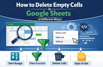
When working in Google Sheets, empty cells often appear in the dataset and can cause several issues. Empty cells may seem unimportant because they don’t contain anything with text, values, or data. ...
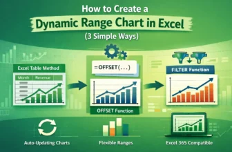
Charts are most useful when they reflect real-time changes in your data but static charts don’t update automatically when you add new entries. That’s where dynamic range charts come in. These charts ...
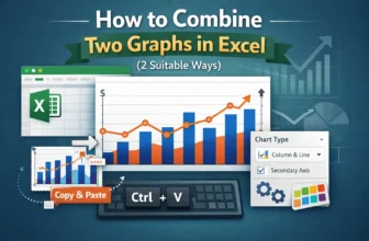
Combining two graphs in Excel lets you compare different data series within a single visual which is perfect for presentations, dashboards, or trend analysis. Whether you're working with two ...
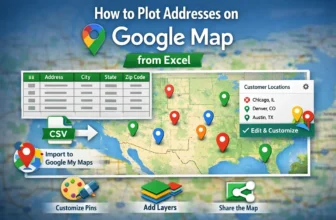
Whether you're tracking customer locations, delivery routes, or real estate listings, plotting addresses from Excel onto Google Maps can turn your spreadsheet data into an interactive, visual ...
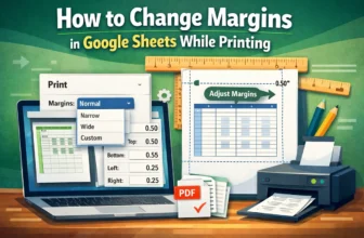
Margins are the blank space between the content of your spreadsheet and the edges of the printed page. Adjusting margins helps you create well-structured and professional-looking printouts when ...
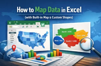
Mapping data in Excel lets you turn raw geographic information into excellent visuals that are easy to interpret. Whether you're tracking regional sales, population by state, or user distribution ...