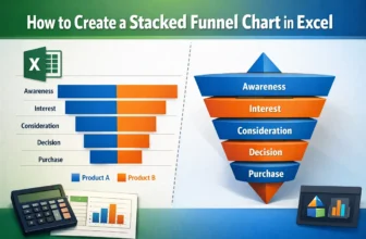
A stacked funnel chart is an excellent visual for tracking data through stages like marketing pipelines, sales funnels, or user journeys. Unlike the default funnel chart in Excel, which only allows a ...
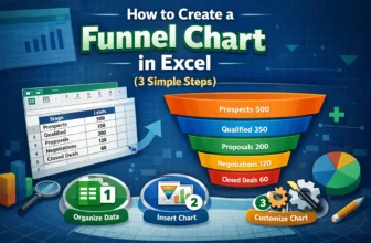
Funnel charts are an effective way to visualize data that flows through stages, such as sales pipelines, lead conversions, or recruitment processes. Each stage is represented as a horizontal bar, and ...
When you work in Google Sheets, the date format might not always match the region you need. This often happens when your spreadsheet is set to a different regional setting, and the dates show up in ...
When working with data in Google Sheets, you might face cases where numbers are stored as text. This can cause problems with calculations and data analysis. That means you can't use them for ...
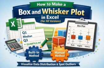
Box and Whisker plots, also called box plots, are excellent tools to visualize the distribution of data. They highlight key statistics like median, quartiles, and outliers, making them perfect for ...
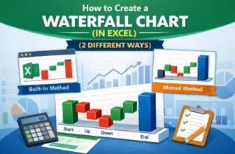
Waterfall charts are an excellent tool for visualizing the step-by-step changes that lead to a final result. Whether you're tracking revenue growth, budgeting expenses, or analyzing inventory flow, a ...
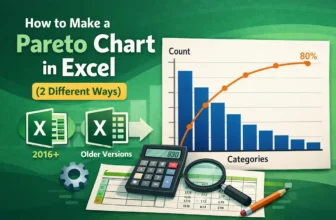
A Pareto chart is an efficient visual tool that highlights the most significant factors in a dataset. It combines a bar graph showing individual values in descending order with a line graph ...
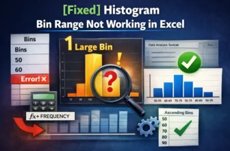
Histogram charts in Excel offer a great way to visualize how data is distributed across defined ranges or “Bins”. But sometimes, your bin range might not work as expected. Excel could ignore your ...
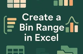
Creating a bin range in Excel helps you group continuous numeric data into intervals, making it easier to interpret trends, build histograms, or summarize large datasets. Whether you’re analyzing ...