Creating a Stacked Bar Chart in Excel is an excellent way to display data when we want to show both the individual parts and the overall total in one view. Instead of listing numbers in a table, this chart makes it easy to see how categories contribute to the whole.
Whether you’re analyzing sales, expenses, or survey results, stacked bar charts make comparisons simple and visually clear.
➤ Highlight the full range (A1:D11).
➤ Go to Insert → Charts → Bar Chart → Stacked Bar.
➤ Excel will insert a stacked bar chart with months on the horizontal axis and product sales stacked by category.
➤ Customize by adding a chart title, axis labels, and data labels if needed.
Now let’s walk through the step-by-step guideline.
Overview of a Stacked Bar Chart in Excel
A stacked bar chart in excel is almost like a regular bar chart we use. The only difference is that it stacks multiple values together instead of showing only one value.
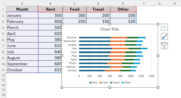
Let’s assume we’re tracking monthly expenses, where each bar represents one month. And inside the bar, different colors show rent, food, travel and other expenses. So, in this way, we can easily see both the total expenses per month and the breakdown of different categories.
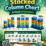
However, there’re usually three types of stacked bar charts in Excel.
➤ 2D Stacked Bar → Flat horizontal bars stacked with values.
➤ 3D Stacked Bar → Adds a 3D effect, useful for presentations but less precise for analysis.
➤ 100% Stacked Bar (both 2D and 3D) → Shows proportions as percentages instead of actual values.
Steps to Create a Stacked Bar Chart in Excel
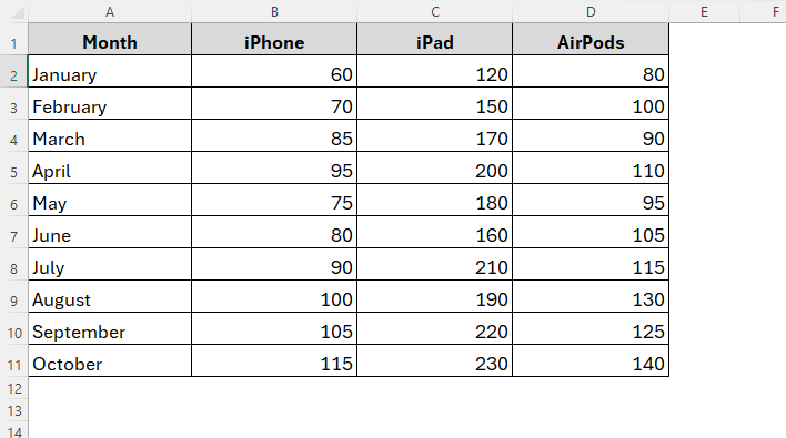
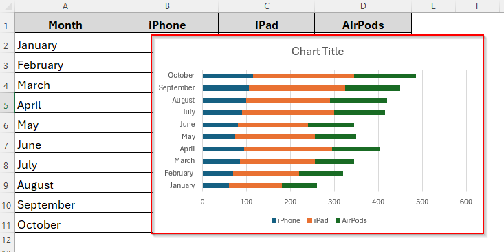
As we already mentioned, stacked bar charts are useful for various purposes. For example, we have a dataset of an Apple retailer company containing three different products iPhone, iPad and AirPods and their total sales for the months January to October.
Now we’ll be creating a bar chart showing the total sales for different months for these three products in three particular colors. To do so, we have to follow two major steps. First, we’ll make the bar chart and second we have to customize it as required. So, let’s see how it goes.
Step-1: Inserting the Stacked Bar Chart from the Chart Types Menu
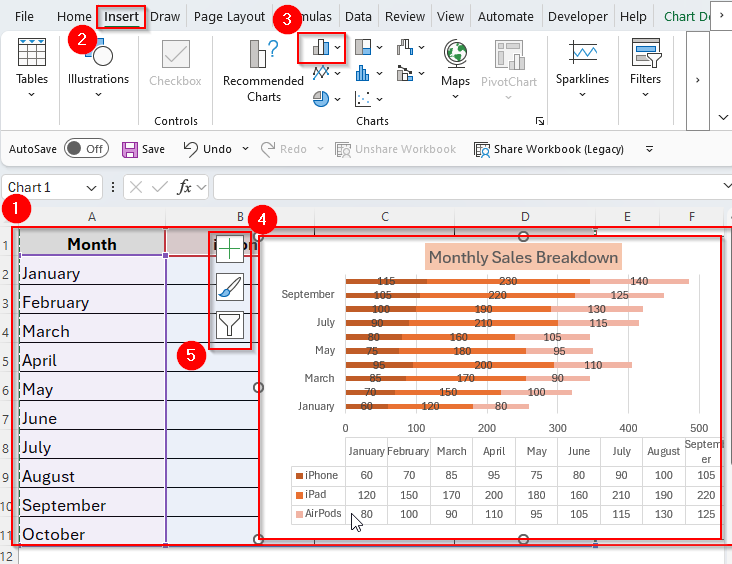
➤ To begin with, arrange your data in a table.
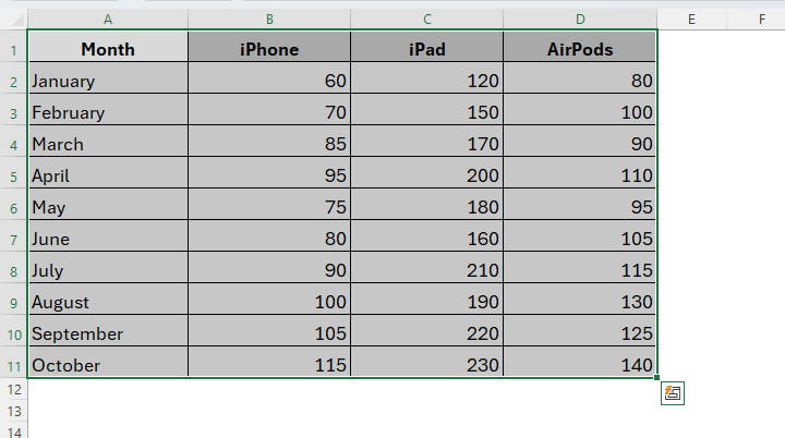
➤ Next, highlight the cell range or the whole table as you prefer. Here, we’ve selected our full dataset as you can see in the image below.
➤ Now, select the chart type. To do so, choose the Insert tab from the Ribbon and go to the charts group. Then, click on the Column or Bar Chart icon within the Charts group and select Stacked Bar from the drop-down menu.
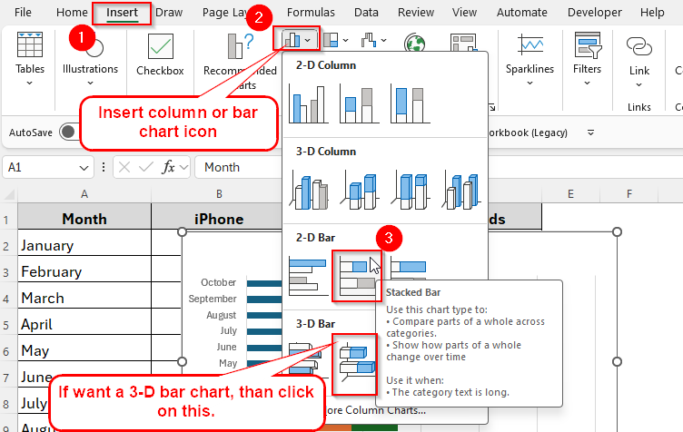
➤ By doing so, it will automatically insert a Stacked Bar Chart in your worksheet as follows.
Step-2: Customizing the Chart for Better Visualization
Now that we have created the chart, let’s customize it according to your personal preferences. We can simply change the chart size, position, color, fonts, title, labels, legends and so on. Below are the steps you can follow to do so.
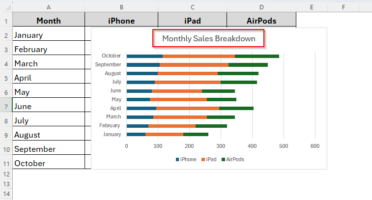
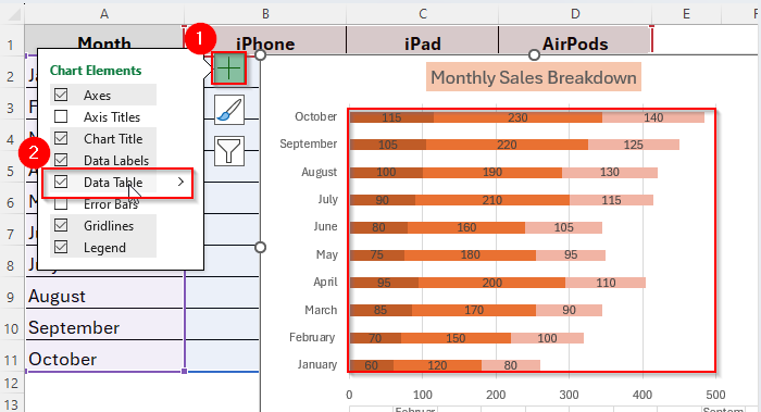
➤ Firstly, we’re going to change the title. To change it, simply click on the chart title box at the top of the chart. Then, type your own title, for example, Monthly Sales Breakdown. Press Enter and the new title will appear.
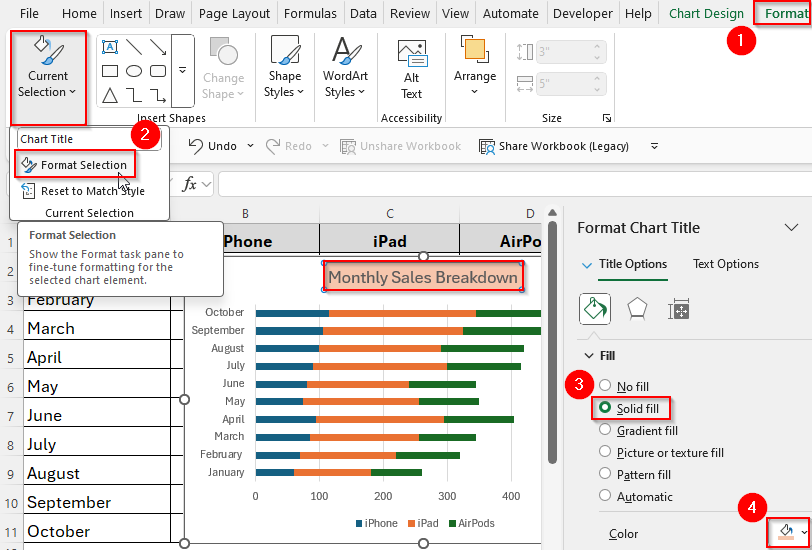
➤ Then we can change Colors for better readability. Sometimes the default colors Excel uses can be too similar or hard to read.
➤ To change a color, go to Format → Format Selection → Fill → Solid Fill. Then, you can simply pick a new color that’s brighter or more distinct. You can also repeat this step for each category until your chart looks clear and colorful.
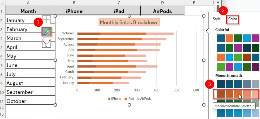
➤ Additionally, you can also change the bar colors. Just click on the bar, select the Brush icon and choose the color you want to add as the image shows below.
➤ Now we’ll change the Data Labels. In a chart, data labels show the actual numbers inside the bars so you don’t have to guess the values. To add them, click on your chart → go to the Chart Elements button (+ icon) on the top-right corner of the chart. Then, tick the box for Data Labels. You’ll instantly see the values displayed on each section of the bar.
➤ Finally, let’s adjust the Legend Position. The legend explains which color belongs to which category. By default, Excel usually puts it on the right side. If it looks crowded, click on the legend → drag it to the bottom or top of the chart.
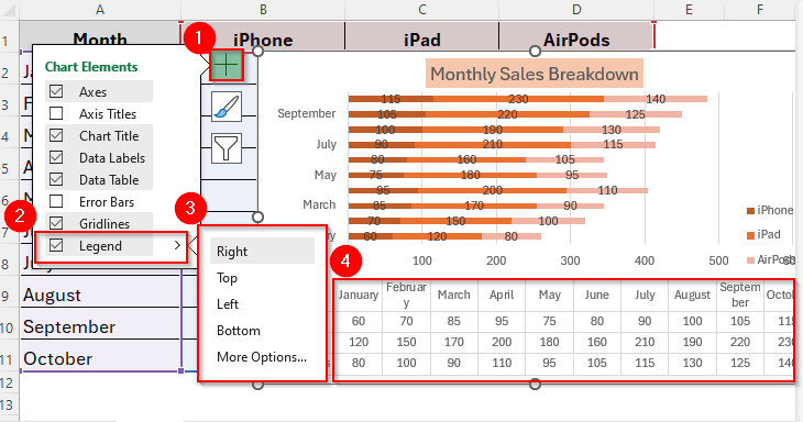
➤ Or, right-click on the legend → choose Format Legend and pick a position (Top, Bottom, Left, Right). Place it where it doesn’t block your chart but is still easy to read.
Tips for Stacked Bar Chart in Excel
Here are some additional tips to follow while making a stacked bar chart in excel.
- Firstly, arrange your data clearly in a table.
- Select the right type of stacked bar. You can choose from between 2D and 3D Stacked Bar. Also, make sure whether you’re using only Stacked Bar or 100% Stacked Bar. Use Stacked Bar for actual numbers and 100% Stacked Bar for percentages.
- Best for small datasets. Better to avoid while working with large datasets, otherwise it will make it clunky.
- Consider alternative chart types depending on your data type.
Frequently Asked Questions (FAQs)
When Can I Use a 100% Stacked Bar Chart?
You can use a 100% Stacked Bar Chart when you need to compare percentages in your dataset instead of actual numbers.
What’s the difference between a stacked bar chart and a clustered bar chart?
The key difference between a stacked bar chart and a clustered bar chart is combining the values. Stacked bar charts combine values in one bar, while clustered bar charts represent values side by side.
Can I switch between vertical and horizontal stacked bars?
Definitely, you can. You can change the chart type anytime by using the Change Chart Type option.
Concluding Words
So, now that we know how to make a stacked bar chart in excel, next time you’re working with multi-category data, try a stacked bar chart. It might be exactly what you need to make your presentation impressive.
A stacked bar chart makes it easier to compare how different parts contribute to the whole across categories. With a few clicks, you can create a clear, professional chart that transforms raw numbers into insights. So, let’s make it stand out.