In Excel, a bar graph or chart displays data using horizontal rectangular bars, where each bar’s length represents the data point’s value. It’s one of the most effective ways to compare categories or show differences across groups.
A standard bar chart compares one categorical and one numerical variable (e.g., products and sales). Adding a third variable (e.g., year or region) adds a new layer of depth to your analysis. For this, you can use the Insert Column or Bar Chart feature.
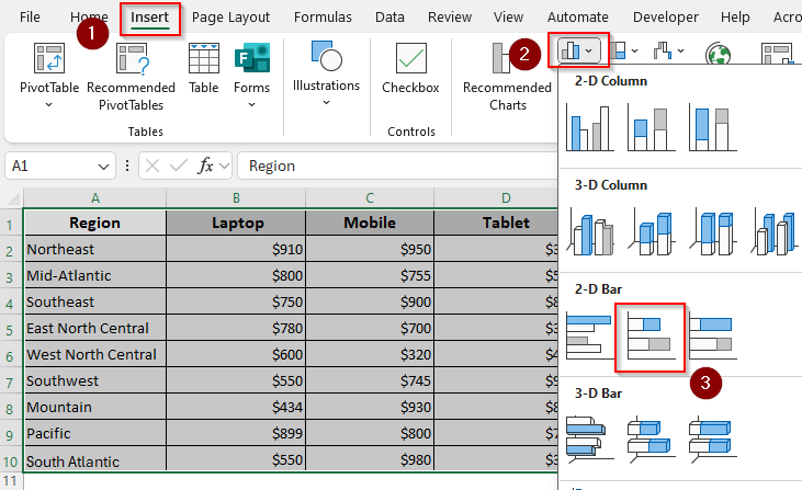
➤ Select your data range with the headers, open the Insert tab, and click the Insert Column or Bar Chart icon from the Charts group.
➤ Under the 2-D Bar (or 3-D Bar to create a 3-D graph) option, press the Clustered Bar, Stacked Bar, or 100% Stacked Bar icon depending on the type of bar graph you want.
➤ As Excel adds a bar graph to your worksheet, customize it using the Chart Design tab.
In this article, we’ll cover all the ways of creating a 2-D/3-D clustered, stacked, or 100% stacked bar.
Create a 2-D/3-D Clustered Bar Graph
For proper data arrangement, you must place your data in columns where:
- The first column or row headers (e.g., Region) contain your primary categories that go on the X-axis.
- Subsequent columns contain the values for each of your series (e.g., Products) within those categories.
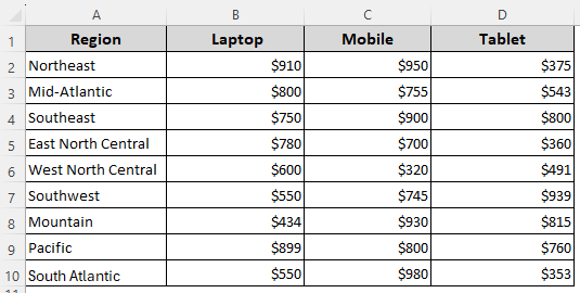
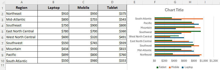
Our sample dataset has 4 columns including a column for regions (Column A), and three more columns representing sales values for different products like Laptop, Mobile, and Tablet.
In a clustered bar graph with 3 variables, each region will have 3 bars placed side by side. It’s best when you want to compare the values of the 3 products within each region. Here’s how to create one:
➤ From your main ribbon, open the Insert tab and navigate to the Charts group. Click on the Insert Column or Bar Chart drop-down.
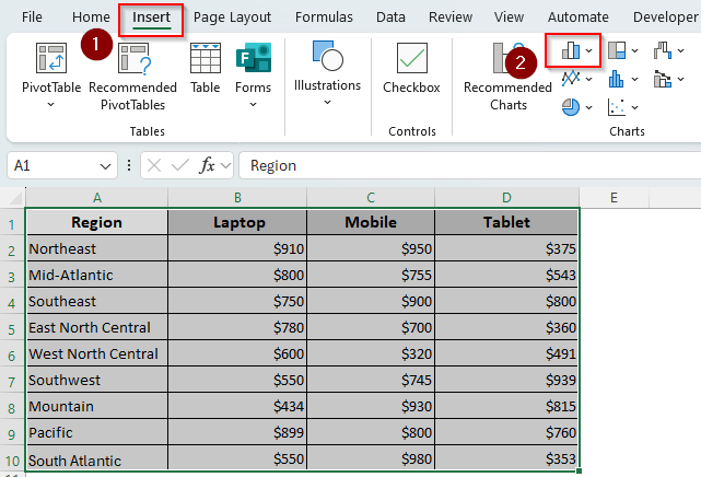
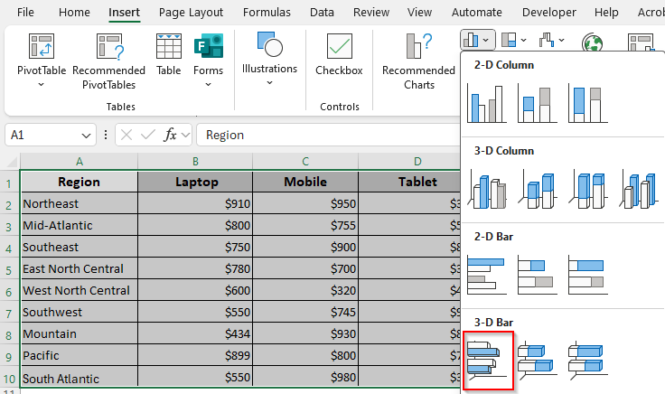
➤ Under the 2-D Bar group, select the Clustered Bar icon (the first icon).

➤ Or, choose the Clustered Bar icon from the 3-D Bar group if you want to add a 3-D perspective to your bar graph.
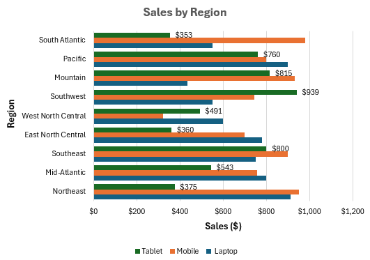
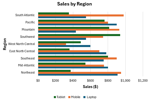
➤ Excel will generate a chart with regions on the vertical axis and three bars (Laptop, Mobile, Tablet) per region.
➤ You can format the following in your bar graph:
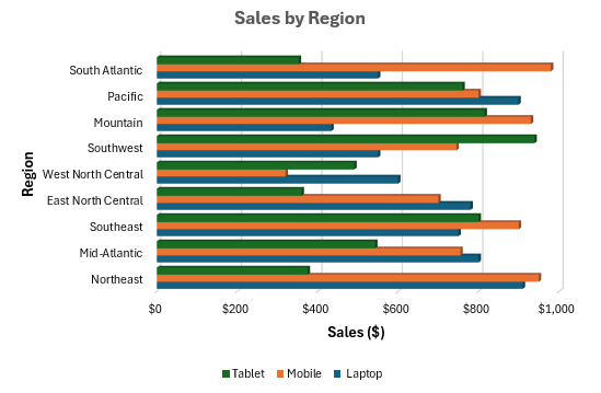
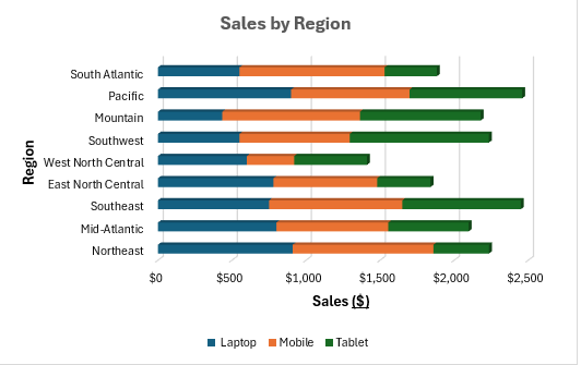
- Chart Title: Click on the Chart Title box at the top of your chart and type the name you prefer. We added the title Sales by Region to our graph.
- Axis Titles: Open the Chart Design tab from your main ribbon, click on the Add Chart Element button, and select Axis Title. We named our horizontal axis Sales ($) and entered Region for the vertical axis.
- Color: From the Chart Design tab, select Change Colors to choose a color scheme for the graph bars.
- Data Labels: To show the exact values for each bar element, click on your chart and press the + sign next to it. Check the Data Labels
- Size: Right-click on a bar in your chart and select Format Data Series. As the Format Data Series pane appears on the right, you can change the gap width (reduce for wider bars or increase for thinner), text sizes, text colors, transparency, lines, etc.
➤ Here’s our 2-D chart after formatting:

➤ Below is the formatted 3-D chart:
Make a 2-D/3-D Stacked Bar Chart
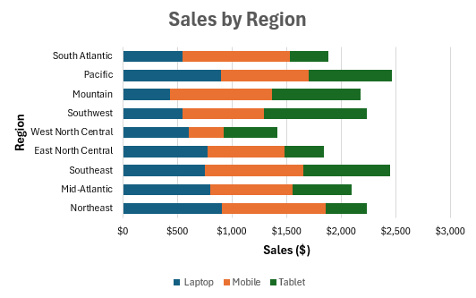
In a stacked bar graph, the bars are stacked on top of each other. It represents the total sales per region while also showing contributions from each product. Below are the steps to make one:
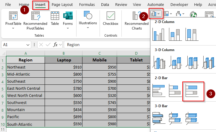
➤ Click and drag to highlight your dataset with the headers and press the Insert tab >> Insert Column or Bar Chart icon.
➤ From the options given under 2-D Bar, select the Stacked Bar icon (the second icon).
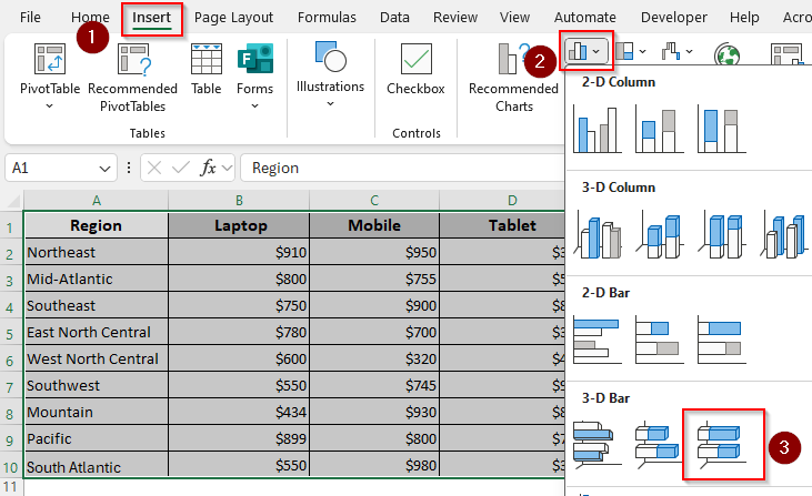
➤ To add a 3-D graph instead, choose the Stacked Bar icon (the second icon) from the options given under 3-D Bar.

➤ When Excel creates a graph, format it as needed using the Chart Design tab. Here’s the final 2-D graph:
➤ Below is the 3-D version:
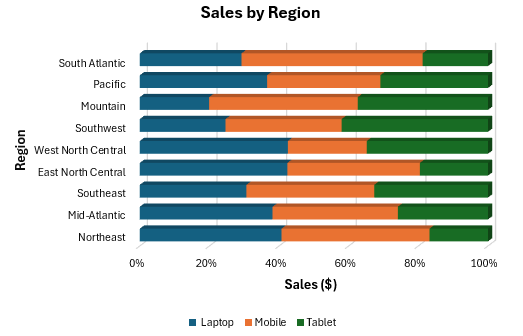
Design a 2-D/3-D 100% Stacked Bar Graph
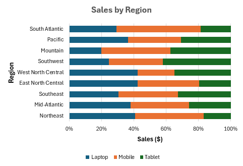
Use a 100% stacked bar chart if you want to compare the percentage contribution of each product within a region. Here, each bar equals 100%, with segments showing proportions. To create one, follow the steps given below:
➤ Highlight your dataset and click on the Insert tab >> Insert Column or Bar Chart icon.
➤ In the 2-D Bar group, choose the 100% Stacked Bar icon (the third icon).
➤ For a 3-D chart, click on the 100% Stacked Bar icon (the third icon) from the 3-D Bar group instead.
➤ Once Excel adds the chart to your worksheet, customize it according to your preferences using the Chart Design tab. Below is our final 2-D graph:
➤ Here’s the graph in 3-D perspective:
Adding a New Variable to an Existing Bar Graph
If you already have a bar graph with one or two variables, you can add new variables (series) to it by following the steps given below:
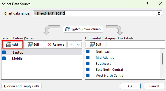
➤ Our existing clustered bar chart consists of two variables, Laptop and Mobile. To add the data from the Tablet column as the third variable, right-click on your chart and choose Select Data from the menu.

➤ As the Select Data Source dialog box opens, navigate to the Legend Entries (Series) group and click on Add.
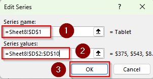
➤ When Excel opens a new dialog box named Edit Series, navigate to the Series Name box and click on the upward arrow.
➤ Now, highlight the cell reference containing the column header of your third variable. For example, we clicked on the D1 cell containing the title Tablet.
➤ Click on the upward arrow beside the Series Values box and highlight all the remaining non-blank cells of the column. We selected the range D2:D10.
➤ Press Ok.
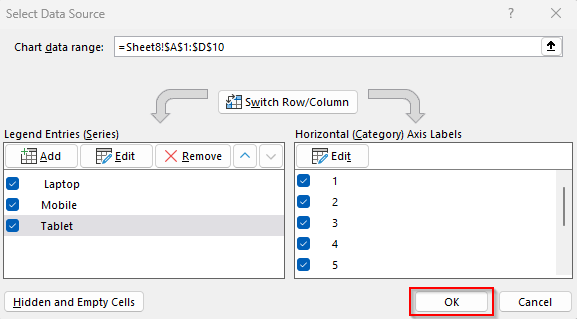
➤ Click Ok to close the Select Data Source dialog box.
➤ Finally, format your chart if necessary.
Frequently Asked Questions
How to do a graph with a bar chart and a line graph?
To create a combo of a bar chart and a line graph using 3 variables, go to the Insert tab >> Insert Column or Bar Chart icon >> More Column Charts >> Combo. Now, from the Chart Type drop-down with each category, we’ll set Laptop and Mobile as Clustered Bar and Tablet as a Line. Press Ok.
How do I create a dynamic bar chart?
A dynamic bar chart updates automatically when new data is added. To create one, first, select your dataset and convert it into a Table using the Ctrl + T shortcut. Insert a bar chart from this Table by clicking on the Insert tab >> Insert Column or Bar Chart icon >> Clustered Bar from 2-D Bar group. Excel will now add a chart that changes dynamically.
How do I make a chart in Excel with 3 columns of data?
Select your dataset with the headers and click on the Insert tab >> Insert Column or Bar Chart icon. Now, under the 2-D or 3-D Column group, choose the Clustered Column, Stacked Column, or 100% Stacked Column icon depending on the type of chart you want.
Concluding Words
While creating a bar graph with 3 variables in, you can choose a Clustered Bar for direct comparison, a Stacked Bar for totals, a 100% Stacked Bar for proportions, or a Combo Chart for mixed analysis. If you want to make the chart dynamic, turn your data range into a table first. To make any changes in the chart, use the Edit option in the Select Data Source dialog box.