Box and Whisker plots, also called box plots, are excellent tools to visualize the distribution of data. They highlight key statistics like median, quartiles, and outliers, making them perfect for spotting trends or spread in datasets. Excel includes a built-in Box and Whisker chart starting from Excel 2016, but earlier versions require a workaround using stacked column charts.
In this article, we’ll walk you through both the built-in method and a manual approach. Our goal is to build a box plot that clearly shows the spread of exam scores across different subjects using a simple dataset. Let’s get started.
Steps to make a box and whisker plot in Excel:
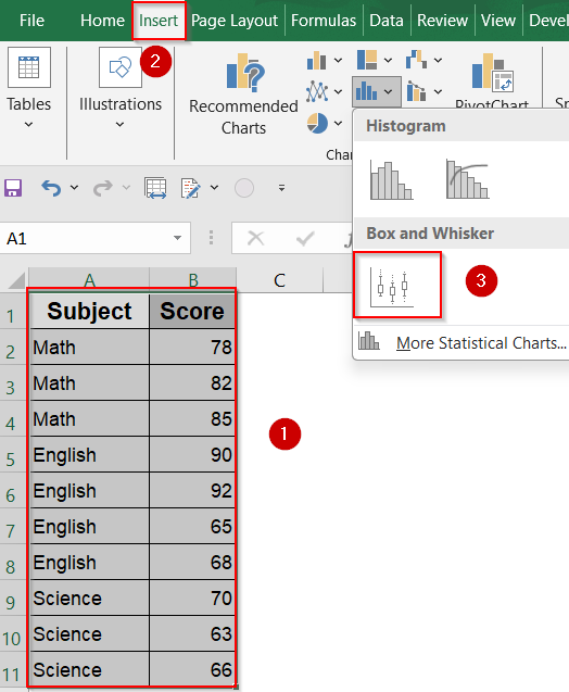
➤ Select the entire dataset, including both “Subject” and “Score” columns.
➤ Go to the Insert tab on the ribbon.
➤ Click the Insert Statistic Chart dropdown.
➤ Choose Box and Whisker from the list.
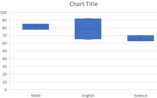
➤ Excel will generate a box plot for each subject category.
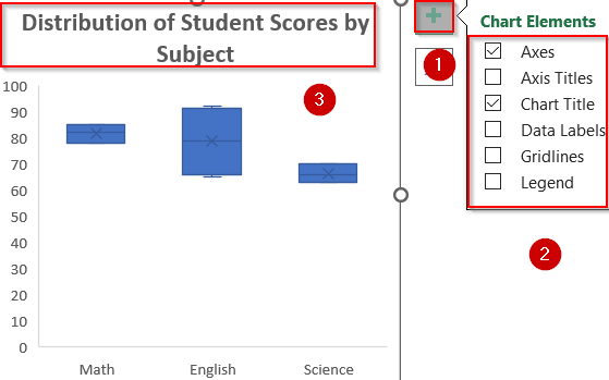
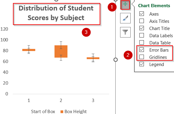
➤ Use the Chart Elements (+) icon to add Chart Title, Axis Titles, and Legend. Uncheck Gridlines for clarity.
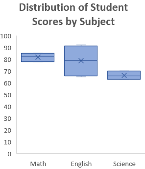
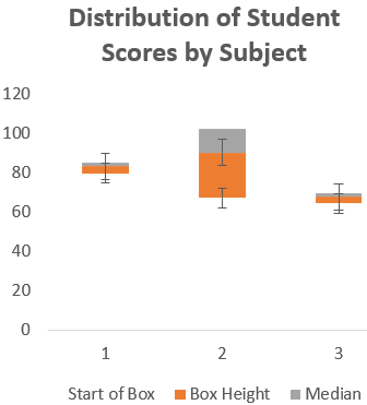
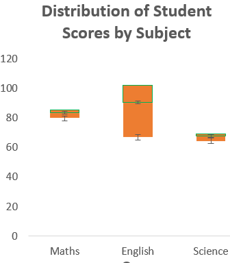
➤ Edit the chart title to something meaningful like “Distribution of Student Scores by Subject“.
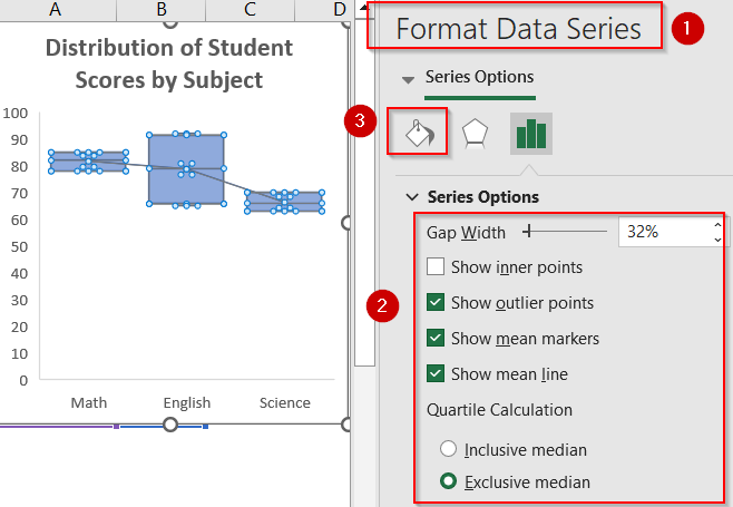
➤ Right-click the boxes or whiskers and choose Format Data Series to format colors, outline thickness, or show/hide outlier markers.
Use the Built-in Box and Whisker Chart Feature (Excel 2016 or Later)
For users working in Excel 2016 or later, the built-in Box and Whisker chart option offers a powerful and efficient way to visualize statistical distribution across categories. In this tutorial, we aim to create a grouped box plot that compares student score distributions for Math, English, and Science based on the dataset shown below. Each category will display a separate box summarizing the minimum, maximum, median, and quartiles, while highlighting any outliers.
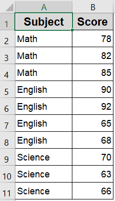
We’ll use a sample dataset showing student scores across three subjects with multiple entries that allows us to visualize the distribution and variability in performance using a Box and Whisker plot.
Steps:
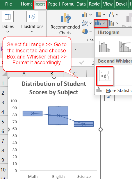
➤ Select the entire dataset, including both “Subject” and “Score” columns.
➤ Go to the Insert tab on the ribbon.
➤ Click the Insert Statistic Chart dropdown.
➤ Choose Box and Whisker from the list.
➤ Excel will generate a box plot for each subject category.
➤ Use the Chart Elements (+) icon to add Chart Title, Axis Titles, and Legend. Uncheck Gridlines for clarity.
➤ Edit the chart title to something meaningful like “Distribution of Student Scores by Subject“.
➤ Right-click the boxes or whiskers and choose Format Data Series to format colors, outline thickness, or show/hide outlier markers and mean line.
Now you have your customised Box and Whisker Chart.
Create a Box Plot Manually in Excel 2013 or Earlier
If you’re using Excel 2013 or an earlier version, you won’t find a built-in Box and Whisker chart. However, you can still visualize statistical distributions by manually constructing the chart using formulas, helper tables, and a stacked column approach. This method involves calculating key quartile values (like Q1, Q3, and the median) for each category such as subject-wise student scores and converting those into a meaningful box plot using columns and error bars.
Steps:
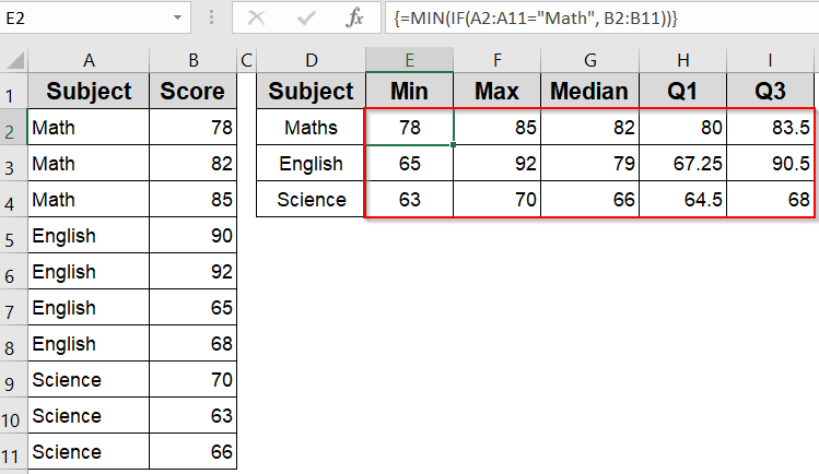
➤ Calculate the five-number summary (Minimum, Q1, Median, Q3, Maximum) for each subject using formulas like =MIN(range), =QUARTILE.INC(range, 1), =QUARTILE.INC(range, 3) and so on.
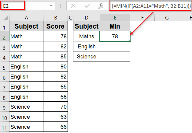
➤ Enter this formula in E2 cell to obtain the the Minimum score for the subject “Math“:
=MIN(IF(A2:A11="Math", B2:B11))
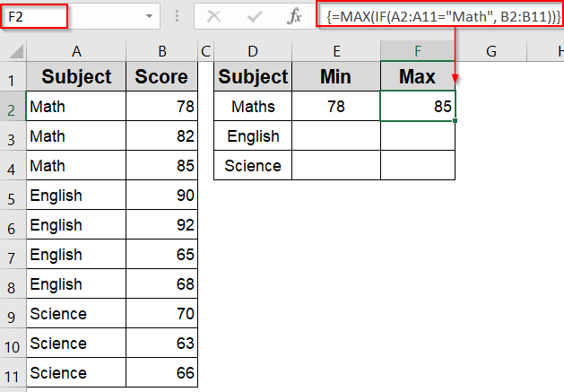
➤ Enter this formula in F2 cell to calculate the Maximum score for the subject “Math“:
=MAX(IF(A2:A11="Math", B2:B11))
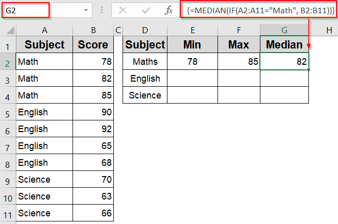
➤ Enter this formula in G2 cell to calculate the Median score for the subject “Math“:
=MEDIAN(IF(A2:A11="Math", B2:B11))
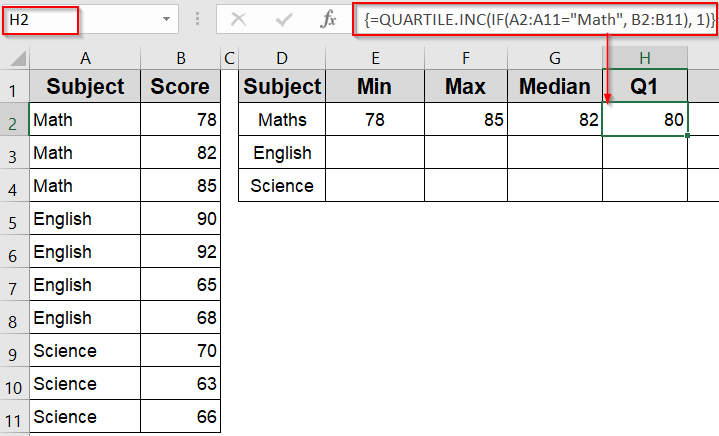
➤ Enter this formula in H2 cell to calculate the First Quartile (Q1) for the subject “Math“:
=QUARTILE.INC(IF(A2:A11="Math", B2:B11), 1)
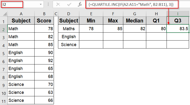
➤ Enter this formula in I2 cell to calculate the Third Quartile (Q3) for the subject “Math“:
=QUARTILE.INC(IF(A2:A11="Math", B2:B11), 3)
➤ Press Ctrl + Shift + Enter if needed.
➤ Repeat the process for the subjects English and Science to create a summary table for each subject.
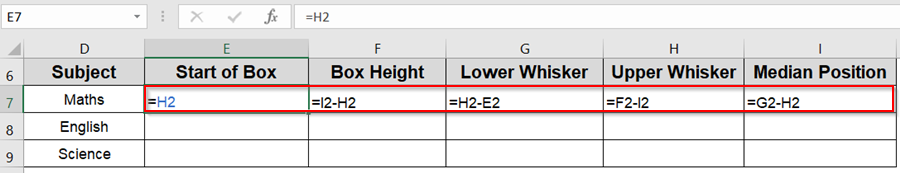
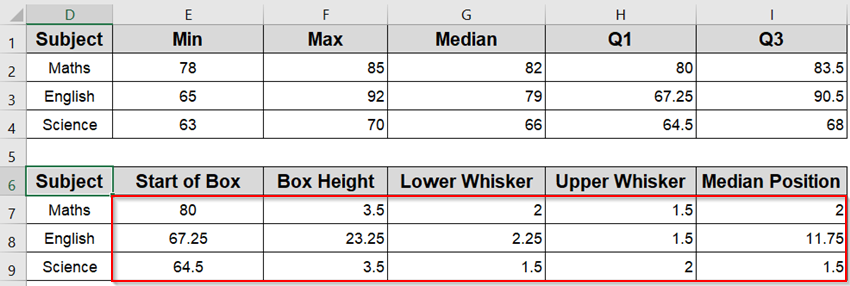
➤ To build the helper table, set Q1 (Start of Box) by entering the following formula in E7 cell: =H2
➤ Calculate Box Height as (Q3 minus Q1) by entering the following formula in F7 cell: =I2–H2
➤ Calculate Lower Whisker as (Q1 minus Min) by entering the following formula in G7 cell: =H2–E2
➤ Calculate Upper Whisker as (Max minus Q3) by entering the following formula in H7 cell: =F2–I2
➤ Find median position as (Median minus Q1) by entering the following formula in I7 cell: =G2–H2
➤ Drag down using the AutoFill handle.
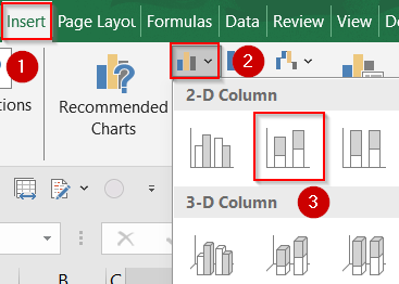
➤ Select the helper table range E7:F9 and insert a Stacked Column Chart from the Insert tab.
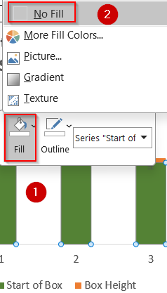
➤ Format the Start of Box bar with No Fill color by right-clicking on it so that only the Box Height bar remains visible.
➤ Add Error Bars above and below the box to simulate the whiskers from the Chart Elements (+) icon. Optionally, uncheck Gridlines and edit your Chart Title accordingly.
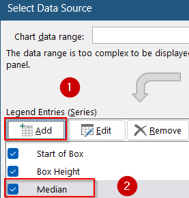
➤ Right-click on the bars and choose Select Data to insert an additional data series to draw a horizontal line at the median position. Click Add under Legend Entries and select your Median Position range and name the series Median.
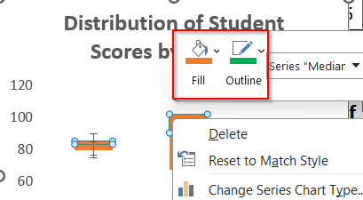
➤ Now right-click on any of the grey bars to format it.
➤ Set the fill color the same as Box Height (orange) and the outline to a contrasting color like green.
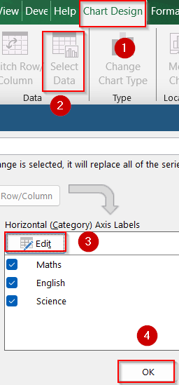
➤ Select the whole chart and go to the Chart Design tab >> Click Select Data and Edit under Horizontal (Category) Axis Labels >> Add the Subject names to display them on the horizontal axis.
➤ Click OK to confirm changes.
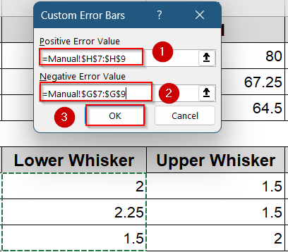
➤ Now right-click on the error bars to open the Format Error Bars pane >> Select Custom and Specify Value.
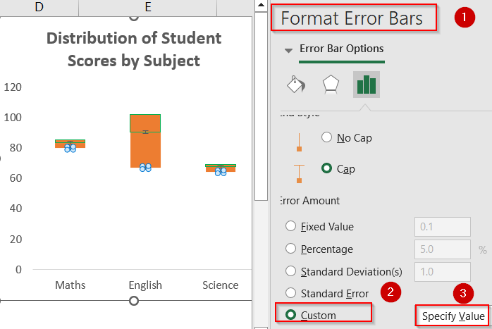
➤ Set Upper Whisker values as Positive Error Value and Lower Whisker Value as Negative Error Value and click OK.
Now we have our customized Box and Whisker chart that is compatible with all Excel versions and allows greater control over chart appearance.
Frequently Asked Questions
What types of data are best suited for Box and Whisker plots?
Box plots work well for visualizing distributions, comparing variability, and spotting outliers across categories which is ideal for exam scores, regional data, product performance, or any numerical values grouped by labels.
Which versions of Excel support Box and Whisker plots, and what are the alternatives?
Excel 2016 and newer include a built-in Box and Whisker chart. For older versions like Excel 2013, you can manually build the plot using stacked column charts and formulas for quartiles and medians.
How does Excel calculate quartiles?
By default, Excel uses the QUARTILE.INC function, which includes the median in both halves of the dataset. This approach ensures consistency with inclusive quartile methods commonly taught in statistics.
What do the whiskers represent in the chart?
Whiskers display the smallest and largest values that are not considered outliers. Any values beyond 1.5 times the interquartile range are plotted individually as dots, signaling potential outliers in your data.
Wrapping Up
In this tutorial, we explored how to make a Box and Whisker plot in Excel to analyze data variability, detect outliers, and compare multiple groups. Whether you use the built-in option or a manual workaround, this chart helps present statistical trends clearly and professionally. Feel free to download the practice file and share your feedback.