A stem and leaf plot in Excel helps you organize quantitative data in a way that reveals patterns, clusters, and outliers. While Excel doesn’t have a built-in function for this type of chart, you can still create a professional-looking stem and leaf plot using manual techniques or a scatter chart workaround. Whether you’re analyzing exam scores, survey results, or other numeric datasets, this approach helps visually break down your data into stems (leading digits) and leaves (trailing digits) for quick interpretation.
In this article, you’ll learn two simple methods to build a stem and leaf plot in Excel using a scatter chart to simulate the structure, and another manual approach to resemble the traditional layout. Both are practical depending on how automated or custom you want your plot to be.
Steps to create a stem and leaf plot in Excel:
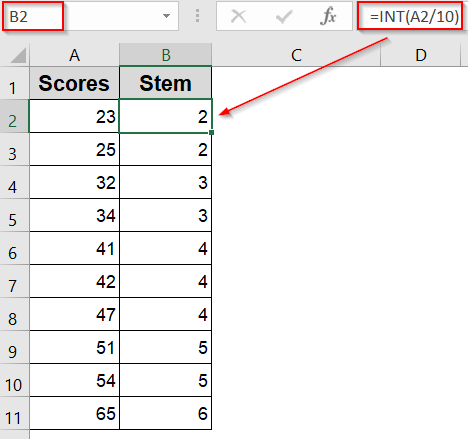
➤ Enter your numeric values in a single column, for example, in cells A2 to A11.
➤ In column B, use this formula to calculate the stem (tens place):
=INT(A2/10)
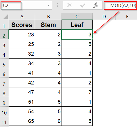
➤ In column C, apply this formula to extract the leaf (ones place):
=MOD(A2,10)
➤ Drag down using the AutoFill handle.
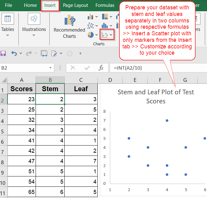
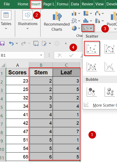
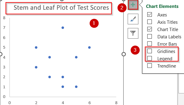
➤ Highlight both the Stem and Leaf columns >> Go to the Insert tab >> Click Scatter Chart >> Choose Scatter with only Markers.
➤ A scatter plot will appear with dots placed based on your stems and leaves.
➤ Clean up the chart by removing gridlines and unnecessary background using Chart Elements.
➤ Add a meaningful chart title and remove default legends if they don’t serve a purpose.
Use Scatter Chart in Excel to Visualize a Stem and Leaf Plot
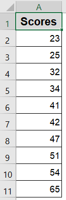
While Excel doesn’t include a built-in stem and leaf plot, you can simulate one using a scatter chart to create a clean, graphical layout of stems (tens place) and leaves (ones place). This is especially useful when you want a visual version of your distribution for presentations or dashboards. We’ll illustrate this using a sample dataset of 10 test scores ranging from 23 to 65 and the goal is to plot these numbers in a format that resembles a traditional stem and leaf chart, but in graph form.

Steps:
➤ Enter your numeric values in a single column, for example, in cells A2 to A11.
➤ In column B, use this formula to calculate the stem (tens place):
=INT(A2/10)
➤ Drag down using the AutoFill handle.
➤ In column C, apply this formula to extract the leaf (ones place):
=MOD(A2,10)
➤ Drag down using the AutoFill handle.
➤ Label columns B and C as “Stem” and “Leaf” for clarity.
➤ Highlight both the Stem and Leaf columns >> Go to the Insert tab >> Click Scatter Chart >> Choose Scatter with only Markers.
➤ A scatter plot will appear with dots placed based on your stems and leaves.
➤ Clean up the chart by removing gridlines and unnecessary background using Chart Elements.
➤ Add a meaningful chart title and remove default legends if they don’t serve a purpose.
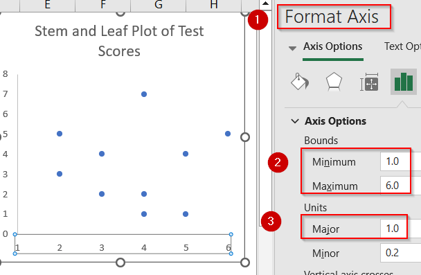
➤ Open Format Axis sidebar and set Minimum and Maximum values for your chart. Adjust the X-axis to use whole numbers (reflecting stem values) by setting Major units to 1 for better alignment.
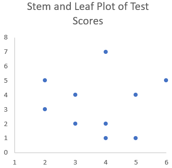
This visual method gives you a charted version of a stem and leaf plot, making patterns in small datasets much easier to spot and interpret at a glance.
Manually Create a Traditional Stem and Leaf Plot
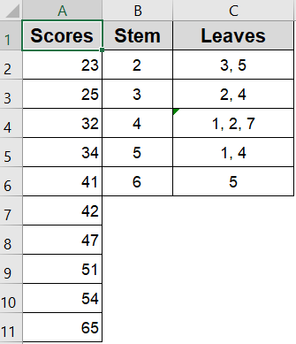
For a more classic and academic presentation, you can manually build a stem and leaf plot using plain cells and text alignment. This approach mimics the exact format used in textbooks which is ideal for handouts, printed reports, or classroom use. We’ll work with the same dataset of 10 test scores between 23 and 65, and the goal is to group these numbers visually by tens (stems) and list their ones digits (leaves) in a neatly aligned layout.
Steps:
➤ Enter your score list in column A (e.g., A2:A11).
➤ In column D, list the unique stems based on the tens place of your data. For this example, stems will be 2, 3, 4, 5, and 6.
➤ In column E, type the corresponding leaves next to each stem such as “3, 5” for stem 2 if your data contains 23 and 25.
➤ Align stems and leaves for a clean visual and ensure proper spacing and add a vertical separator if needed.
➤ Label your stem and leaf columns clearly and apply light borders or formatting for better readability.
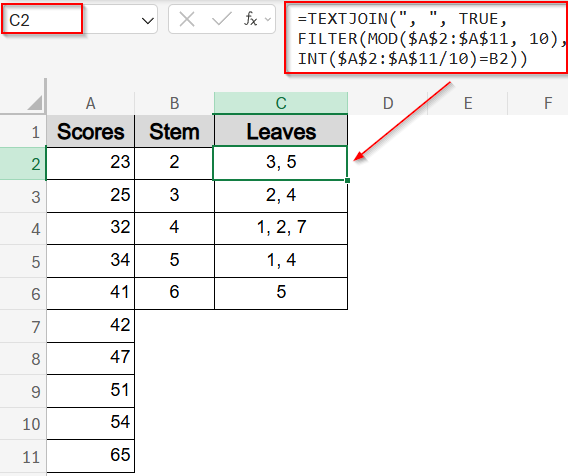
➤ To automate leaf extraction, you can use the TEXTJOIN formula with filtering in C2 cell:
=TEXTJOIN(", ", TRUE, FILTER(MOD($A$2:$A$11, 10), INT($A$2:$A$11/10)=B2))
This method produces a traditional stem and leaf layout that is easy to interpret and instantly familiar to those with statistical training.
Frequently Asked Questions
Can I automate a stem and leaf plot in Excel?
Excel doesn’t offer a built-in tool for stem and leaf plots, but you can automate one using formulas like INT and MOD, combined with manual formatting or scatter plots for a visual display.
What is the best way to separate stems and leaves?
Use the formula =INT(cell/10) to extract the stem (tens place) and =MOD(cell,10) to get the leaf (ones place). This approach works well for two-digit numbers and organizes your data effectively.
Can I make a back-to-back stem and leaf plot in Excel?
Yes, you can. Place stems in the middle column, and arrange leaves from two datasets on either side. This layout is great for comparing two groups, such as male vs. female test scores.
What kind of data works best for stem and leaf plots?
Stem and leaf plots are ideal for small datasets with two or three-digit numbers. They’re often used for exam results, age groups, or ratings where individual values matter alongside the distribution pattern.
Why use a stem and leaf plot over a histogram?
Stem and leaf plots preserve original data values while still showing frequency, making them better for small datasets where details matter. Histograms group values into bins, which hides individual data points.
Wrapping Up
In this tutorial, we explored how to create a stem and leaf plot in Excel using both a visual chart-based method and a manual formatting approach. While Excel doesn’t offer a built-in feature, these workarounds make it easy to display data in a structured, intuitive format. Whether you’re working on a school assignment or presenting statistical results, a stem and leaf plot offers a quick and clear way to explore number patterns. Feel free to download the practice file and share your feedback.