In most workplaces, the ability to display visual data for presentation is a highly required skill. In this case, Excel is one of the best tools that help people to make graphs, charts, and tables to ...
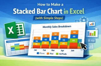
Creating a Stacked Bar Chart in Excel is an excellent way to display data when we want to show both the individual parts and the overall total in one view. Instead of listing numbers in a table, this ...
In Excel, a bar graph or chart displays data using horizontal rectangular bars, where each bar's length represents the data point's value. It’s one of the most effective ways to compare categories or ...
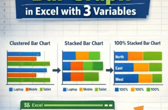
A stacked column chart allows for the comparison of components of a whole across different categories. Instead of showing separate bars, it stacks the values on top of each other, making it easy to ...
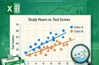
Scatter plots effectively visualize the relationship between two variables, vital for data analysis in business, science, and education. Microsoft Excel provides an easy way to create a scatter plot ...
A scatter plot in Excel is a powerful tool for identifying relationships between variables, analyzing data patterns, detecting outliers, conducting trend analysis, and comparing data sets. Whether ...
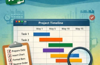
Gantt charts are an excellent way to visualize project timelines and track task progress in a clear, visual format. While Excel doesn’t have a dedicated Gantt chart type, you can create one easily ...
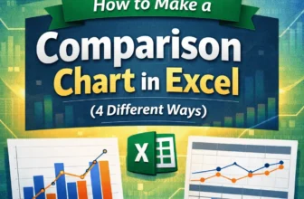
Comparison charts in Excel are excellent tools for spotting patterns, differences, and trends across categories or time periods. Whether you're comparing quarterly revenues, product ratings, or ...
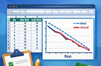
Burndown charts are an excellent tool for tracking project progress, especially in Agile or Scrum environments. They visualize how much work remains versus how much time is left, helping teams stay ...