Changing the colors of your pie chart in Excel is a simple way to improve visual clarity and align the design with your presentation or brand. Whether you want to update the entire color theme or customize each slice individually, Excel provides several built-in options to modify chart colors, allowing users to customize either individual slices or the entire chart theme with ease.
In this article, you’ll learn several effective methods to change pie chart colors in Excel, including manual color selection, theme-based adjustments, chart style usage, and an efficient VBA script for bulk slice coloring.
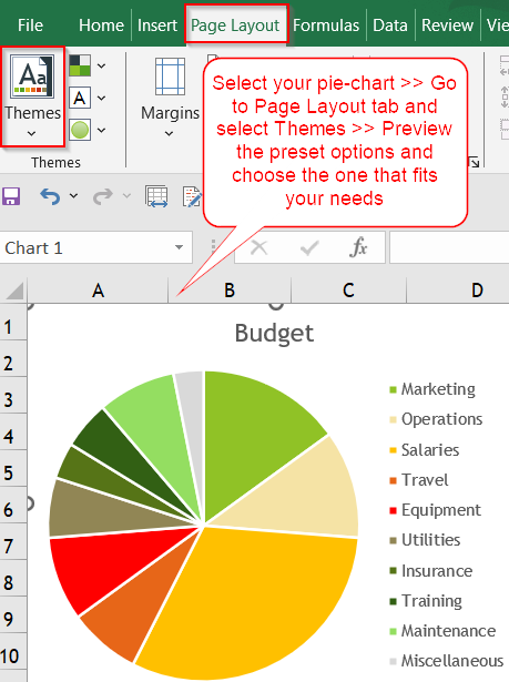
Steps to change pie chart color in Excel:
➤ Click on the pie chart to activate it.
➤ Go to the Page Layout tab in the ribbon.
➤ Click on Themes >> Hover over the different themes to preview.
➤ Select the theme that best matches your report or branding.
Manually Customize Pie Slice Colors Using the Fill Tool
If you need full control over how each part of your pie chart is colored, this method is the most precise. By manually selecting individual slices and assigning unique fill colors, you can match specific design guidelines, highlight key segments, or apply branded color schemes. This approach is best for static reports where color accuracy is essential.
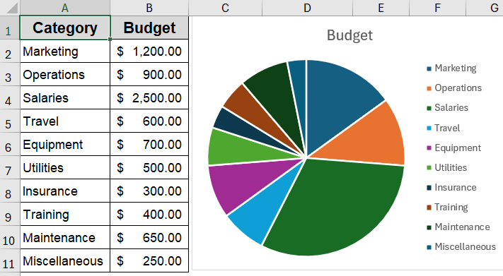
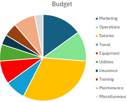
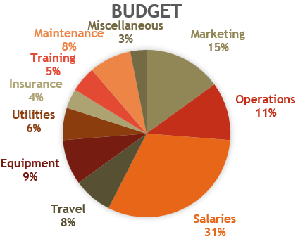
To demonstrate the methods clearly, we’ll use a basic dataset showing budget allocations across different departments. This data will be used to create and modify a pie chart in Excel.
Steps:
➤ Click on your pie chart to select it.
➤ Click once more on a specific slice to select just that one.
➤ Right-click on the selected slice >> You can directly change the color using the Fill option or choose Format Data Point for more control.
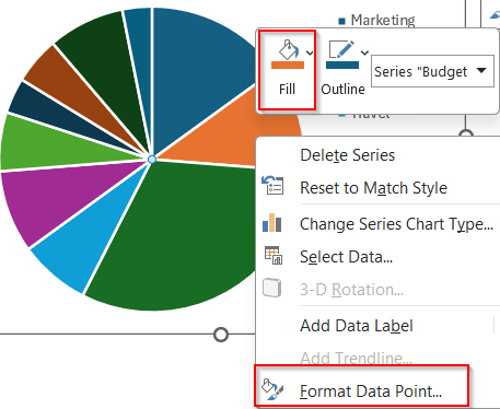
➤ In the Format pane, go to Fill >> Select Solid Fill.
➤ Choose a custom color for that slice.
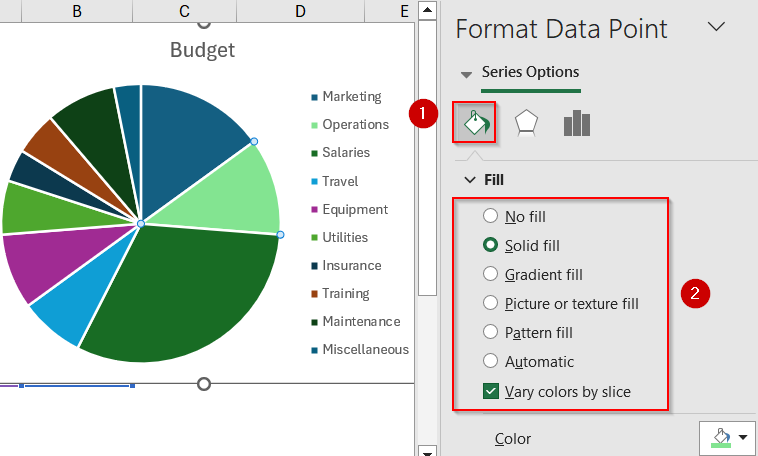
➤ Repeat the process for other slices if needed.
This is the most hands-on approach for precise color customization.
Apply Excel Themes to Instantly Update Chart Color Schemes
Using Excel’s built-in themes is a fast and efficient way to apply a cohesive color palette across your chart and worksheet. Themes not only update the pie chart’s color scheme but also affect fonts, background colors, and other visual elements, ensuring your entire spreadsheet maintains a uniform and polished look. This is ideal for professional reporting or formal documentation.
Steps:
➤ Click on the pie chart to activate it.
➤ Go to the Page Layout tab in the ribbon.
➤ Click on Themes >> Hover over the different themes to preview.
➤ Select the theme that best matches your report or branding.
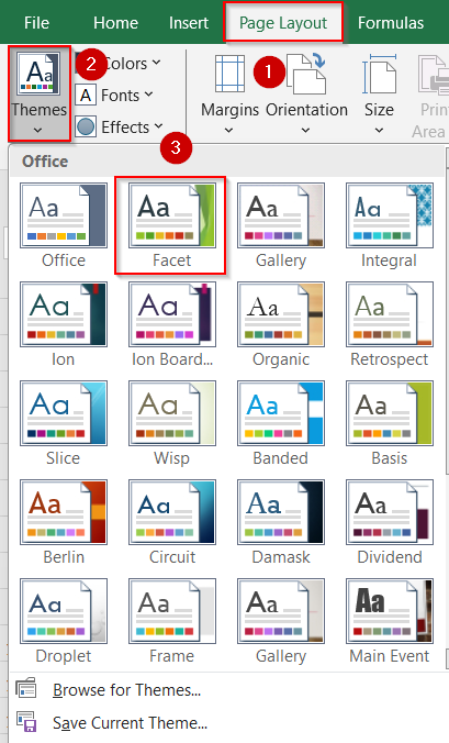
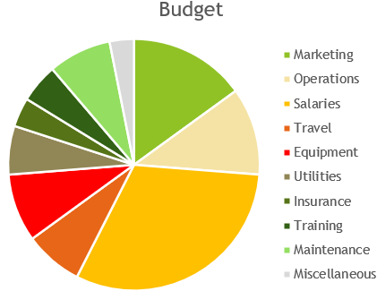
This applies a new color palette to the entire chart, including the background and fonts if applicable.
Enhance Chart Appearance with Predefined Chart Styles
Chart Styles offer a range of pre-designed layouts that instantly modernize the appearance of your pie chart. These styles include curated color palettes, subtle effects like gradients or borders, and layout enhancements that improve readability. This method is perfect when you want a clean, visually appealing chart without manually adjusting each color or element.
Steps:
➤ Click on your pie chart to enable the Chart Design tab.
➤ Click on the Chart Styles button.
➤ Click on the Color dropdown beside it.
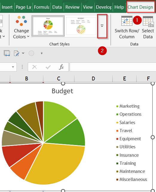
➤ Choose a pre-defined color palette from the Change Colors tool that suits your design needs.
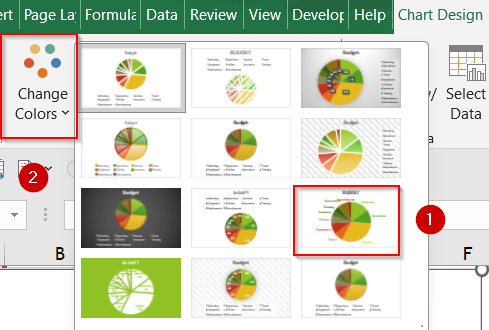
This is a quick and easy way to modernize your pie chart without customizing each element manually.
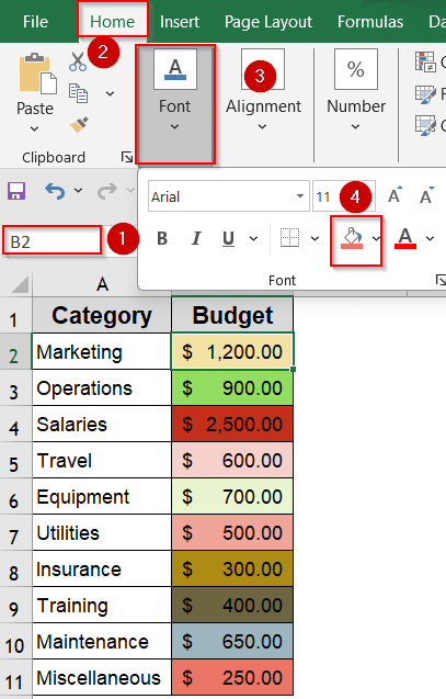
Automate Pie Slice Coloring Based on Cell Formatting Using VBA
For advanced users managing dynamic datasets, this method automates the color assignment process. With a simple VBA macro, you can link each pie slice’s color to the fill color of corresponding data cells. This ensures visual consistency even when your data changes, making it particularly useful for dashboards or recurring reports that require automated formatting.
Steps:
➤ First, assign a custom Fill color to each cell in your dataset which you want included in the pie chart by going to the Home tab >> Fill color under Font group.
➤ Press Alt + F11 to open the VBA Editor.
➤ Double-click ThisWorkbook to insert your module.
➤ Paste the following VBA code in the blank box that appears:
Private Sub SheetActivate()
Dim ch As ChartObject
Dim l As Long
Dim vntValues As Variant
Dim s As String
Dim myS As Series
For Each ch In ActiveSheet.ChartObjects
    For Each myS In ch.Chart.SeriesCollection
        If myS.ChartType <> xlPie Then GoTo SkipNotPie
        s = Split(myS.Formula, ",")(2)
        vntValues = myS.Values
        For l = 1 To UBound(vntValues)
            myS.Points(l).Interior.Color = Range(s).Cells(l).Interior.Color
        Next l
SkipNotPie:
    Next myS
Next ch
End Sub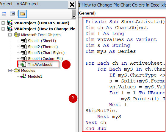
➤ Press F5 key to run the macro.
➤ Close the editor and go back to Excel.

The VBA will automatically update pie slice colors based on cell background colors.
Frequently Asked Questions
Can I apply a different color to each slice manually?
Yes. You can manually assign a unique color to each pie slice by clicking on the chart, selecting an individual slice, and using the “Format Data Point” pane to choose your preferred fill color.
What’s the fastest way to recolor the entire chart?
The quickest method to recolor the full pie chart is by selecting the chart and navigating to the “Chart Design” tab. From there, use the “Chart Styles” >> “Color” options to apply preset color palettes.
Will the colors stay if I update the data?
Not always. If you change or expand the dataset, Excel might override any manually applied colors. To maintain consistent formatting, consider using built-in themes or reapplying your colors after editing the data.
Can I copy pie chart colors from another chart or sheet?
Excel does not offer a direct way to copy color schemes between charts. However, you can manually replicate colors by using the same fill color settings or inputting matching RGB/HEX codes for consistency.
Is it possible to use brand colors in pie charts?
Yes. You can use brand-specific colors by selecting “More Fill Colors” and entering custom RGB or HEX values. This ensures that your chart aligns with your organization’s visual identity and design standards.
Wrapping Up
In this tutorial, we covered multiple practical ways to change pie chart colors in Excel, including manual adjustments, theme-based styling, and even automated updates using VBA. Each method serves a different use case, from quick presentations to professional reporting. Feel free to download the practice file and share your feedback.